The component catalog.
Browse every build69 component by category and preview it in context. Each one is fetchable via get_registry_item — a self-contained, copy-paste bundle with source, sub-components, and dependencies resolved.
★ Popular components
 Popular
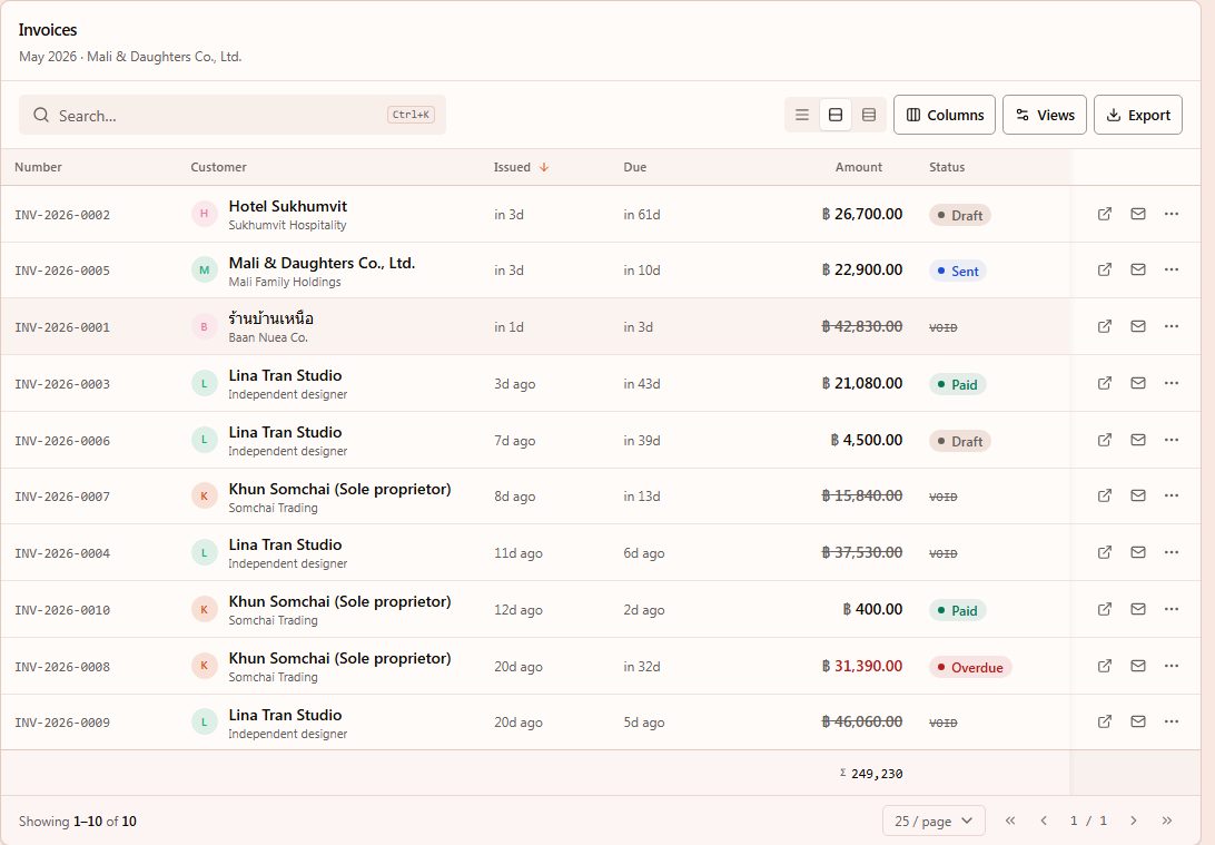
DataTable
v1.0.29Data DisplayProfessional sortable, filterable, groupable table powered by TanStack Table. Use for any tabular list where users need to slice the data.
 Popular
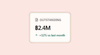
StatCard
v1.0.6Data DisplayKPI tile showing a single big number, delta vs prior period, and optional sparkline. Stack 3-6 in a row at the top of dashboards. Supports a colorful mode that hashes the title to a deterministic palette hue for "rainbow
 Popular
Button
v1.0.7Buttons & ActionsPrimary interactive element. Several size and variant styles, supports asChild for composition with Link components. Adds loading / success / error feedback states, an inline confirm flow, badge + tooltip slots, and an o
 Popular
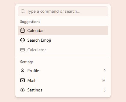
Command
v1.0.8OverlaysCommand palette / fuzzy-search menu (cmdk). Drives ⌘K palettes, autocompletes, and command lists.
 Popular
DatePicker
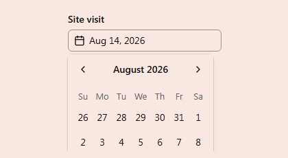
v1.0.9Date & TimeDate, date-range, and date-time pickers built on Calendar + Popover. Supports from/to constraints, a presets footer slot, and the Thai Buddhist Era calendar (พ.ศ.) with full Thai locale labels.
 Popular
Dialog
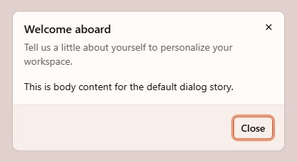
v1.0.7OverlaysModal dialog (Radix). Blocking overlay for confirmations, forms, or focused tasks. Ships with tonal headers, a confirm pattern, multi-step stepper, and form-dialog layout for richer flows.
Components198
Buttons & Actions6
PopularButton
v1.0.7Buttons & ActionsPrimary interactive element. Several size and variant styles, supports asChild for composition with Link components. Adds loading / success / error feedback states, an inline confirm flow, badge + tooltip slots, and an o
ButtonGroup
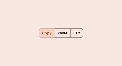
v1.0.5Buttons & ActionsSegmented control or pill group for clustering related actions and single-select choices. Horizontal or vertical orientation; child borders auto-merge.
CopyButton
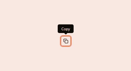
v1.0.7Buttons & ActionsButton that copies a value to the clipboard — a plain string or a sync/async producer resolved at click time. Writes via navigator.clipboard with a hidden-textarea/execCommand fallback, flips to a check icon for a config

Fab
v1.0.1Buttons & ActionsFloating Action Button: circular + extended variants, three sizes, tonal colours, and fixed-corner positioning helpers. Supports loading state and icon-only / icon+label content.
 New
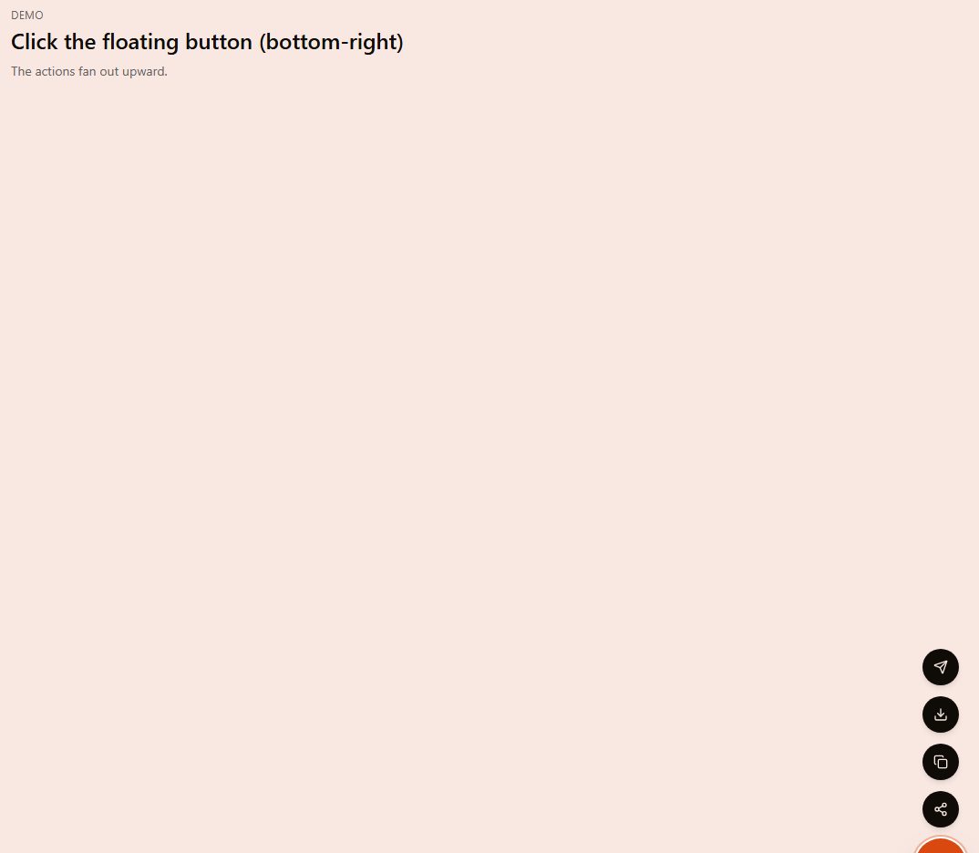
NewSpeedDial
v1.0.1Buttons & ActionsFloating action button that expands a radial cluster of sub-actions. All four directions, tooltip placement per action, optional backdrop, open-on-hover or click.
SplitButton
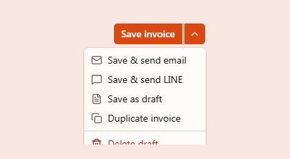
v1.0.7Buttons & ActionsPrimary action button with an attached caret segment that opens a dropdown of secondary actions. Both segments share Button's tone × emphasis × size API with correctly joined border radii, and the menu is fully keyboard
Text Inputs15
CurrencyInput
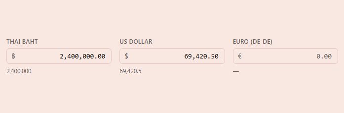
v1.0.1Text InputsMoney field with a currency symbol prefix and locale-aware thousands/decimal separators probed from Intl.NumberFormat, so th-TH, en-US and de-DE each format correctly. onAccept hands back both the numeric value and the display string, and scale/min/max control the fractional digits and clamp the amount as it is typed. Right-aligned monospace tabular figures; ships THB, USD, EUR, GBP and JPY presets.
EmailInput
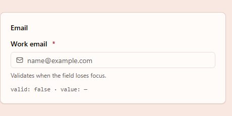
v1.0.6Text InputsValidated email field with leading mail icon, trailing status pill, RFC 5322 regex, optional domain allowlist / blocklist, Levenshtein typo suggestions against 17 common providers ("Did you mean gmail.com?"), and server-
 New
NewInlineEdit
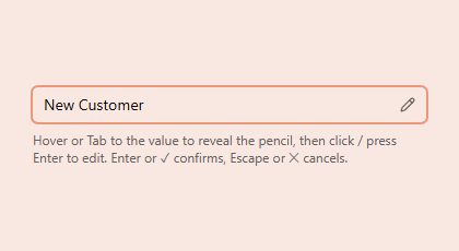
v1.0.1Text InputsClick-to-edit field: renders a committed value as text with a pencil affordance on hover/focus, and swaps to an input, textarea, or native select on activation. Enter or the check button confirms (Ctrl/Cmd+Enter in texta
Input
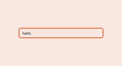
v1.0.3Text InputsSingle-line text input for short values. Leading / trailing icons, prefix / suffix addons, clear button, password reveal, copy-to-clipboard, character counter, a lock / pen editability indicator, and validation states.
input-otp
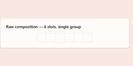
v1.0.1Text Inputsshadcn input-otp primitive (installed via `npx shadcn add input-otp`). Provides InputOTP / InputOTPGroup / InputOTPSlot / InputOTPSeparator with per-slot caret, paste support, and aria-invalid ring. Source primitive for
InputGroup
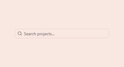
v1.0.8Text InputsCompose an Input with leading or trailing addons (icons, prefix text, suffix buttons).
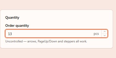
NumberInput
v1.0.3Text InputsNumeric spinbutton field with min/max clamping, step increments (keyboard + hold-to-repeat stepper buttons) and Intl.NumberFormat display when blurred — decimal, currency (default THB) or percent. Shows the raw editable
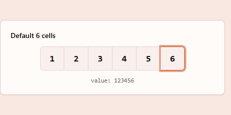
OtpInput
v1.0.1Text InputsMulti-cell digit / alphanumeric verification-code input built on the shadcn input-otp primitive. Configurable length and groups, paste support, auto-submit on complete, optional resend countdown (mm:ss), and three size s
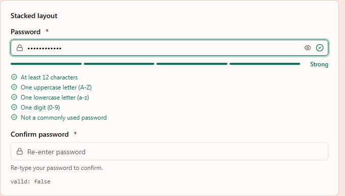
PasswordConfirmInput
v1.0.6Text InputsPairs PasswordInput with a confirm field. Forwards all PasswordInput props to the primary field; the confirm field validates equality with a red/green ring + inline match indicator.
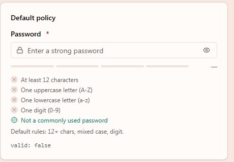
PasswordInput
v1.0.6Text InputsPassword field with configurable rules (min length default 12, upper/lower/digit/special), top-50 common-password blocklist, 4-segment strength meter (Weak/Fair/Good/Strong), rule checklist, visibility toggle, and option
 New
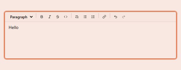
NewRichTextEditor
v1.0.9Text InputsTiptap-based WYSIWYG editor with a token-styled formatting toolbar: paragraph/H1–H3 select, bold, italic, strike, inline code, blockquote, bullet/ordered lists, validated link popover (http(s)/mailto) and undo/redo. Cont
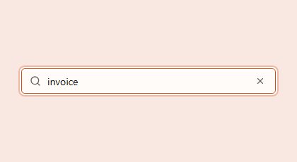
SearchInput
v1.0.3Text InputsCanonical build69 search-input composite. Leading magnifier, optional clear button, platform-aware ⌘K kbd hint, optional global keyboard shortcut, debounced onDebouncedChange, async loading spinner, pill / full-width var
 New
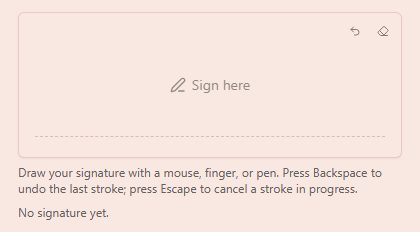
NewSignaturePad
v1.0.8Text InputsDependency-free canvas signature capture with smooth quadratic-curve strokes and velocity-based pen width. DPR-aware and responsive (ResizeObserver redraw), undo/clear toolbar, read-only display from a data URL, and PNG
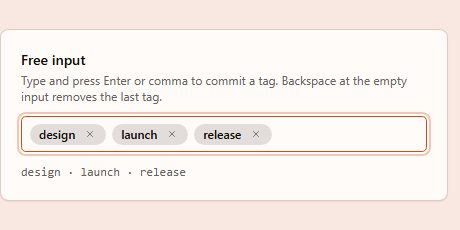
TagInput
v1.0.8Text InputsGmail / GitHub-style inline chip input. Type-then-commit on Enter / comma / semicolon / Tab; backspace deletes last chip; paste comma-separated splits into multiple tags; autocomplete dropdown with arrow-key nav + pinned
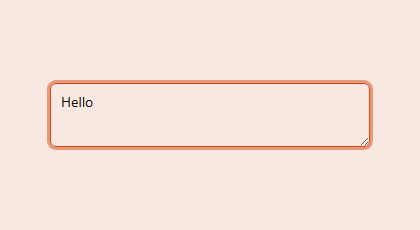
Textarea
v1.0.8Text InputsMulti-line text input. Resizable by default; pairs with FormField for long-form input. Adds autosize, character counter, markdown preview (DOMPurify-sanitised), mentions autocomplete, a floating formatting toolbar, and s
Selection & Choice17
 New
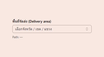
NewCascader
v1.0.7Selection & ChoiceHierarchical dependent select (Ant Cascader-style) for tree-shaped choices such as Thai addresses (จังหวัด → เขต/อำเภอ → แขวง/ตำบล). Multi-column popover where each pick reveals the next level; the value is the string[]

Checkbox
v1.0.1Selection & ChoiceTwo- or three-state checkbox (Radix). Use for boolean form fields or selectable list rows. Adds description / error slots, a card layout variant, and a CheckboxGroup that derives indeterminate state on a parent from its
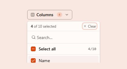
ChecklistMenu
v1.0.7Selection & ChoiceMulti-select checkbox dropdown. Search filter, "Select all" with indeterminate state, "Clear" link, "N of M selected" header, trigger count badge, optional grouping with section headings.
 New
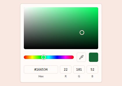
NewColorPicker
v1.0.1Selection & ChoiceDependency-free HSV color picker with a 2D saturation/brightness area, hue slider, optional alpha slider (checkerboard), hex + RGB(A) inputs, preset swatches and an eyedropper button when the browser supports window.EyeD
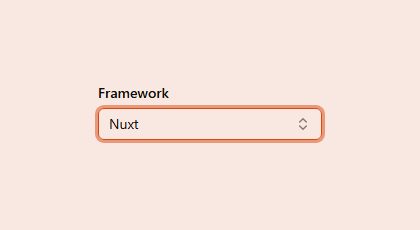
Combobox
v1.0.9Selection & ChoiceSearchable single- or multi-select that composes Popover + Command. Hand-rolled — single via Combobox, multi via MultiCombobox.
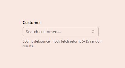
ComboboxAsync
v1.0.9Selection & ChoiceAsync-loading combobox with debounced fetch, optional creatable entries, multi-select with chips, free-solo input, and grouped results. Exports ComboboxAsync + ComboboxAsyncMulti.
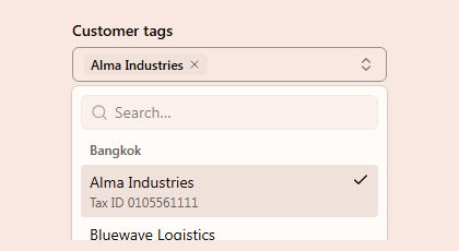
ComboboxAsyncMulti
v1.0.8Selection & ChoiceMulti-select counterpart to ComboboxAsync: the same host-driven async loading, spinner, error-and-retry panel, creatable and free-solo rows and grouped results, but the trigger carries one removable chip per value with a "+N more" count past `maxChips`. `maxValues` caps how many can be picked, and Backspace or Delete on the trigger removes the last chip. Values the current result set no longer contains still render as chips using the raw value as the label.
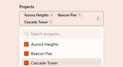
MultiCombobox
v1.0.8Selection & ChoiceDedicated multi-select combobox: a searchable Popover + Command list whose trigger holds one removable chip per selection plus a "+N more" count once the list exceeds `maxDisplay`. Uses a values/onValuesChange array API rather than Combobox's discriminated single/multiple union, so state stays a plain string[]. Chips are removable by mouse, and Backspace in an empty search field drops the last value.
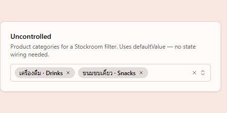
MultiSelect
v1.0.7Selection & ChoiceToken multi-select: popover listbox with checkbox options + built-in search, rendering the selection as removable chips in the trigger. Flat or grouped options, select-all / clear-all that respects the active search filt
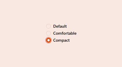
RadioGroup
v1.0.1Selection & ChoiceMutually-exclusive option group (Radix). Use when exactly one of a small set must be chosen. Adds inline / stacked / cards layouts, description + recommended-pill slots, per-item disabled state, and an optional icon slot
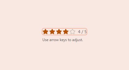
Rating
v1.0.3Selection & ChoiceFive-star rating with half-star precision, hover preview, hover labels, custom icon support, read-only / disabled states, and three sizes.
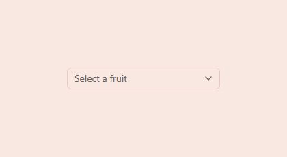
Select
v1.0.1Selection & ChoiceNative-like select control (Radix). Use for single choice from a moderate list.

Slider
v1.0.4Selection & ChoiceRange slider control (Radix). Single or dual-thumb for numeric range input. Adds marks with labels, a hover value bubble, paired numeric inputs, and tonal variants.

Switch
v1.0.7Selection & ChoiceOn/off toggle (Radix). Use for immediate boolean settings (no save button). Adds inline / stacked / card layouts, label + description slots, a loading spinner, and an optional confirm gate before applying the change.
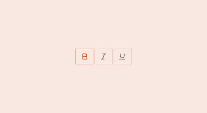
ToggleGroup
v1.0.2Selection & ChoiceTwo-state toggle buttons built on Radix Toggle / ToggleGroup. Ships a standalone Toggle (aria-pressed) plus a ToggleGroup with single or multiple selection — ideal for view switchers, list-page status filters and formatt
 New
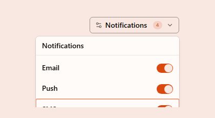
NewToggleMenu
v1.0.8Selection & ChoiceDropdown panel of Switch rows. Description + leading-icon slots per item, grouping with separators, per-item async loading spinner, "Reset to defaults" footer wired to defaultValues, and an "N changed" indicator.
 New
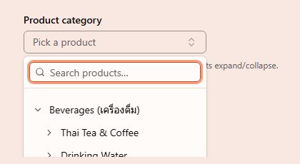
NewTreeSelect
v1.0.7Selection & ChoiceSelect input whose popover is a checkable tree. Single mode is a radio-like leaf select; multiple mode adds tri-state parent checkboxes with a checkStrategy (all / parent / child) controlling which values are emitted. Se
Date & Time10
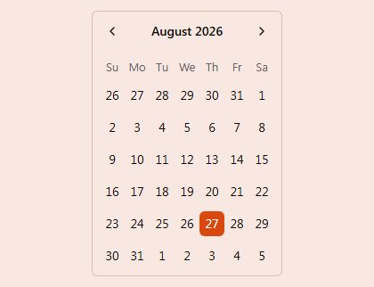
Calendar
v1.0.7Date & TimeDate picker grid powered by react-day-picker. Used inside a Popover as a DatePicker; range selection supported.
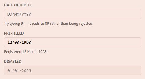
DateInput
v1.0.3Date & TimeKeyboard-first `DD/MM/YYYY` date field with real range constraints — day 1-31 and month 1-12 are enforced by the mask, so `99/99/9999` can never be typed. `autofix: 'pad'` pads a leading `9` to `09` instead of rejecting the keystroke. Use it when typing a date is faster than picking one; reach for DatePicker when a calendar popover is wanted.
PopularDatePicker
v1.0.9Date & TimeDate, date-range, and date-time pickers built on Calendar + Popover. Supports from/to constraints, a presets footer slot, and the Thai Buddhist Era calendar (พ.ศ.) with full Thai locale labels.
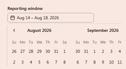
DateRangePicker
v1.0.7Date & TimeTwo-month range picker in a Popover, with an optional quick-range rail (Today, Yesterday, Last 7/30 days, This month, Last month, This quarter) via `presets` — pass `true` for the built-ins or supply your own presets array. The trigger collapses the range to a compact label, dropping the repeated year when both ends share one. Supports Buddhist Era (พ.ศ.) and Thai locale labels.
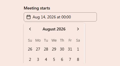
DateTimePicker
v1.0.7Date & TimeCombined date + time-of-day picker: a Popover calendar with an Hour/Minute Select row beneath it, merging both into one Date value. Minute options are step-filtered via `minuteStep` (default 5), and an off-grid current minute (e.g. :37 on a 5-minute step) is spliced in so the control never misrepresents the stored time. Supports Buddhist Era (พ.ศ.) and Thai locale labels.
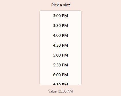
DigitalClock
v1.0.2Date & TimeScrollable digital time-list pickers (MUI DigitalClock / MultiSectionDigitalClock equivalents). DigitalClock renders one scrollable column of times at a fixed interval; MultiSectionDigitalClock renders hours | minutes |
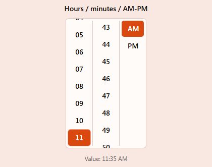
MultiSectionDigitalClock
v1.0.1Date & TimeSide-by-side scrollable columns for hours, minutes and either AM/PM or seconds, the MUI MultiSectionDigitalClock equivalent. The `views` prop chooses which columns render and in what order, while minutesStep and secondsStep control each column's granularity. Every column is its own accessible listbox with keyboard support and auto-scrolls its selected value into view.
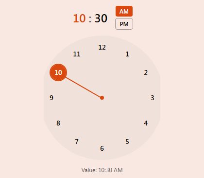
TimeClock
v1.0.7Date & TimeAnalog clock-face time picker (MUI TimeClock equivalent). A round face where the user clicks a number to pick hours, then minutes — the classic two-step interaction. Supports 12h (AM/PM) and 24h (two concentric rings), o
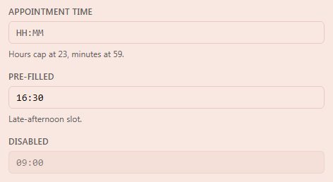
TimeInput
v1.0.3Date & TimeKeyboard-first 24-hour `HH:MM` time field with real range constraints — hours cap at 23 and minutes at 59, so `87:95` can never be typed. `autofix: 'pad'` pads a leading `9` to `09` instead of rejecting the keystroke. Use it when typing a time is faster than spinning a clock; reach for TimePicker or TimeClock for a picker UI.
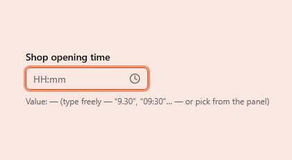
TimePicker
v1.0.8Date & TimeTime field with free-text parsing plus a popover digital-clock panel (composes MultiSectionDigitalClock). Type "9:30", "1:45 pm" or "18:20:05" and it parses/validates live — invalid or out-of-range text shows the error s
Masked & Validated5
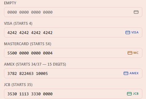
CreditCardInput
v1.0.1Masked & ValidatedCredit card number field that auto-detects the brand from the typed prefix and shows a tinted badge (Visa, Mastercard, Amex, Discover, JCB). The mask switches itself to Amex's 15-digit `0000 000000 00000` grouping the moment a 34/37 prefix is seen, and back to 16-digit grouping otherwise. Sets inputMode="numeric" and autoComplete="cc-number"; the badge can be hidden with `hideBrand`.

InputMask
v1.0.2Masked & ValidatedMasked input wrapping the shadcn Input visual contract on top of react-imask. Ships with pre-baked exports for phone, credit card, tax ID, date, time, and currency formats.
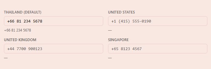
PhoneInput
v1.0.1Masked & ValidatedPhone number field with the country dial code baked into the mask — Thailand `+66 XX XXX XXXX` by default, plus US, UK and Singapore formats. The prefix is fixed mask text rather than a separate overlay, so the accepted value always carries the full international number. Renders monospace tabular figures and sets inputMode="tel" and autoComplete="tel".
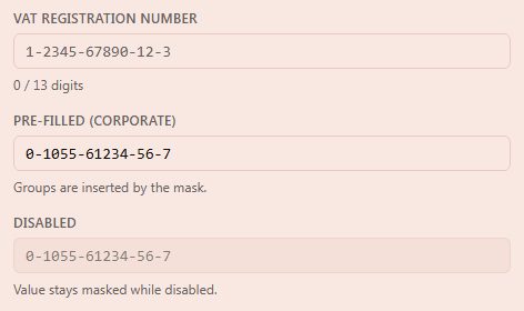
TaxIdInput
v1.0.1Masked & ValidatedThai 13-digit tax ID field masked as `X-XXXX-XXXXX-XX-X`. The grouping hyphens are inserted by the mask, so the field only ever accepts digits and the accepted value is always correctly grouped. Renders monospace tabular figures with inputMode="numeric".
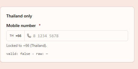
ValidatedPhoneInput
v1.0.9Masked & ValidatedMasked phone input with country-specific completeness validation across 12 countries (TH/US/UK/SG/AU/JP/KR/CN/PH/MY/ID/VN). Searchable country picker on the left, masked local number on the right (react-imask), plus E.16
Data Display24
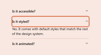
Accordion
v1.0.7Data DisplayVertically stacked collapsible sections built on Radix Accordion. Use for FAQs, settings groups, or progressive disclosure of long content. Also ships richer variants (card / flush / bordered / separated) plus declarativ

Avatar
v1.0.3Data DisplayUser or entity avatar with image + initials fallback. Use anywhere a person, team, or organisation needs an identity glyph. Adds hash-tinted initials, status dot, size + tone + ring variants, and an AvatarGroup with hori
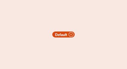
Badge
v1.0.1Data DisplaySmall pill-shaped label for status, counts, or tags — covering BOTH the MUI Chip role (standalone pill in the full tone × emphasis matrix with leading dot / icon / avatar slots, dismiss button, count + pulse modes) AND t
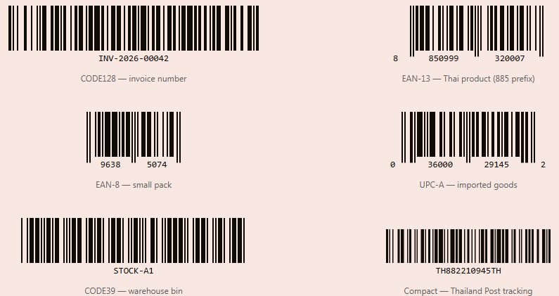
Barcode
v1.0.1Data Display1D barcode tile rendering CODE128, EAN-13, EAN-8, UPC-A or CODE39 symbologies via jsbarcode into an SVG ref inside useEffect, making it SSR-safe. Bar width, height, colours and the human-readable text line are all configurable, with an optional caption under the code. Values that are invalid for the chosen format (a bad EAN-13 check digit, Thai text in CODE39) surface as a danger-toned inline error state instead of throwing.
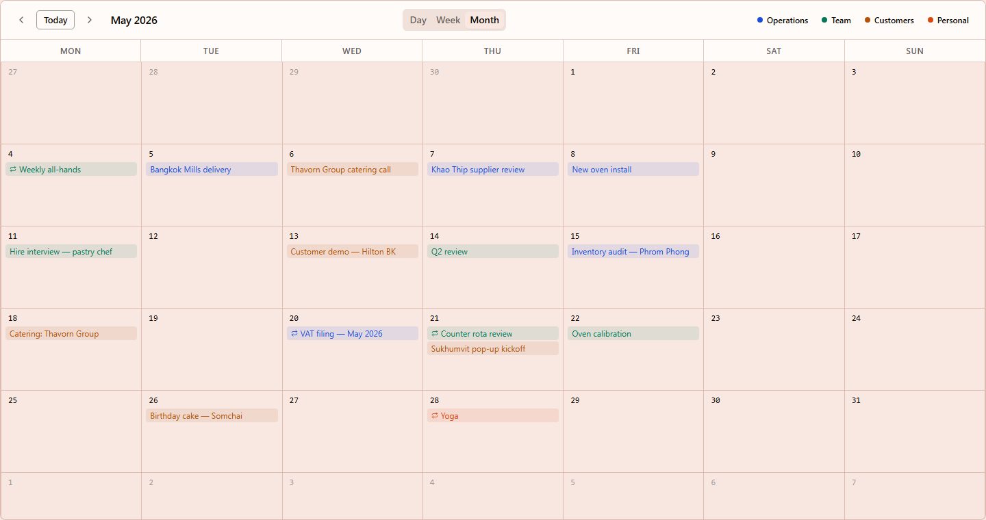
BuildCalendar
v1.0.11Data DisplayMonth / week / day calendar with event chips and drag-to-create. Use when users need to see and schedule events on a grid.
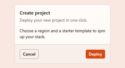
Card
v1.0.2Data DisplayGeneric container with subtle border, padding, and slots for header / title / description / content / footer. Adds elevation levels, hover lift, selected state, tonal tint, and a loading overlay for richer surface compos
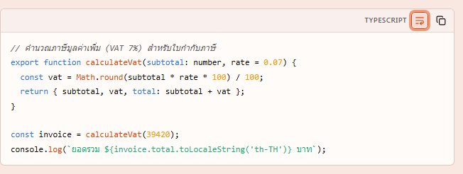
CodeBlock
v1.0.7Data DisplaySyntax-highlighted code display built on highlight.js with design-token colors that follow the app theme in both light and dark schemes (no hljs stylesheet). Supports explicit language or auto-detect, line numbers, per-l
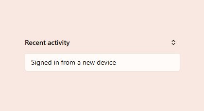
Collapsible
v1.0.1Data DisplaySingle expand / collapse region built on Radix Collapsible — simpler than the Accordion (which manages many items). The consumer supplies one trigger and one content region with a smooth height animation. Supports contro
PopularDataTable
v1.0.29Data DisplayProfessional sortable, filterable, groupable table powered by TanStack Table. Use for any tabular list where users need to slice the data.
 New
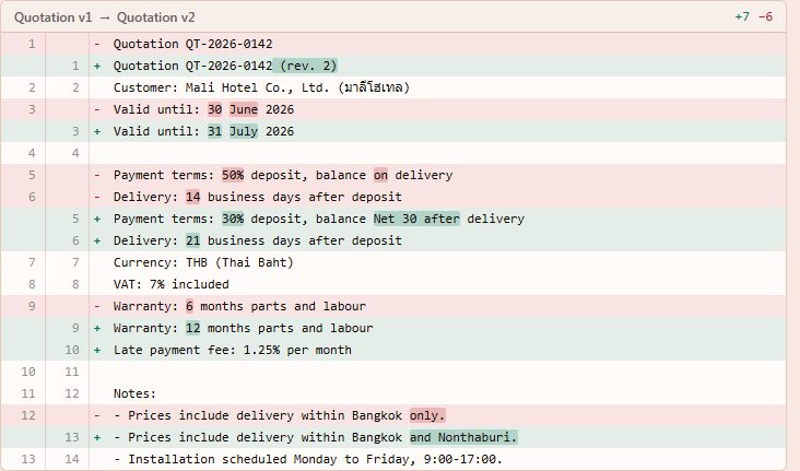
NewDiffViewer
v1.0.1Data DisplayDependency-free text diff viewer: line-level Myers (linear space) with word-level refinement inside changed line pairs. Unified (inline) and side-by-side (split) modes, collapsible unchanged context with keyboard-operabl
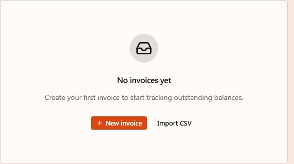
EmptyState
v1.0.2Data DisplayFriendly empty-list illustration + headline + sub-copy + primary CTA. Use whenever a list, search, or filter returns nothing.
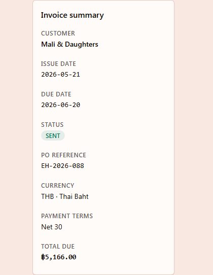
KVList
v1.0.9Data DisplayTwo-column key/value display list. Use for read-only metadata, attribute panels, audit summaries.
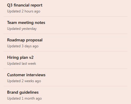
List
v1.0.1Data DisplayVertical list primitive with rich slots — avatar / leading icon / primary / secondary / trailing actions. Compound API: List.Item, List.Avatar, List.Action.
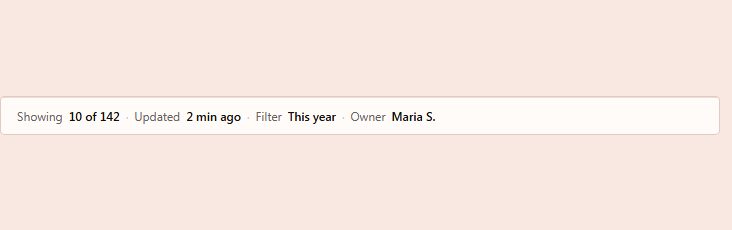
ListMeta
v1.0.4Data DisplayCompact meta-info row shown above or below a list (count, pagination summary, sort indicator, density toggle).
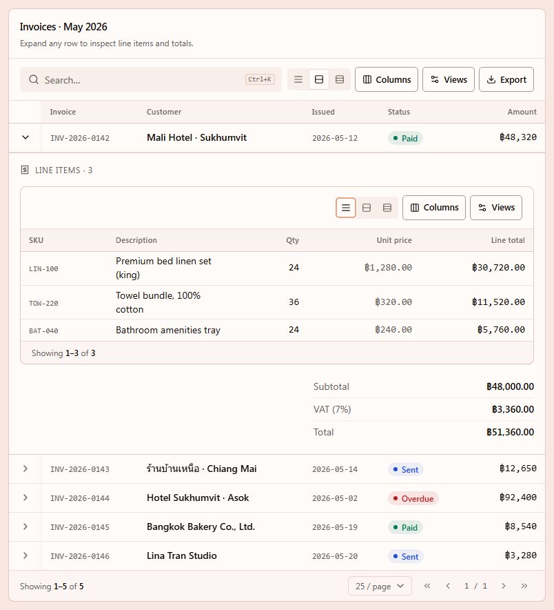
MasterDetail
Data displayExpandable master–detail rows for DataTable — click a row to reveal an animated detail panel with related records inline.
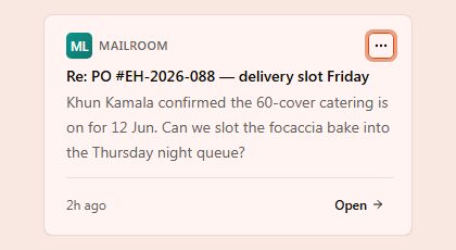
PinCard
v1.0.7Data DisplayPinned-content card for dashboards or "My day" — shows a snippet, quick action, and dismiss / pin affordance.
 New
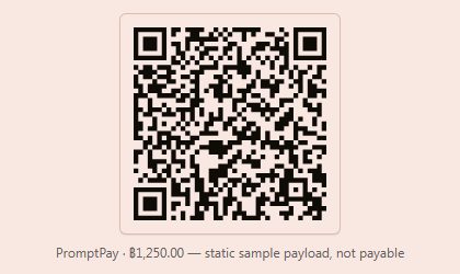
NewQRCode
v1.0.2Data DisplayScannable-code tiles for payment slips, receipts, shipping labels and product tags. QRCode renders a token-themed SVG QR (react-qr-code) with quiet-zone padding, optional centre logo slot, caption and a download-as-PNG a
PopularStatCard
v1.0.6Data DisplayKPI tile showing a single big number, delta vs prior period, and optional sparkline. Stack 3-6 in a row at the top of dashboards. Supports a colorful mode that hashes the title to a deterministic palette hue for "rainbow
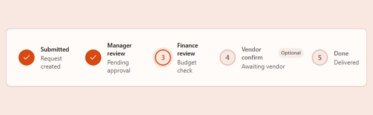
Stepper
v1.0.2Data DisplayMulti-step indicator with 6 step states (idle / active / completed / error / disabled / loading), horizontal or vertical orientation, linear or non-linear navigation, alternative-label mode, and a content slot per step.
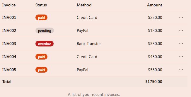
Table
v1.0.2Data DisplayLow-level styled <table>. Build trivial tables directly; use DataTable for anything interactive.
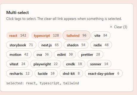
TagCloud
v1.0.4Data DisplayVisible cluster of selectable tag chips (filter rail, blog cloud, category picker). Three selection modes (none / single / multi), three layouts (wrap / horizontal-scroll / grid), six variants (default / outline / subtle
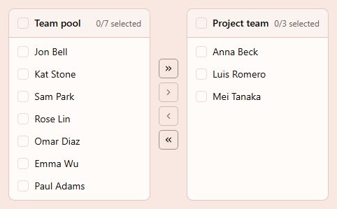
TransferList
v1.0.8Data DisplayTwo parallel lists with move (→ ←) buttons, drag-and-drop reorder, optional search and sort. Use to assign / unassign items between an "available" and "selected" pool.
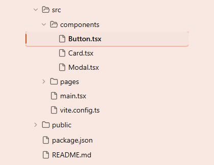
TreeView
v1.0.11Data DisplayRecursive tree of nested nodes with optional checkboxes / single / multi select, lazy loading, drag-and-drop reorder, search filter, and right-click context menu.
 New
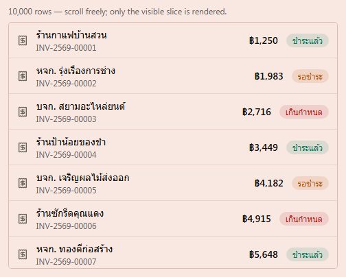
NewVirtualList
v1.0.2Data DisplayWindowed list built on @tanstack/react-virtual that renders only the visible slice of arbitrarily long datasets while keeping list/listitem semantics, roving-tabindex keyboard navigation, and aria-setsize / aria-posinset
Timelines8
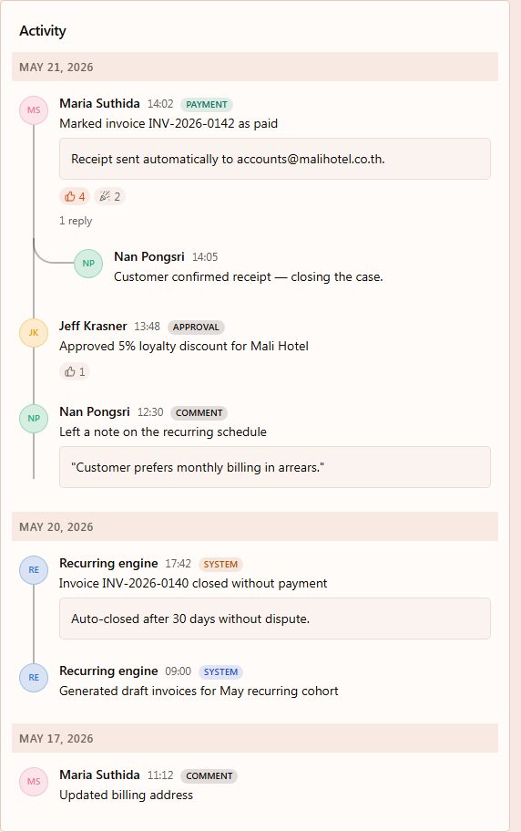
Timeline
v1.0.9TimelinesVertical activity timeline of events with timestamps, icons, and descriptions. Use for audit logs, comments, status history.
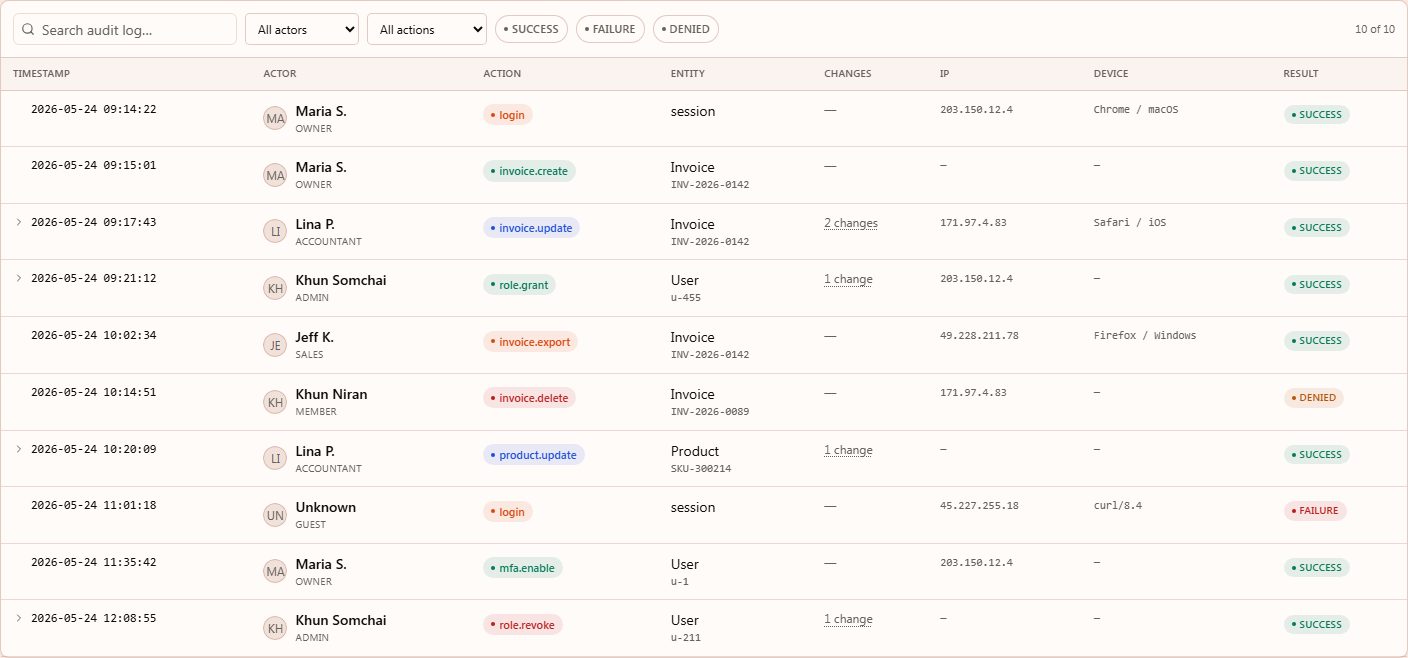
TimelineAudit
v1.0.7TimelinesCompliance-style table view of audit events: actor / target / action / timestamp / IP, with optional filters and severity badges.
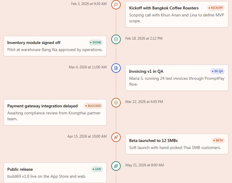
TimelineCentered
v1.0.1TimelinesMUI Lab-style alternating left/right timeline with a center rail. Use for biography / case-history-style narratives.
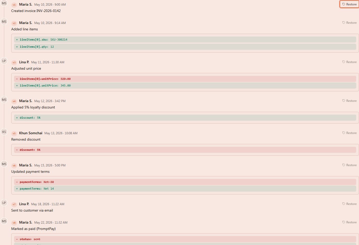
TimelineHistory
v1.0.9TimelinesDiff and restore change-history timeline: who changed what, before / after diff, and a restore action per revision.

TimelineHorizontal
v1.0.3TimelinesGantt-light horizontal timeline with milestones and optional multi-lane rows. Use for roadmaps and release schedules.
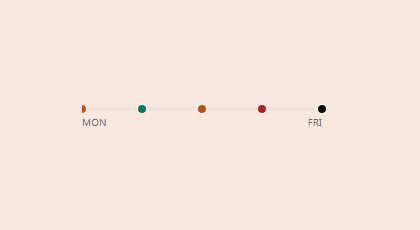
TimelineMini
v1.0.3TimelinesSparkline-style inline timeline for KPI cards and table cells. Just dots on a line.
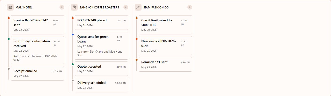
TimelineSwimlanes
v1.0.1TimelinesParallel-track timeline with one swimlane per actor / department / channel. Use for cross-team operations and multi-channel campaigns.

TimelineTracking
v1.0.1TimelinesLarge-step milestone tracking timeline (order placed → packed → shipped → delivered) with success and failure states.
Charts19
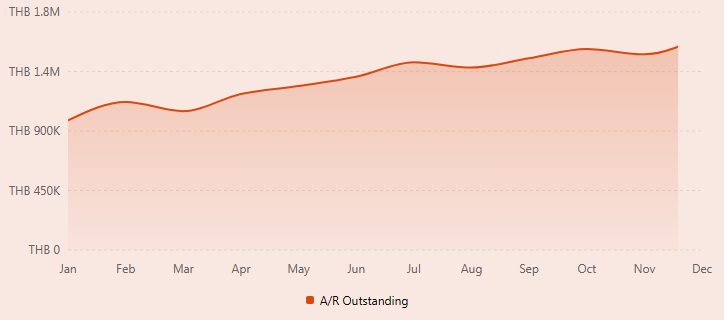
AreaChart
v1.0.4ChartsRecharts-backed area chart with stacked + threshold variants. Use to emphasise cumulative volume over time.
BarChart
v1.0.5ChartsRecharts-backed bar chart with grouped, stacked, horizontal, and color-by-point variants. The default categorical comparison chart.
chart
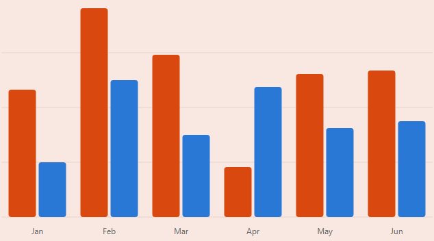
v1.0.1Chartsshadcn ChartContainer / ChartTooltip / ChartLegend wrappers that adapt recharts to build69 theme tokens. Foundation for all build69 chart composites.
ComboChart
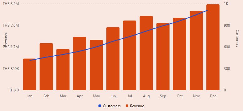
v1.0.4ChartsRecharts-backed combo chart mixing bars + lines on the same axes (e.g., revenue bars + margin line). Two or three series.
FunnelChart
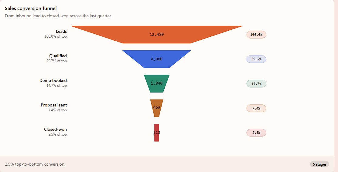
v1.0.5ChartsTrapezoidal funnel of stages with percentage and per-stage drop-off labels. Horizontal or vertical orientation.
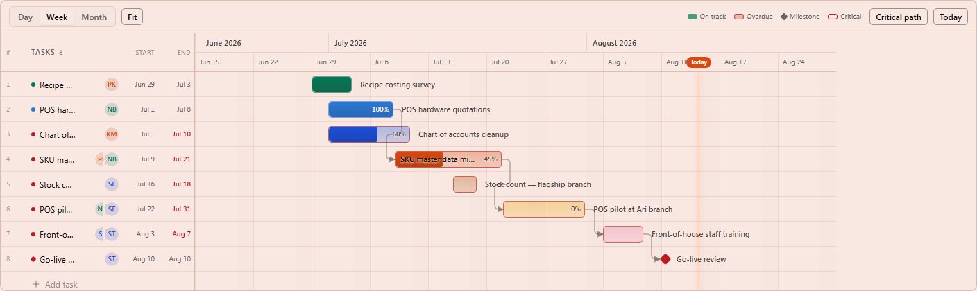
GanttChart
v1.0.11ChartsClickUp-style project timeline — a zoomable task grid with collapsible group headers, dependency links, a critical-path toggle and a resizable task panel.
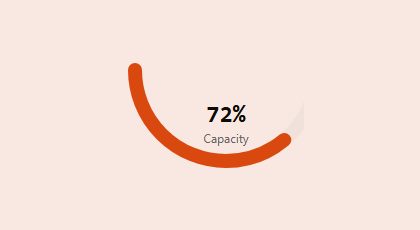
Gauge
v1.0.4ChartsArc / speedometer gauge drawn with pure SVG. Shows a single value against a [min, max] range as a coloured arc with a centre readout. Supports arbitrary start / end angles, colour-band thresholds, tick segments, an optio
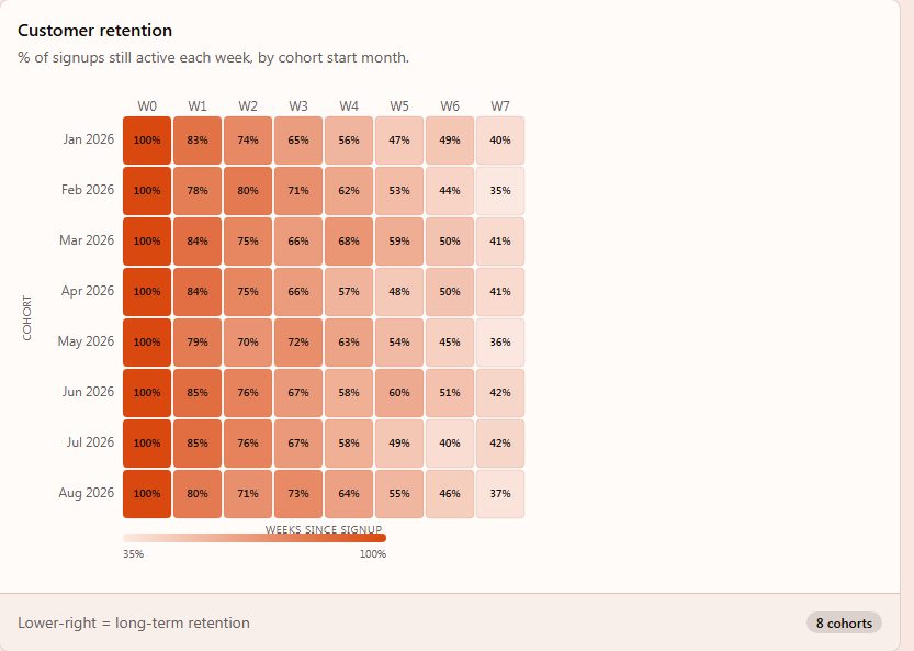
HeatmapChart
v1.0.5Charts2D grid heatmap with sequential / diverging / categorical colour scales, hover tooltip, axis labels, and tonal palettes. Use for matrices like retention or hour-of-day activity.
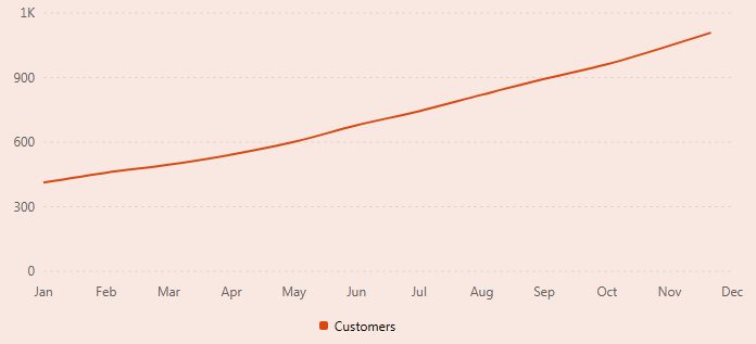
LineChart
v1.0.4ChartsRecharts-backed line chart with multi-series, area fill, straight-segment, and dashed-forecast modes. The default time-series chart.

MiniArea
v1.0.3ChartsTiny inline area chart for table cells / KPI tiles. No axes.

MiniBar
v1.0.3ChartsTiny inline bar chart for table cells / KPI tiles. Single line, no axes.

MiniLine
v1.0.3ChartsTiny inline line chart for table cells / KPI tiles. No axes.
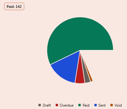
PieChart
v1.0.4ChartsRecharts-backed pie / donut chart with external labels and click-to-highlight mode. Use for part-of-whole when there are 2-6 slices.
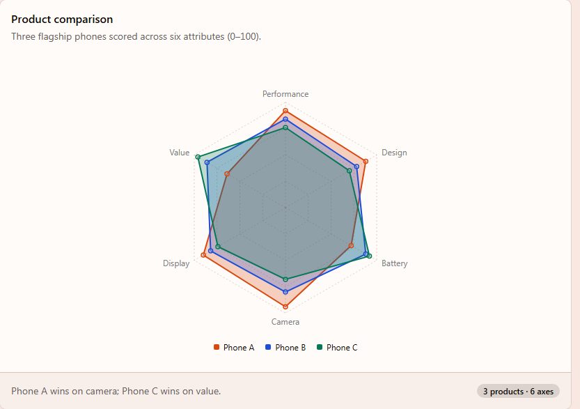
RadarChart
v1.0.4ChartsMulti-axis polar / radar / spider chart — recharts-backed. Use to compare items across multiple metrics in one shape.

RadialChart
v1.0.4ChartsRecharts-backed radial (gauge) chart with single-gauge, percent-progress, and multiple-rings variants. Use for goal completion and rate indicators.
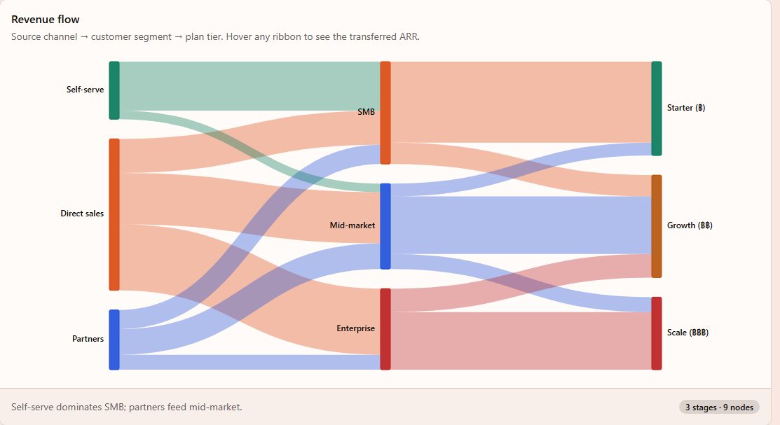
SankeyChart
v1.0.3ChartsFlow diagram (recharts) showing weighted edges between nodes with hover highlight of incoming + outgoing flows.
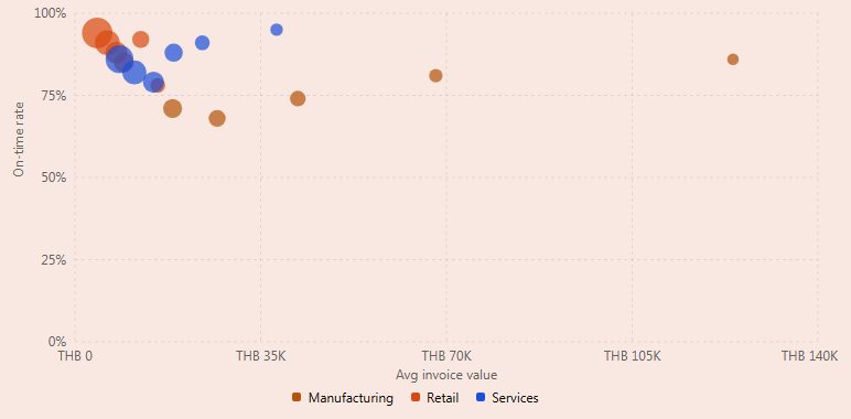
ScatterChart
v1.0.3ChartsRecharts-backed scatter chart with optional brush selector for filtering. Use to spot correlation between two metrics.

Sparkline
v1.0.4ChartsTiny SVG line chart for inline trend display. Shipped with StatCard but usable anywhere.
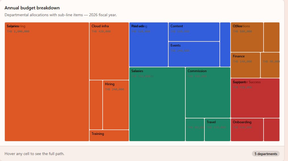
TreemapChart
v1.0.4ChartsNested rectangles sized by value — recharts-backed. Use for budget / revenue breakdowns or any hierarchical part-of-whole.
Feedback & Status18
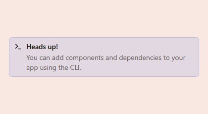
Alert
v1.0.7Feedback & StatusInline callout for short, contextual messages (info, warning, error, success). Not a toast — stays in the layout. Now ships the full tone × emphasis matrix, action slot, countdown auto-dismiss, expandable details, and a

Backdrop
v1.0.1Feedback & StatusFull-page overlay surface with dark / light / blur / glass tones. Composes with dialogs, sheets, and custom overlays; supports escape + click-outside dismiss.

Progress
v1.0.2Feedback & StatusLinear progress bar (Radix). Shows determinate or indeterminate task progress. Adds multi-segment bars, stepped indicators, a circular variant, striped fill, indeterminate mode, and tonal + size variants.
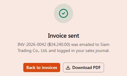
Result
v1.0.1Feedback & StatusOutcome block for an operation the user just performed or a route resolving to an HTTP error. Big tone-colored status icon (or large dimmed code typography for 403/404/500), title, subtitle, actions slot, and an optional

Skeleton
v1.0.2Feedback & StatusAnimated grey placeholder block. Use during data loading to preserve layout. Ships pre-baked shapes (Avatar / Text / Card / Row / Table / Form / Stat / Chat) plus pulse or shimmer wave animation.
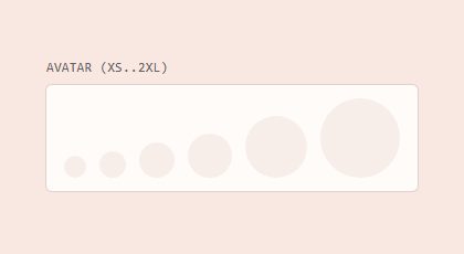
SkeletonAvatar
v1.0.1Feedback & StatusA circular placeholder standing in for a profile picture while user data loads. Ships six preset sizes from xs (20px) to 2xl (72px) so it lines up with whatever avatar it replaces. Pick the size that matches the real avatar and the row will not reflow when data arrives.
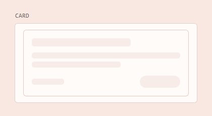
SkeletonCard
v1.0.2Feedback & StatusA ready-made placeholder for a content card: title bar, a two-line body and a footer holding a meta label and a pill. Comes wrapped in a bordered card surface with role="status" and aria-busy so assistive tech announces the loading state. Drop it straight into a card grid while the list request is in flight.

SkeletonChat
v1.0.2Feedback & StatusA placeholder for a message thread: alternating incoming and outgoing bubbles with avatars, at deterministically varied widths so the transcript looks natural. Outgoing rows flip direction and corner rounding just like real bubbles. Use it while chat history loads.
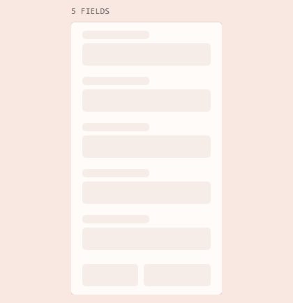
SkeletonForm
v1.0.2Feedback & StatusA placeholder for an edit form: `fields` label-and-input pairs followed by a right-aligned pair of action buttons. Set fields to the number the real form renders so the dialog or panel keeps its height when data arrives. Announces itself with role="status" and aria-busy.
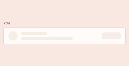
SkeletonRow
v1.0.2Feedback & StatusA placeholder for a single list item: circular avatar, a title and subtitle stack, and a right-hand action button. Stack several to hold the shape of a people or conversation list while it loads. Carries role="status" and aria-busy for assistive tech.
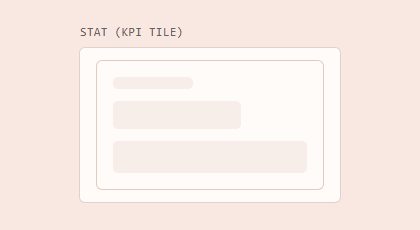
SkeletonStat
v1.0.2Feedback & StatusA placeholder for a KPI tile: a small label bar, a large metric-value bar and a sparkline block, inside a bordered card. Built for the metrics strip at the top of a dashboard, where four tiles usually load together. Carries role="status" and aria-busy.
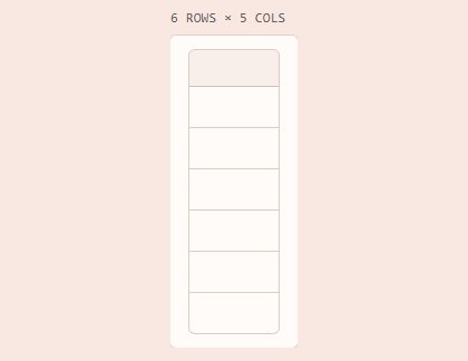
SkeletonTable
v1.0.2Feedback & StatusA placeholder for a data grid: a tinted header strip plus a rows x cols body of cells. Cell widths are staggered deterministically so the block reads as real tabular data instead of a uniform grid. Match rows and cols to your page size and the table will not jump when data lands.
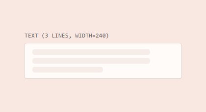
SkeletonText
v1.0.1Feedback & StatusA stack of placeholder bars standing in for a paragraph of copy. Renders `lines` bars at the given width, with the last bar shortened to 60% so the block reads as prose rather than a solid box. Use it wherever a run of text is still loading.
Sonner
v1.0.1Feedback & StatusToast notification system (sonner library). Stack of transient feedback messages.

Spinner
v1.0.1Feedback & StatusInline loading spinner with seven visual variants (spin, dots, pulse, ring, bars, gradient, orbit), five sizes, and three tones. Use inside buttons or anywhere a small loading glyph is needed.
SpinnerOverlay
v1.0.2Feedback & StatusFull-page or container-overlay loading state. Three layouts: fixed full-viewport with blur (screen), absolute fill of a relative parent (card), and inline spinner + label (inline).
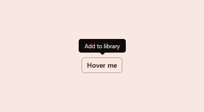
Tooltip
v1.0.2Feedback & StatusHover / focus hint floating above an element (Radix). Adds rich content support, a keyboard-shortcut hint slot (Kbd), tonal variants, and an interactive (hover-stay) mode that keeps the tooltip open when hovered.
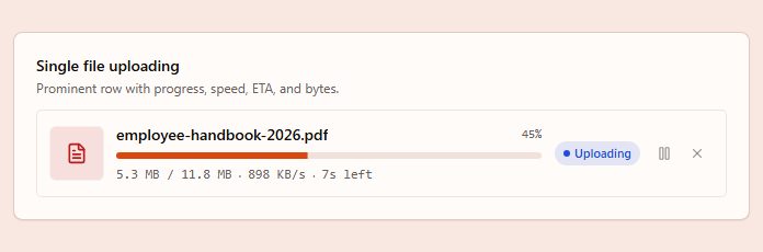
UploadProgress
v1.0.7Feedback & StatusRich file-upload progress display. Three modes (single / list / aggregate); shows bytes uploaded / total, speed (auto-computed via rolling 10-sample buffer if not provided), ETA, chunked-upload segmented progress bar; st
Overlays10
PopularCommand
v1.0.8OverlaysCommand palette / fuzzy-search menu (cmdk). Drives ⌘K palettes, autocompletes, and command lists.
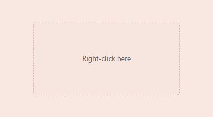
ContextMenu
v1.0.6OverlaysRight-click / long-press menu built on Radix ContextMenu, styled 1:1 with DropdownMenu: identical item anatomy (icon / label / description / Kbd shortcut), checkbox and radio items, nested submenus, separators, labels an
PopularDialog
v1.0.7OverlaysModal dialog (Radix). Blocking overlay for confirmations, forms, or focused tasks. Ships with tonal headers, a confirm pattern, multi-step stepper, and form-dialog layout for richer flows.
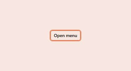
DropdownMenu
v1.0.6OverlaysContext / action menu (Radix). Supports nested submenus, checkboxes, radios, and keyboard shortcuts. Adds searchable items, a recently-used section, icons + keyboard hints, destructive tone, and trigger-width matching.

HoverCard
v1.0.3OverlaysRich preview card that opens when the pointer rests on (or keyboard focus reaches) a trigger, built on Radix HoverCard with the same popover surface styling as Popover. Ships width presets, an arrow option, tunable open/
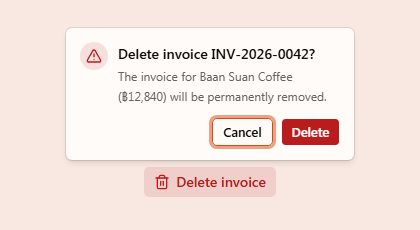
Popconfirm
v1.0.7OverlaysInline confirmation popover for destructive or consequential actions. Wraps any trigger; on open shows a tone-aware icon, title, optional description, and Cancel + Confirm buttons. Async onConfirm shows a loading spinner
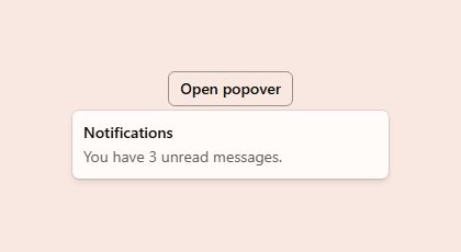
Popover
v1.0.7OverlaysFloating panel anchored to a trigger (Radix). Used for date pickers, mini-forms, info bubbles. Adds header / body / footer slot composition, search input slot, sectioned items, tonal variants, and a form-popover layout.

Sheet
v1.0.8OverlaysSide panel that slides in from an edge (Radix). Use for filters, settings, or detail editors. Adds header / body / footer slots, declarative sub-sections, a dismissable backdrop toggle, and a form-friendly footer with a
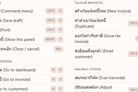
ShortcutHelp
v1.0.8OverlaysKeyboard-shortcuts help dialog built on Radix Dialog. Documents app shortcuts as a grouped two-column list of Kbd keycaps ("mod" renders ⌘ on macOS, Ctrl elsewhere), with a filter-as-you-type search field and a global ho

Tour
v1.0.7OverlaysProduct tour / spotlight overlay. Dims the page with an SVG-masked scrim, cuts a rounded spotlight over each step's target, and shows a card with next / back / skip / finish controls and step dots.
Navigation19
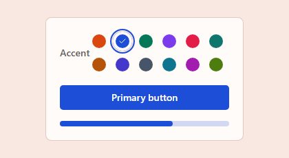
AccentPicker
v1.0.3NavigationBrand-accent swatch row that switches the data-theme accent (orange/blue/green/violet/rose). Controlled, or self-persisting to localStorage. Each swatch renders its real primary token — no hardcoded color.
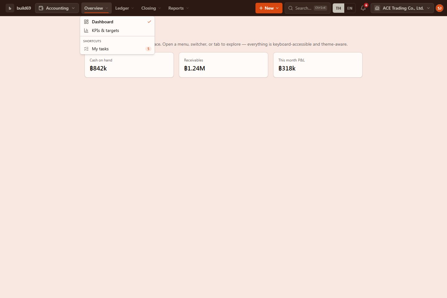
AppBar
v1.0.9NavigationOdoo/Xero-style module-menu top bar — app launcher, brand, a current-module pill with switcher, a Radix Menubar section-dropdown bar, and a right cluster (+New, ⌘K search, notifications, company switcher, avatar). Dark surface.

AppBarCommand
v1.0.8NavigationCommand-first light top bar (Linear / Vercel) — brand, a large centered ⌘K command/search button, and a compact right cluster. Light surface.
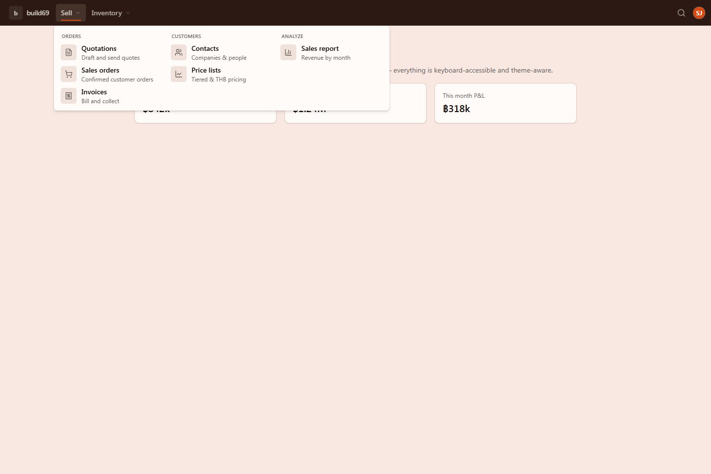
AppBarMegaMenu
v1.0.7NavigationCatalogue-style top bar where each trigger opens a wide multi-column mega-menu panel (icon + label + description). Built on Radix Menubar. Dark surface.

AppBarPills
v1.0.8NavigationModern SaaS light top bar with a centered segmented-pill nav (active pill filled), brand, and a right cluster (+New, avatar).
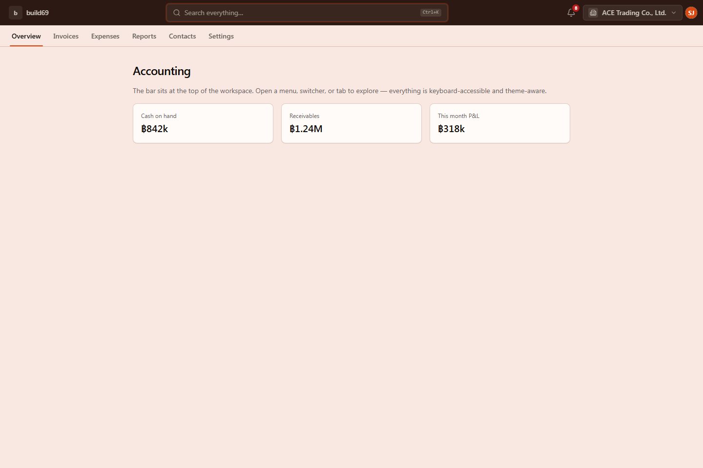
AppBarSplit
v1.0.7NavigationTwo-row admin top bar — a dark utility row (brand, growing global search, notifications, company switcher, avatar) over a light section-tab row.
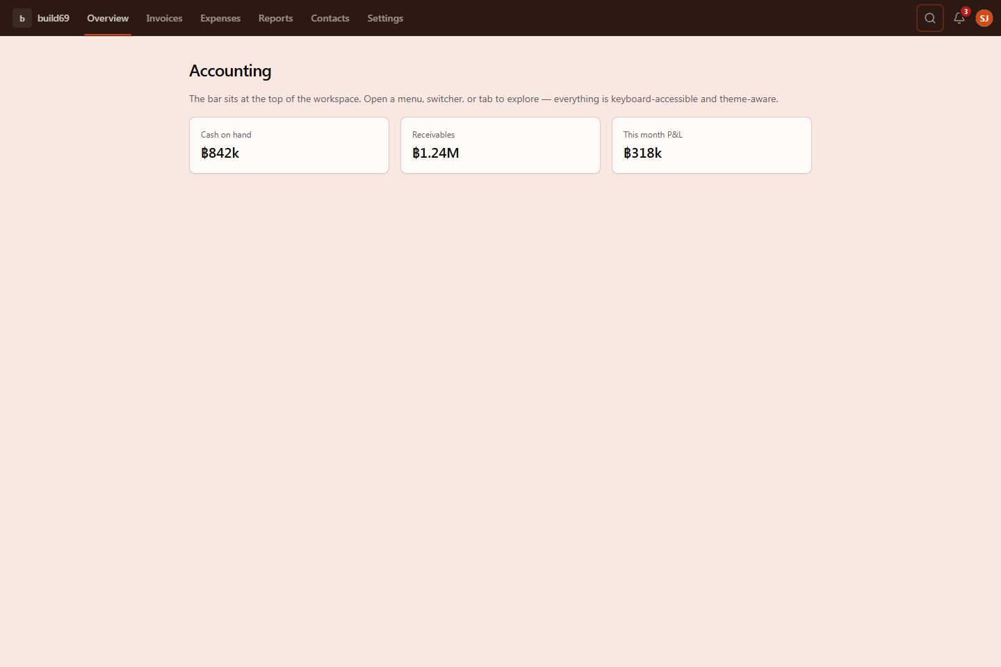
AppBarTabs
v1.0.8NavigationFlat text-tab top bar (Slack / Notion) — brand, a scrollable row of flat nav links with an active underline, and a compact right cluster (search, notifications, avatar). Dark surface.

AppMarker
v1.0.2NavigationPill-shaped tag that identifies which build69 app a record belongs to (e.g., CRM, Inventory, HR). Used in cross-app lists.
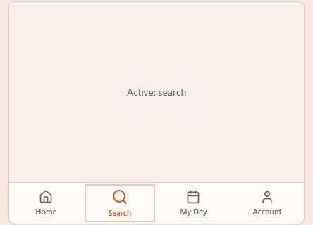
BottomNavigation
v1.0.2NavigationMobile-first bottom tab bar with fixed or inline placement, badges, and labels-when-active mode. Pair with mobile pages or sticky surfaces.
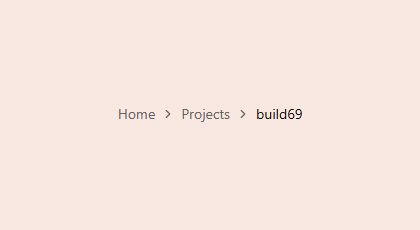
Breadcrumb
v1.0.1NavigationHierarchical location trail with optional ellipsis collapse for long paths. Use when a record sits three or more levels deep in the nav.
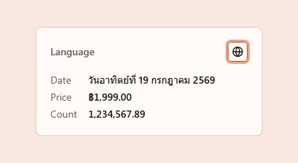
LanguageSwitcher
v1.0.5NavigationLocale selector in menu or select form. Controlled, or drop-in via LocaleController which owns the locale state and renders LocaleProvider. Switching reformats every build69 date/number/currency via Intl.
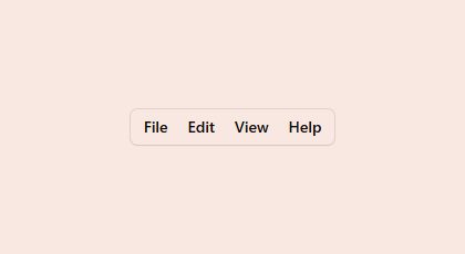
Menubar
v1.0.1NavigationApplication menu bar (File / Edit / View…) built on Radix Menubar. Same item vocabulary and visual language as DropdownMenu — items, checkbox items, radio groups, nested submenus, separators and keyboard-shortcut hints —
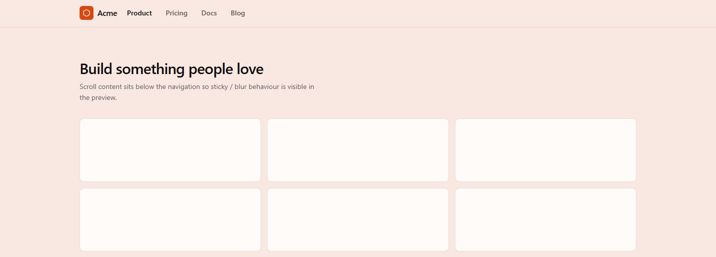
Navbar
v1.0.8NavigationResponsive marketing / public-site top navigation (logo + links + CTA + mobile hamburger) — distinct from the in-app Topbar chrome. Pass a logo, an array of links (each may carry children for a dropdown / mega-menu), and
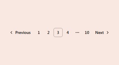
Pagination
v1.0.7NavigationStandalone pagination controls (separate from the DataTable built-in). Numbered links, prev/next, ellipsis collapse, with optional page-jump input.

Sidebar
v1.0.9NavigationPrimary vertical navigation panel. Sections with collapsible groups, item badges, active highlight, and collapsed/expanded states. The "MA" workspace badge centers correctly in collapsed icon-only mode.
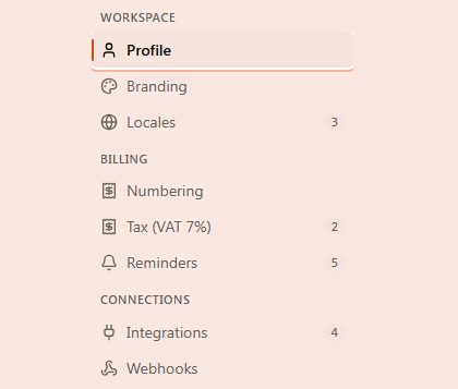
SideNav
v1.0.4NavigationReusable left-rail navigation with sections, nested items, count pills, optional search, sticky positioning, footer slot, and card / flush visual variants. Lighter-weight alternative to Sidebar for inner panels.
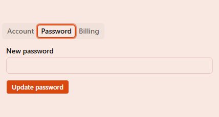
Tabs
v1.0.3NavigationTabbed content panels (Radix). Use for switching between related views in the same context. Adds pills / underline / segmented / enclosed visual variants, closable + addable tabs, overflow scroll, sticky header, and coun
ThemeToggle
v1.0.8NavigationLight / dark / system color-scheme control over next-themes, in menu, segmented or single-icon form, with an optional brand-accent submenu. Drop into any app bar or settings row.
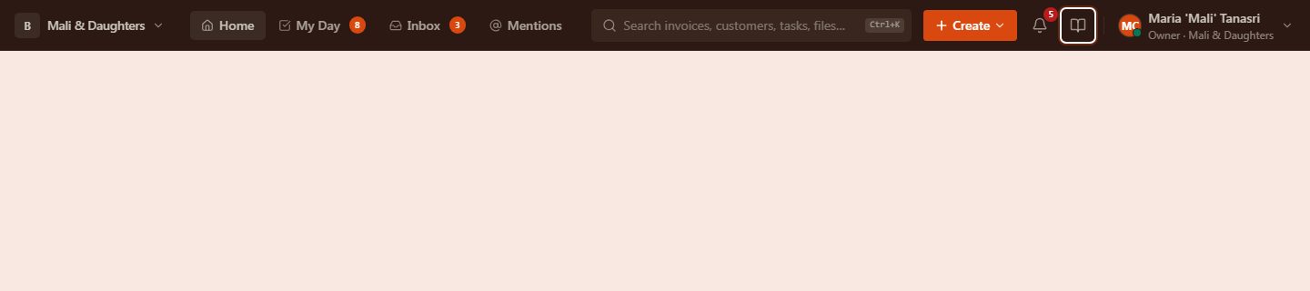
Topbar
v1.0.10NavigationPersistent app-level top bar with breadcrumb / page title slot, action buttons, and user menu.
Media & Files10
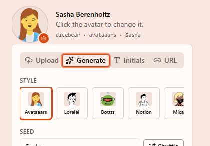
AvatarPicker
v1.0.9Media & FilesThree-tab avatar picker: upload a file, generate from DiceBear HTTP API (10 styles), or paste an image URL. Falls back to hash-tinted initials.
Carousel
v1.0.8Media & FilesEmbla-powered carousel for image galleries, content slides, and onboarding. Horizontal or vertical, optional autoplay, thumbnails, and one-at-a-time scroll.
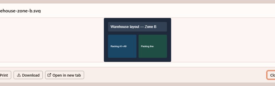
DocumentViewer
v1.0.1Media & FilesModal viewer for ONE stored document (fb_781415ea): fetches it WITH credentials, renders a PDF in an iframe, an image inline, and an explicit "cannot be shown here" state + Download for office types. Footer: print through the frame (so the DOCUMENT prints), download under the stored filename, open-in-new-tab, close. Also accepts app-composed markup (srcDoc) for client-built print sheets. DocumentViewerSurface is the dialog-less inner surface for embedding / SSR.
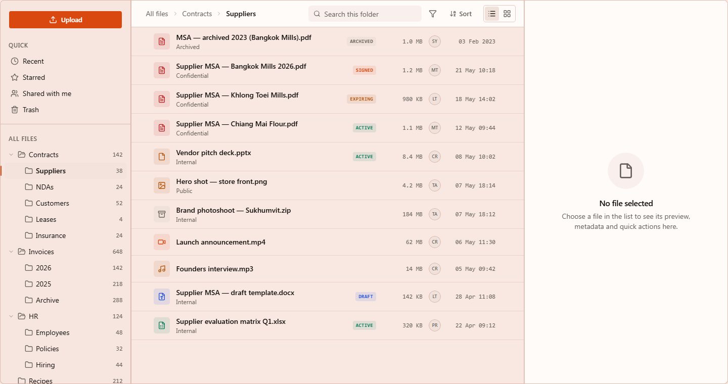
FileBrowser
v1.0.10Media & FilesTwo-pane file browser: nested folder tree on the left, file table / grid on the right. Drag to move, right-click for actions.
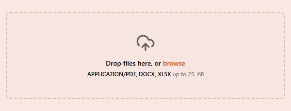
FileUpload
v1.0.8Media & FilesDrag-drop dropzone with click-to-pick fallback, per-file progress, rejection feedback, and a virus-scan placeholder. Three layouts: default panel, single-line compact, and round avatar picker.

ImageList
v1.0.1Media & FilesUniform image grid with title / subtitle overlays and configurable aspect ratios. For photo galleries and product catalogues.
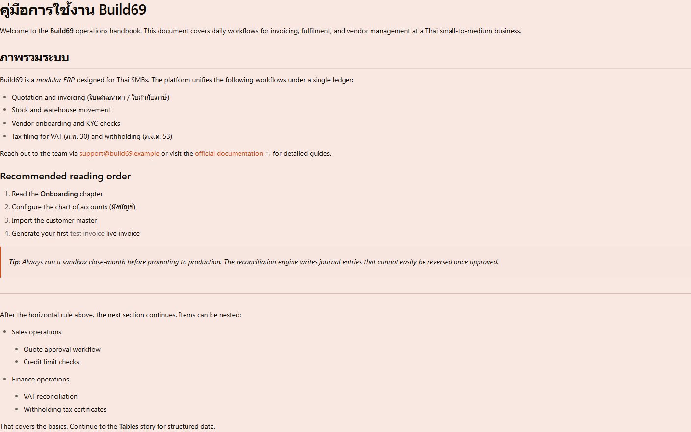
Markdown
v1.0.7Media & FilesThemed markdown renderer with GFM tables, KaTeX math, lazy Mermaid (securityLevel:strict), remote-rendered PlantUML SVG, syntax-highlighted code, and task lists. Output is sanitised via DOMPurify.
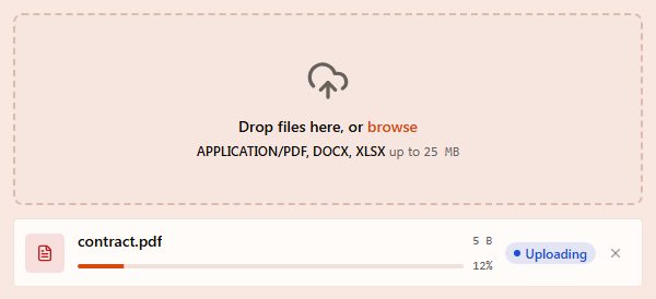
Upload
v1.0.7Media & FilesUpload component with four visual variants (default panel / compact / avatar / gallery), drag-drop, per-file progress, pause / resume / retry, and DnD reorder.
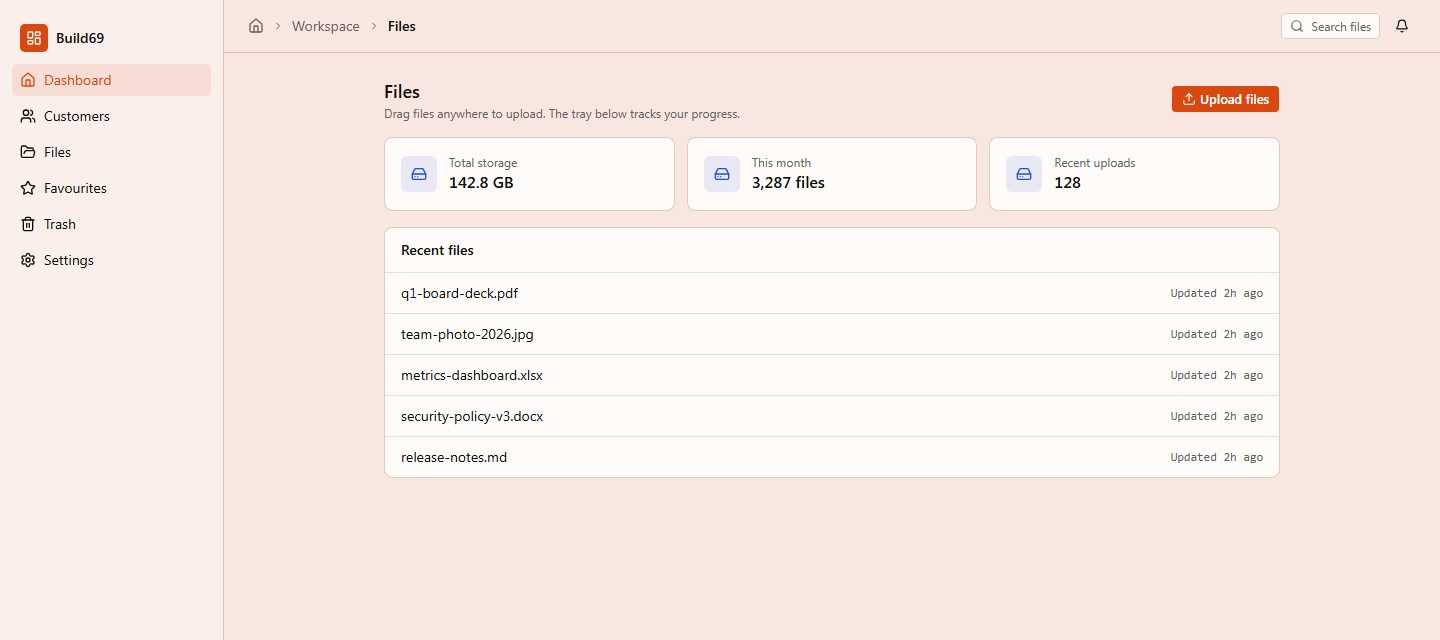
UploadTray
v1.0.8Media & FilesGmail-style floating upload manager. Fixed corner positioning, minimisable header (thin progress visible while minimised), persistent across pages, autoCloseOnComplete, notifyOnComplete (sonner toast), four corners, conf
VideoPlayer
v1.0.0Media & FilesThemed <video> surface with an overlay control bar — play / pause, a seek scrubber with a buffered underlay, an elapsed / duration clock, optional volume and playback-rate controls, and fullscreen. Controls fade on idle during playback (or pin with controlsVisibility="always").
Layout & Surfaces14

AspectRatio
v1.0.1Layout & SurfacesLocks content to a fixed width÷height ratio while the width stays fluid. Built on Radix AspectRatio with preset ratio strings, corner rounding, and automatic media fitting: direct img / video / iframe children are stretc
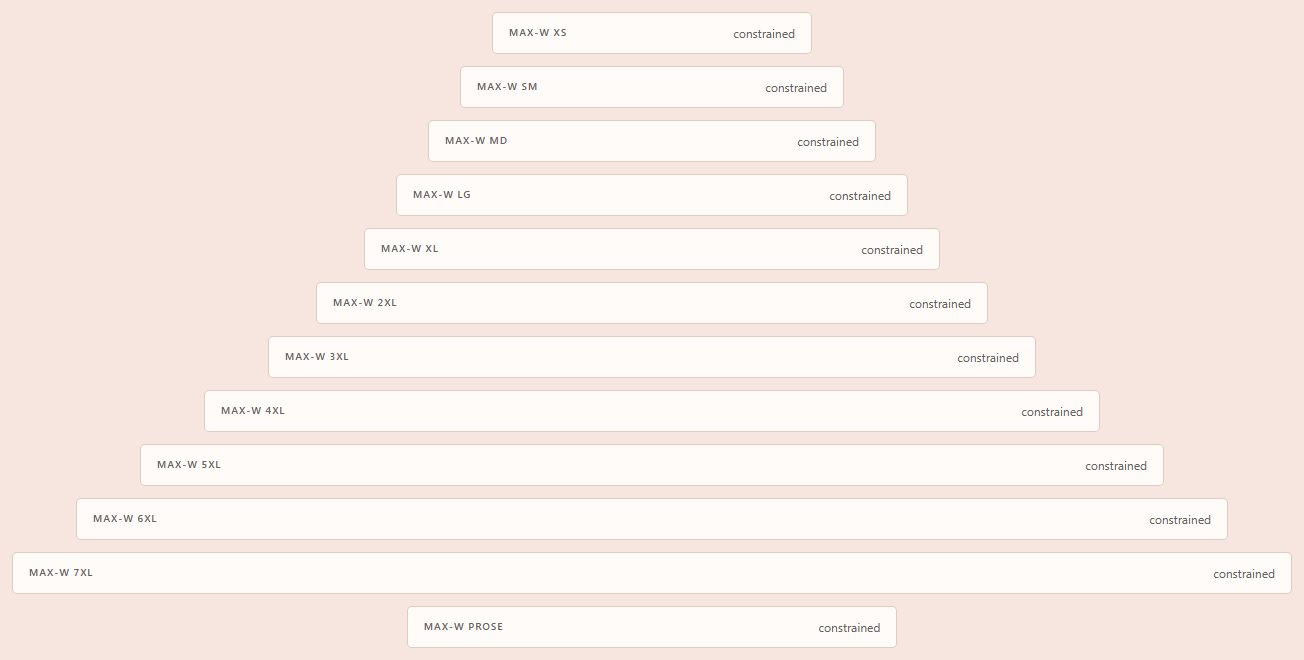
Container
v1.0.1Layout & SurfacesMax-width centered wrapper with 13 width tokens (xs through 9xl + prose + full) and 5 padding scales. Use as the outer wrapper of any page content area.
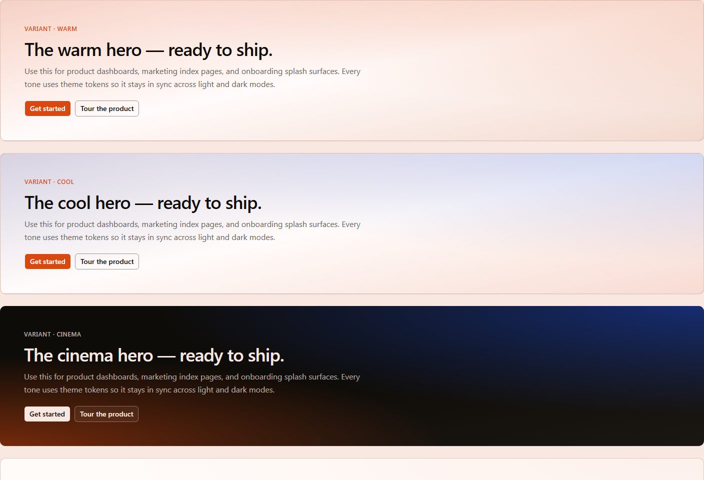
HeroGradient
v1.0.7Layout & SurfacesDecorative gradient hero strip — used as the page background of marketing or public landing surfaces, or as a header block.
kbd
v1.0.1Layout & SurfacesPlatform-aware keyboard hint renderer: shows ⌘ on Mac, Ctrl on Windows / Linux, plus the formatShortcut + useIsMac helpers for shortcut display.
Label
v1.0.1Layout & SurfacesForm label (Radix Label). Click forwards focus to associated input.
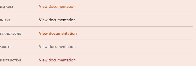
Link
v1.0.1Layout & SurfacesThemed anchor with 5 variants, 3 underline modes, an external-link auto-icon, and size + weight tokens. Drop-in replacement for plain <a>.
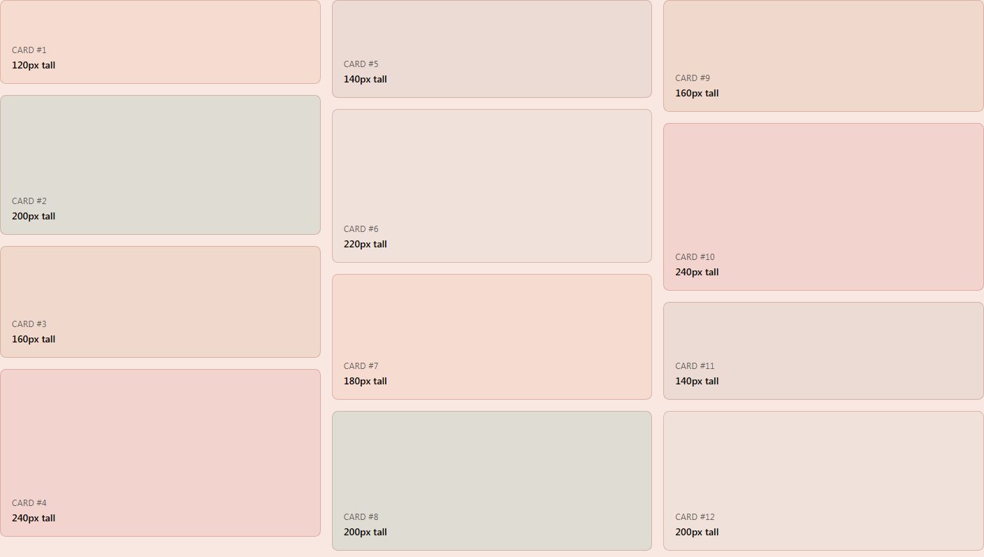
Masonry
v1.0.1Layout & SurfacesCSS multi-column staggered grid with responsive column counts and consistent gap. Use for mixed-height media galleries and pin boards.

Paper
v1.0.1Layout & SurfacesSurface primitive: elevation 0-5, outlined / inset / tinted variants, hoverable lift. The cheapest framing layer above raw <div>.
 New
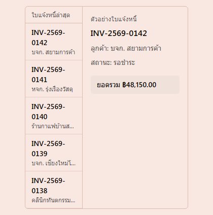
NewResizable
v1.0.2Layout & SurfacesResizable split-pane layout built on react-resizable-panels v4. Compose ResizablePanelGroup → ResizablePanel + ResizableHandle for master-detail workspaces, collapsible sidebars, and IDE-like layouts. Handles are keyboar
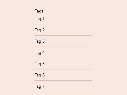
ScrollArea
v1.0.1Layout & SurfacesCustom-styled scroll container (Radix). Replaces native scrollbars with consistent thin track.
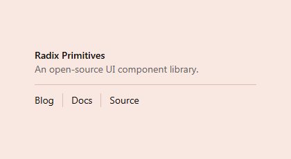
Separator
v1.0.2Layout & SurfacesThin horizontal or vertical divider line (Radix). Adds an optional label, icon, and dashed variant for richer section dividers.
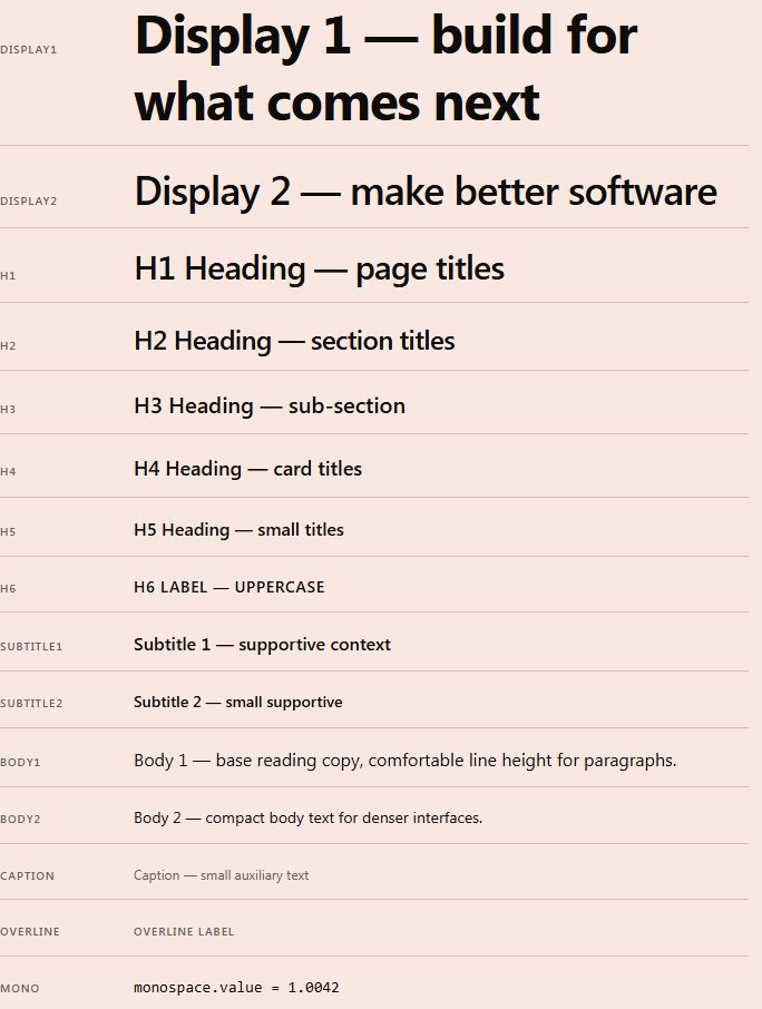
Typography
v1.0.1Layout & SurfacesThemed typography component with a 15-step type ramp (display-2xl down to caption-xs), tones, alignment, weight, truncate, and line-clamp helpers.
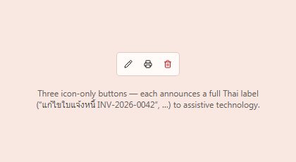
VisuallyHidden
v1.0.1Layout & SurfacesScreen-reader-only content primitive: renders children in an sr-only span (or merges onto your own element via Radix Slot asChild). A focusable mode reveals the content as a small token-styled pill while focused — the sk
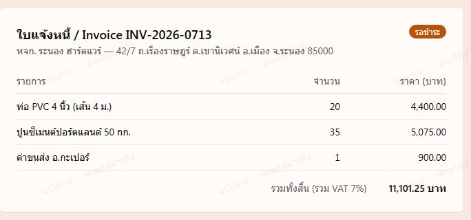 New
NewWatermark
v1.0.1Layout & SurfacesOverlay watermark for confidential documents: wraps children in a relative container and tiles deterministic SVG text (or an image) on an absolutely-positioned pointer-events-none layer above the content. Theme-aware ink
Motion — Text Animations10

animated-gradient-text
v1.0.1Motion — Text AnimationsLower-level MagicUI source primitive backing `AnimatedText.GradientText`. Prefer the `AnimatedText` composite from `@/components/motion/animated-text` unless you need direct access to the underlying API.
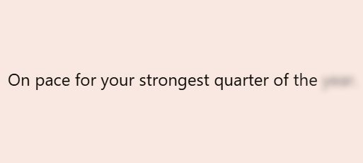
BlurInText
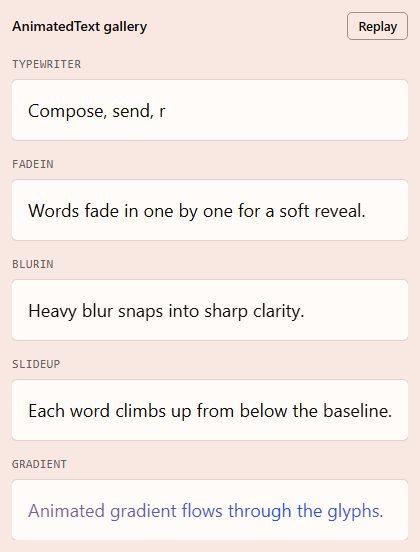
v1.0.1Motion — Text AnimationsReveals a sentence word-by-word, each word resolving from a heavy blur into sharp focus. Wraps the MagicUI TextAnimate primitive with animation="blurIn" and converts build69's ms-based `delay`/`initialDelay` into TextAnimate's seconds-based duration. Under prefers-reduced-motion it renders the text plainly with no animation.
FadeInText
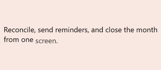
v1.0.1Motion — Text AnimationsReveals a sentence word-by-word with a soft opacity fade, staggering each word by a delay you set in milliseconds. Wraps the MagicUI TextAnimate primitive with animation="fadeIn" and converts build69's ms-based `delay`/`initialDelay` into TextAnimate's seconds-based duration. Under prefers-reduced-motion it renders the text plainly with no animation.
GradientText
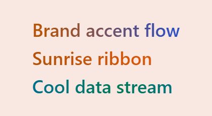
v1.0.1Motion — Text AnimationsFills text with a continuously animated linear gradient that flows through the glyphs, driven by a moving 300% background-position. Takes two stops (from/to) or three (from/via/to) using any CSS colour, including build69 tokens like var(--b69-accent). It is the lightest member of the AnimatedText family — it has no motion/react dependency and no reduced-motion branch, since the animation is pure CSS.
NumberTicker
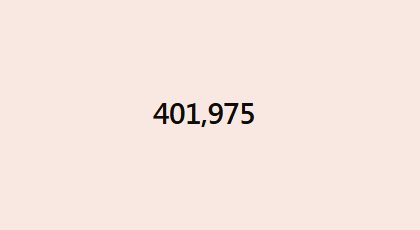
v1.0.1Motion — Text AnimationsAnimated counting number for KPI reveals. Spring-driven via motion/react with locale-aware Intl.NumberFormat — integer, currency, percent, or decimal formats with size and tone tokens.
SlideUpText
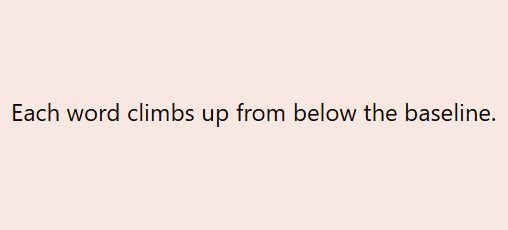
v1.0.1Motion — Text AnimationsReveals a sentence word-by-word, with each word climbing up from below the baseline into place. Wraps the MagicUI TextAnimate primitive with animation="slideUp" and applies a tight leading-[1.1] so large display headings do not clip. Under prefers-reduced-motion it renders the text plainly with no animation.
 New
NewSpinningText
v1.0.1Motion — Text AnimationsText laid out around a rotating circular path (MagicUI). Each character is positioned on a ring of a given radius and the whole ring spins continuously. Use for badge seals, vinyl-record labels, or playful hero accents;
text-animate
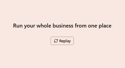
v1.0.1Motion — Text AnimationsLower-level MagicUI source primitive backing `AnimatedText.FadeInText`, `BlurInText`, and `SlideUpText`. Prefer the `AnimatedText` composite from `@/components/motion/animated-text` unless you need direct access to the u
TypewriterText
v1.0.1Motion — Text AnimationsTypes text out character-by-character with an optional blinking cursor, either as a single static string or as a rotating list that types, pauses, deletes and moves to the next phrase. Wraps the MagicUI TypingAnimation primitive with build69 prop names (speed/deleteSpeed/pauseMs). Under prefers-reduced-motion it renders the first string statically instead of looping forever.
typing-animation
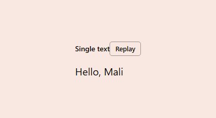
v1.0.1Motion — Text AnimationsLower-level MagicUI source primitive backing `AnimatedText.TypewriterText`. Prefer the `AnimatedText` composite from `@/components/motion/animated-text` unless you need direct access to the underlying API.
Motion — Transitions & Decorative11
AnimatedList
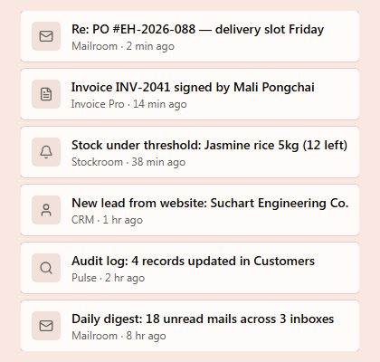
v1.0.1Motion — Transitions & DecorativeStaggered-entrance wrapper that runs a motion/react variant on each child. Four animations: fade-up, fade, slide-right, scale — respects prefers-reduced-motion.
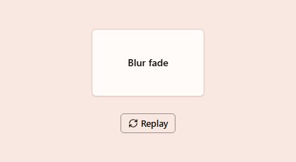
blur-fade
v1.0.1Motion — Transitions & DecorativeLower-level MagicUI source primitive used by `AnimatedText.BlurInText` / `FadeInText` patterns. Prefer the `AnimatedText` composite from `@/components/motion/animated-text` unless you need direct access to the underlying
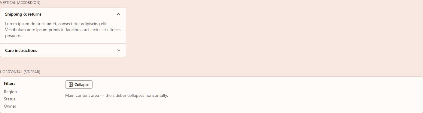
Collapse
v1.0.1Motion — Transitions & DecorativeAnimates its child between zero and its natural size, measuring real content with a ResizeObserver so no fixed height or width is needed. `orientation` switches between collapsing height (accordions) and width (sidebars), and the measurement re-runs when the content changes, so dynamic children stay correct. The only transition wrapper that animates layout rather than opacity or transform.
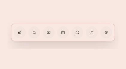
Dock
v1.0.1Motion — Transitions & DecorativemacOS-style magnifying dock (MagicUI). Icons rest at a base size and grow as the cursor approaches, with falloff over distance. Composes a Dock container with DockIcon children that can show a hover tooltip and a "runnin
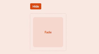
Fade
v1.0.1Motion — Transitions & DecorativeCross-fades its child's opacity in and out based on the `in` prop, using a pure-CSS transition driven by inline styles. Supports per-instance duration, delay and easing, plus `unmountOnExit` to remove the child from the DOM after the exit transition finishes. Combine with a `delay` per item to stagger a list or grid entrance.
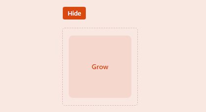
Grow
v1.0.1Motion — Transitions & DecorativeFades its child in while scaling it from 0.95 to 1 — a subtle, restrained entrance that reads as 'appearing in place' rather than flying in. A `transformOrigin` prop anchors the scale, so a popover can grow out of the corner nearest its trigger. Gentler than Zoom, which scales all the way from 0.

Marquee
v1.0.1Motion — Transitions & DecorativeHorizontal or vertical scrolling banner (pure CSS, MagicUI source). Use for logo strips, news tickers, and tag clouds — the seamless loop is built in.
 New
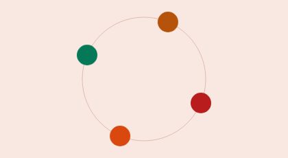
NewOrbitingCircles
v1.0.1Motion — Transitions & DecorativeElements orbiting a central node on a circular path (MagicUI). Children are spaced evenly around a ring of a given radius and revolve at a configurable speed / direction. Nestable to build multi-ring solar-system / brand
 New
NewShineBorder
v1.0.1Motion — Transitions & DecorativeAnimated conic-gradient border that sweeps around its contents (MagicUI source, themed with build69 tokens). Use sparingly to mark premium tiles, AI-generated content, or featured pins.

Slide
v1.0.2Motion — Transitions & DecorativeTranslates its child in from a given direction while fading it, so content enters with a sense of where it came from. `direction` picks the origin edge (up / down / left / right) and `distance` sets the travel in px. Pair it with Fade and a per-item delay to build a staggered grid entrance.
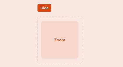
Zoom
v1.0.1Motion — Transitions & DecorativeScales its child from 0 to full size while fading it in — the most assertive of the transition wrappers, built to pull the eye. Use it where the appearance itself is the message, such as a success tick or a badge landing on a card. For a calmer in-place entrance reach for Grow, which only scales from 0.95.
Foundations2
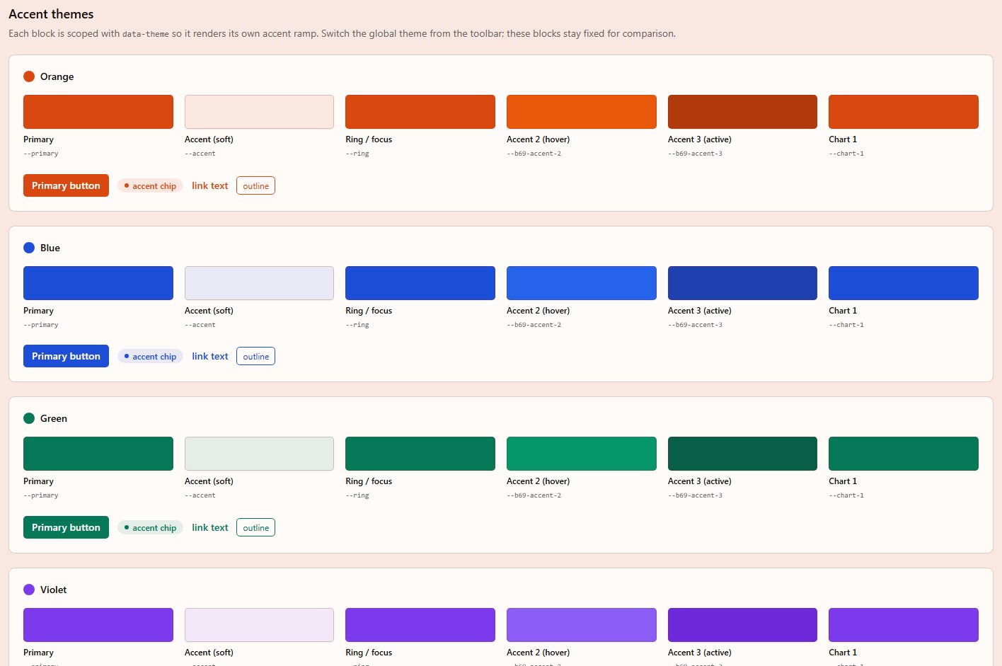
Colors
FoundationsColor foundation: the complete build69 token palette and the per-theme accent variants. Browse the semantic tokens (primary/accent/status/chart/sidebar/surfaces), see how each accent theme (orange / blue / green / violet

useMediaQuery
v1.0.1FoundationsSSR-safe React hook wrapping window.matchMedia. Accepts a CSS media query string and returns whether it currently matches, re-rendering on change. Ships with breakpoint helper (useBreakpoint), pointer-type helper (useIsT
Patterns33
Page Structure6
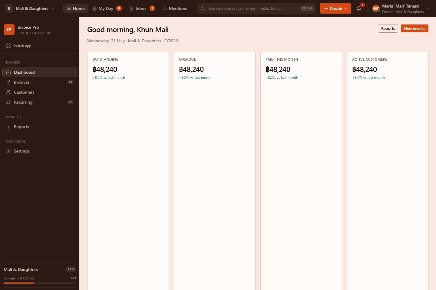
AppShell
v1.0.8Page StructureTop-level frame that arranges Sidebar + Topbar + main content. Every full-page screen in build69 wraps in AppShell.

ContextualSaveBar
v1.0.7Page StructurePolaris-style dirty-form save bar. A portal-rendered bar docked to the top or bottom edge that slides in while a form has unsaved changes, with a Discard action (optional confirm dialog) and a Save action with loading sp

DetailHead
v1.0.8Page StructureHeader for record detail pages: title + key meta fields + status + tabs + actions. Pairs with KVList for the body.
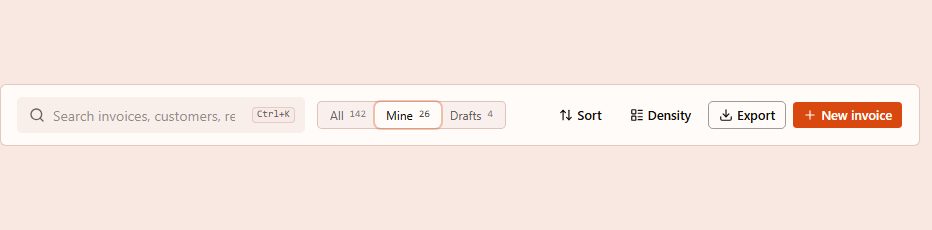
FilterBar
v1.0.8Page StructureHorizontal toolbar of filter chips, search, and view actions. Sits above a DataTable or list to drive its query.
PageHead
v1.0.9Page StructureIn-page header with title, breadcrumb, subtitle, status badge, and action buttons. Sits just below the global Topbar.
PageLayout
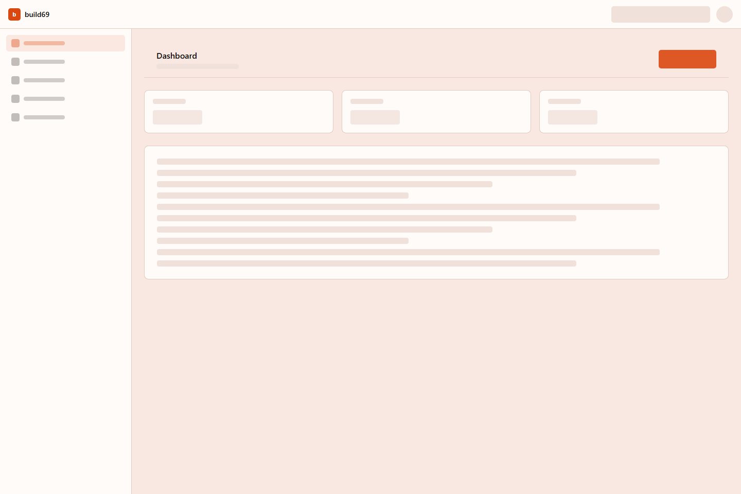
Page StructureFull-height page layout patterns for Next.js (App Router). Six live mocks — AppShell (topbar+sidebar+main), StickyHeader, HeaderContentFooter (sticky action bar), SidebarContent (settings/section nav), CenteredColumn (do
Forms & Flows5
FormBuilderCanvas
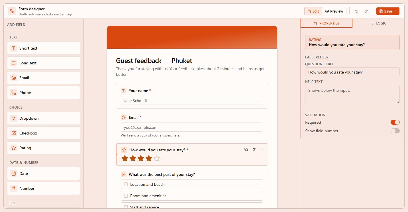
v1.0.11Forms & FlowsDrag-and-drop form-builder canvas (dnd-kit). Used inside the form designer to compose a public form from a palette of field types.
FormField
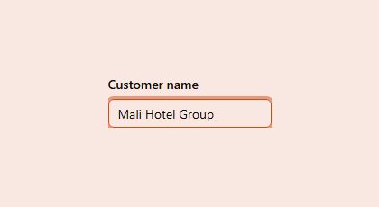
v1.0.8Forms & FlowsComposite of Label + Input/Select/Textarea + description + error. The standard atom for any form row in build69.
FormSection
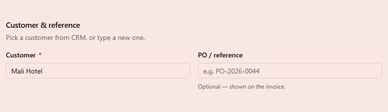
v1.0.1Forms & FlowsVisual + semantic grouping of related FormField rows under a heading and optional description. Use for long forms with logical sections.
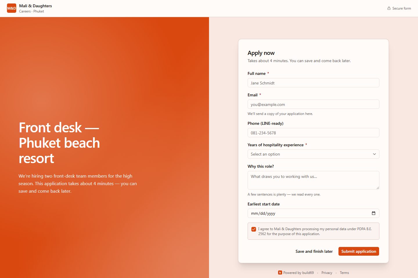
PublicFormCover
v1.0.8Forms & FlowsBranded cover/hero block for public-facing forms (lead capture, RSVP, survey). Provides logo, headline, sub-copy, and decorative gradient.
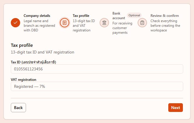
Wizard
v1.0.9Forms & FlowsMulti-step form shell composing the Stepper: clickable step header, WizardStep content panels, and a Back/Next/Finish footer. Next/Finish run the current step's validate() (sync or async) — a string result renders as an
Chat & Collab4
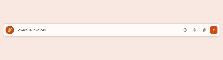
AgentBar
v1.0.7Chat & CollabSticky bottom bar for the build69 AI agent: text input + quick prompt chips + streaming response slot + tool call chips.
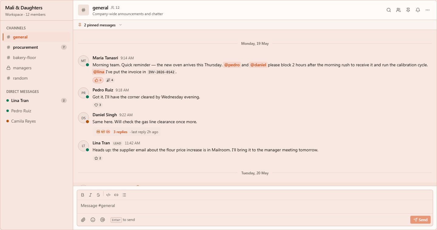
Chat
v1.0.12Chat & CollabThreaded chat conversation view: bubbles with avatars, timestamps, sender grouping, typing indicator, attachment slots.
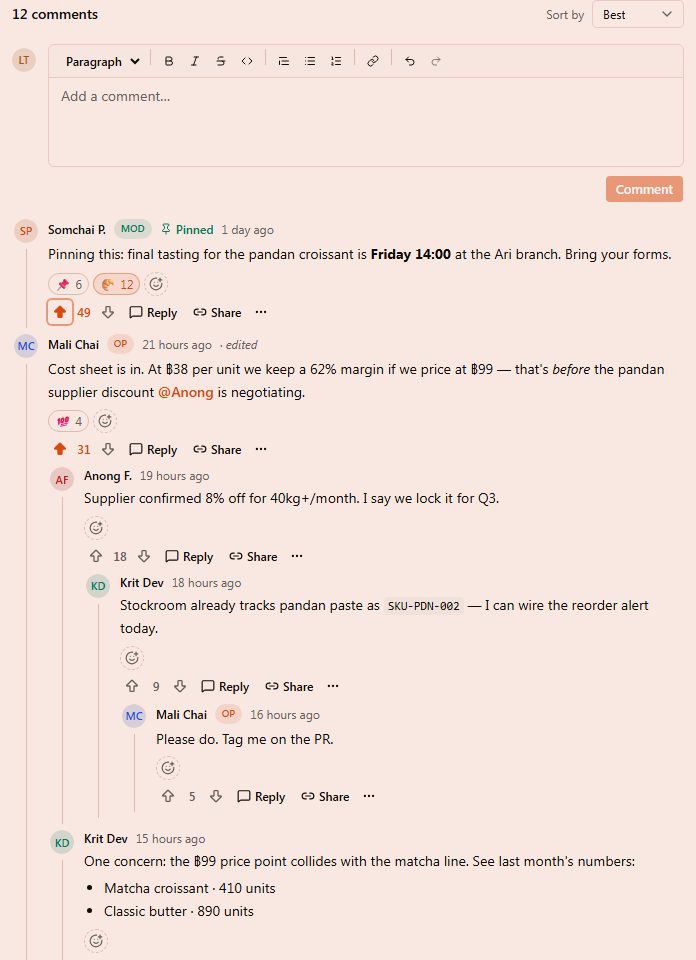
CommentThread
v1.0.11Chat & CollabThreaded discussion component — nested replies, reactions, role badges, rich-text bodies and score/sort controls for internal comment feeds.
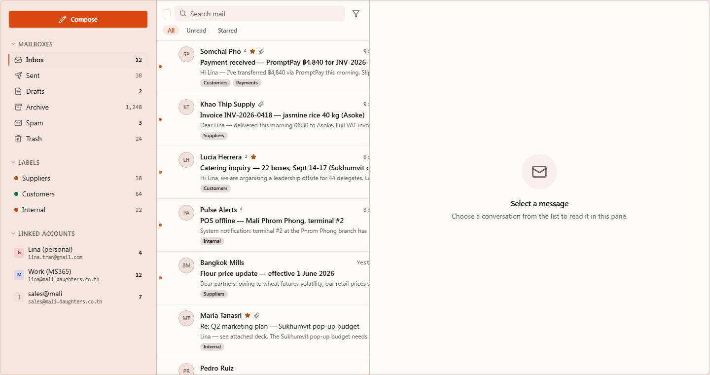
EmailThreeColumn
v1.0.11Chat & CollabClassic three-column email layout: folders pane, message-list pane, reading pane. Resizable panels.
Work & Boards3
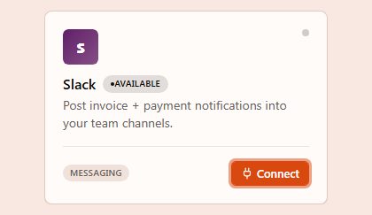
IntegrationCard
v1.0.10Work & BoardsTile representing a third-party integration (connect / configure / disconnect actions). Used in settings > integrations grids.
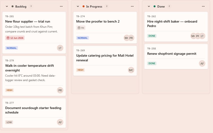
Kanban
v1.0.12Work & BoardsDrag-and-drop board with columns of cards (dnd-kit). Use for task pipelines, sales stages, kanban workflows.
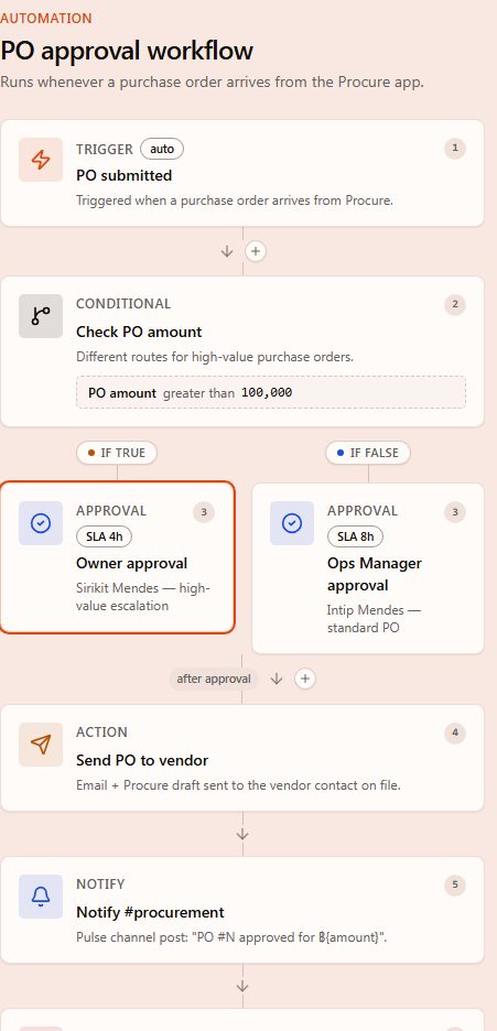
RuleStep
v1.0.8Work & BoardsSingle step block for the workflow / automation designer (trigger / condition / action). Composes into a linear or branching workflow.
Marketing Sections15

Banner
v1.0.9Marketing SectionsSlim full-width promo / announcement / cookie banner strip. Copy-paste block; baked-in demo content (edit the JSX to customise).
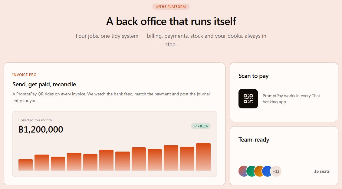
Bento
v1.0.3Marketing SectionsBento-grid section — mixed-size feature cards arranged in an asymmetric grid. Copy-paste block; baked-in demo content (edit the JSX to customise).
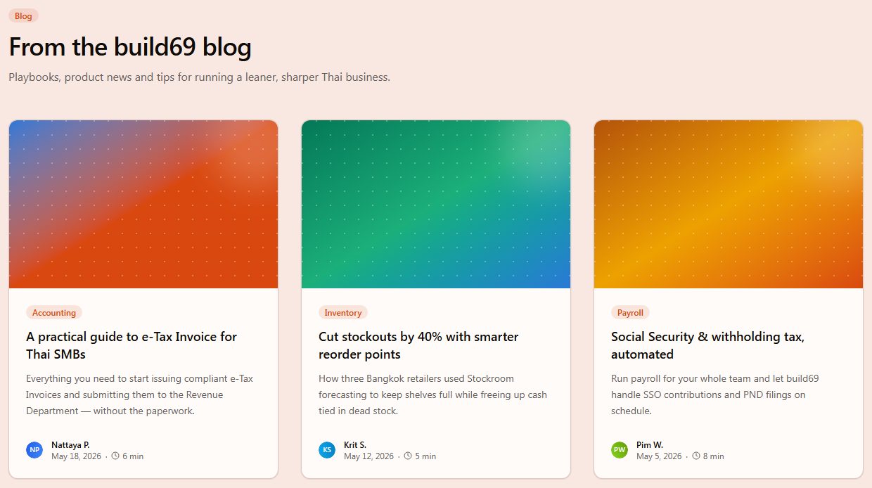
Blog
v1.0.11Marketing SectionsBlog / article listing section with cards, featured posts and sidebars. Copy-paste block; baked-in demo content (edit the JSX to customise).
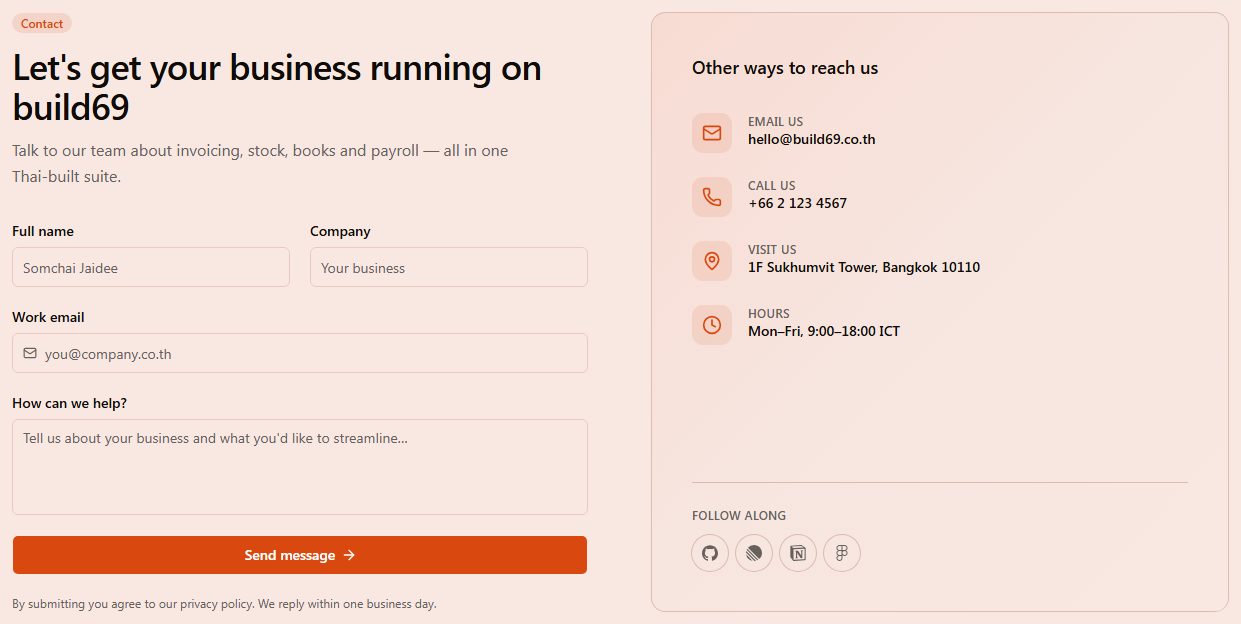
Contact
v1.0.9Marketing SectionsContact section pairing a message form with details / map. Copy-paste block; baked-in demo content (edit the JSX to customise).
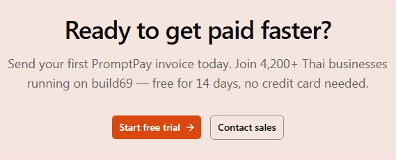
Cta
v1.0.11Marketing SectionsCall-to-action section that converts — bold headline plus prominent buttons. Copy-paste block; baked-in demo content (edit the JSX to customise).
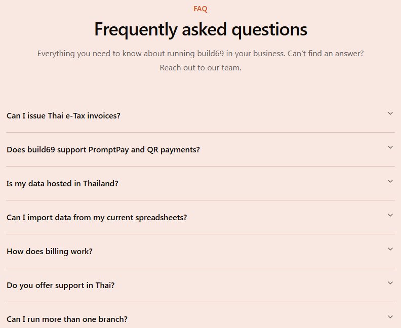
Faq
v1.0.9Marketing SectionsFrequently-asked-questions section built around accordions and Q&A columns. Copy-paste block; baked-in demo content (edit the JSX to customise).
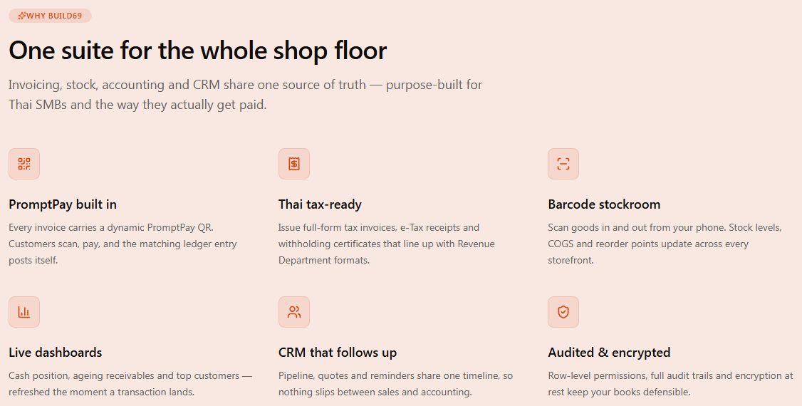
Features
v1.0.10Marketing SectionsProduct feature showcase section — icon grids, alternating media rows, tabs and checklists. Copy-paste block; baked-in demo content (edit the JSX to customise).
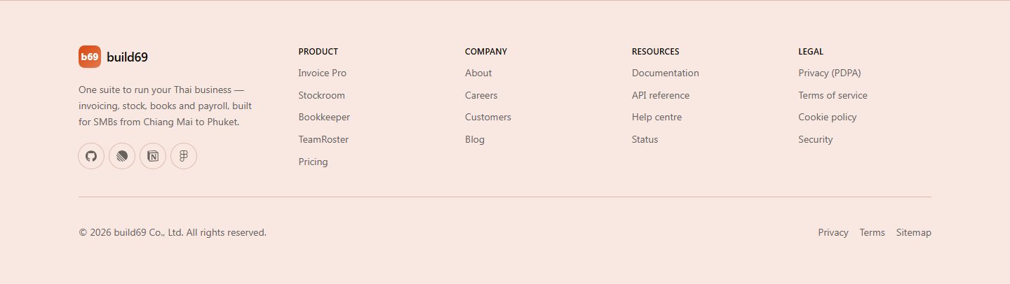
Footer
v1.0.9Marketing SectionsSite footer with link columns, newsletter, legal row and social icons. Copy-paste block; baked-in demo content (edit the JSX to customise).
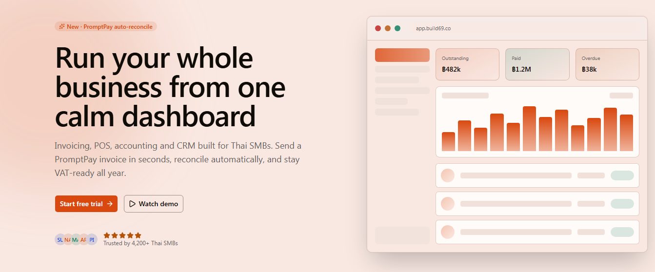
Hero
v1.0.11Marketing SectionsAbove-the-fold hero section for landing/marketing pages — headline, subcopy, CTAs and a visual. Copy-paste block; baked-in demo content (no data props — edit the JSX to customise).

LogoCloud
v1.0.3Marketing SectionsTrusted-by logo wall showing customer / partner brand logos. Copy-paste block; baked-in demo content (edit the JSX to customise).
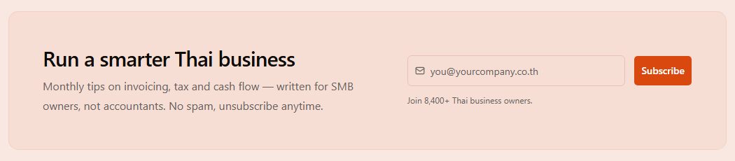
Newsletter
v1.0.8Marketing SectionsEmail-capture / newsletter sign-up section with inline and card layouts. Copy-paste block; baked-in demo content (edit the JSX to customise).
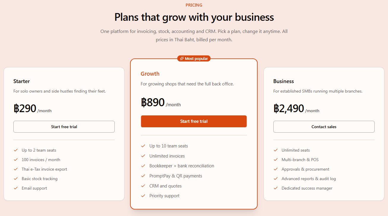
Pricing
v1.0.10Marketing SectionsPricing section with tier cards, billing toggles and comparison tables. Copy-paste block; baked-in demo content (edit the JSX to customise).
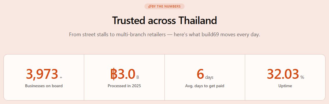
Stats
v1.0.9Marketing SectionsMetrics / stats band highlighting headline numbers (users, uptime, revenue). Copy-paste block; baked-in demo content (edit the JSX to customise).
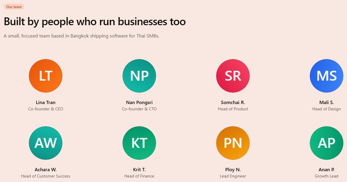
Team
v1.0.10Marketing SectionsTeam / people section with portrait cards, bios and social links. Copy-paste block; baked-in demo content (edit the JSX to customise).
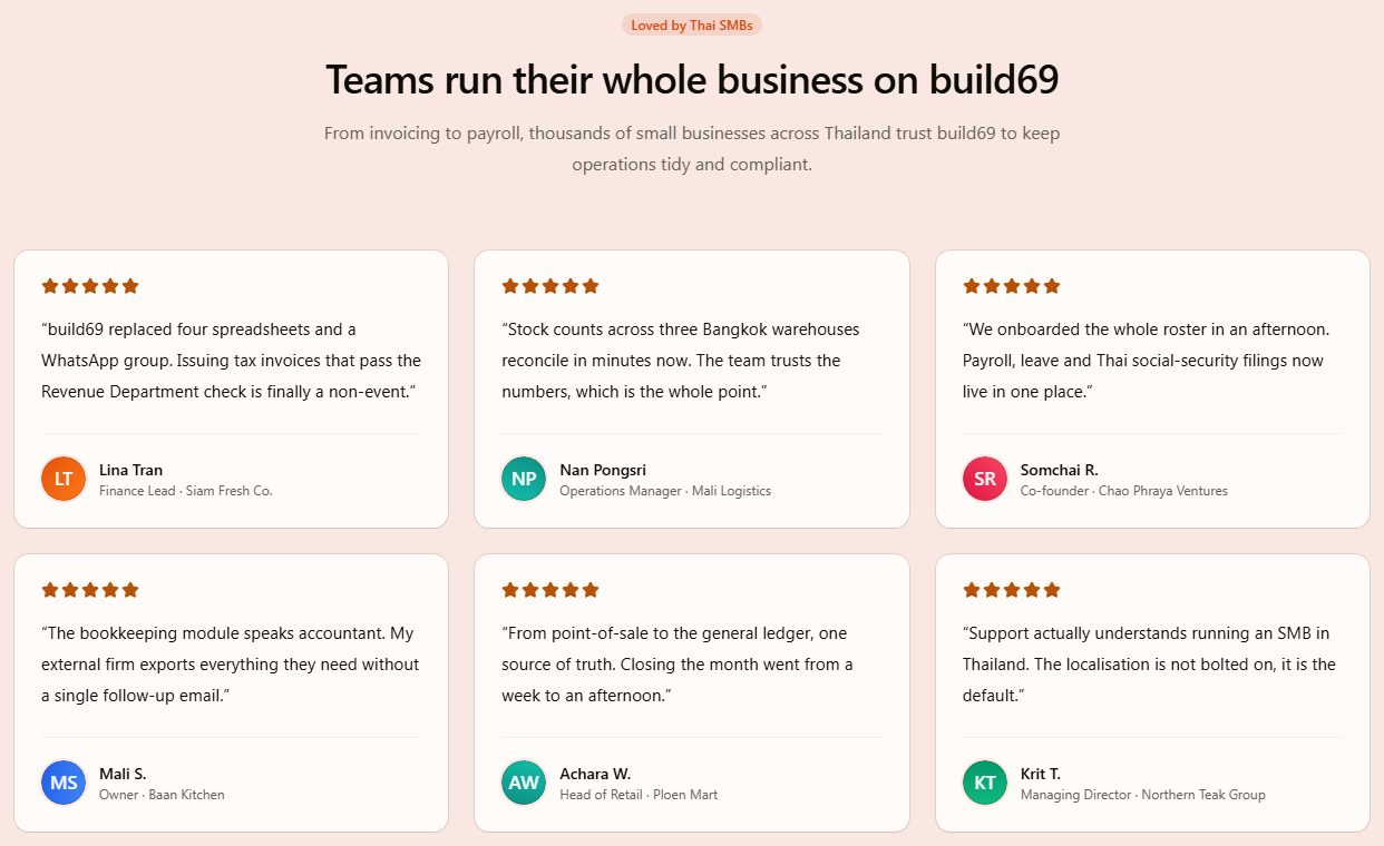
Testimonials
v1.0.11Marketing SectionsSocial-proof section showing customer quotes, ratings and logos. Copy-paste block; baked-in demo content (edit the JSX to customise).
Pages104
App47
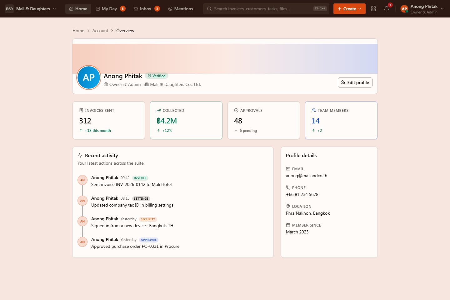
Account
v1.0.18AppUser account page — overview, profile edit, security/privacy, tabbed dashboard and activity log. Full-page copy-paste template; baked-in demo content (edit the JSX to customise).
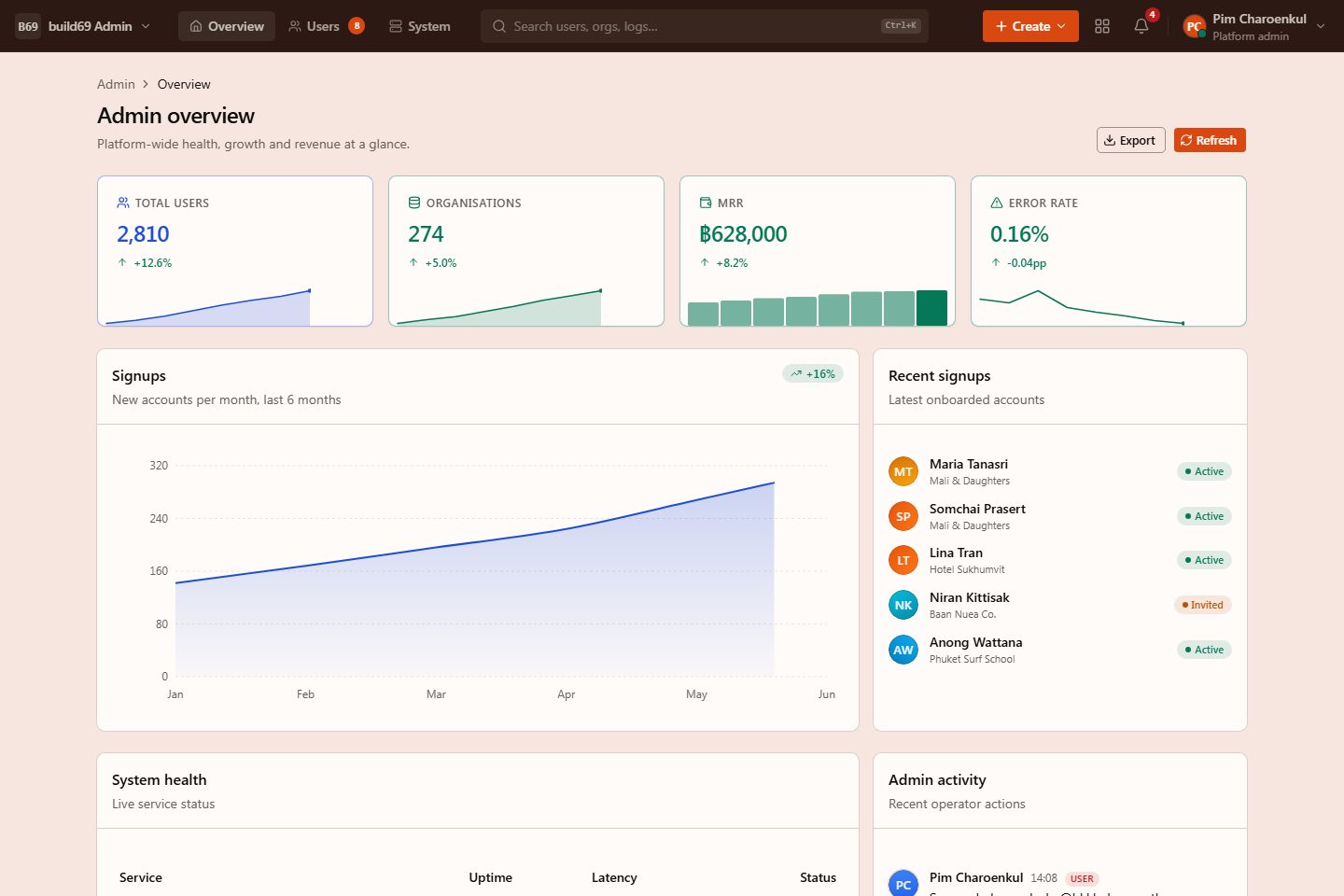
Admin
v1.0.40AppAdmin console page — overview, user management, roles/permissions, org management and system health. Full-page copy-paste template; baked-in demo content (edit the JSX to customise).
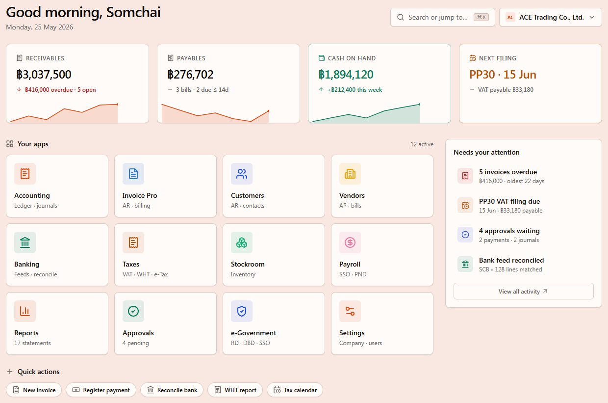
AtriumHome
v1.0.7AppCross-product launcher home — an active-company KPI header, a 'Your apps' tile grid, quick actions and a 'needs attention' rail. Full-page copy-paste template; baked-in demo content (edit the JSX to customise).
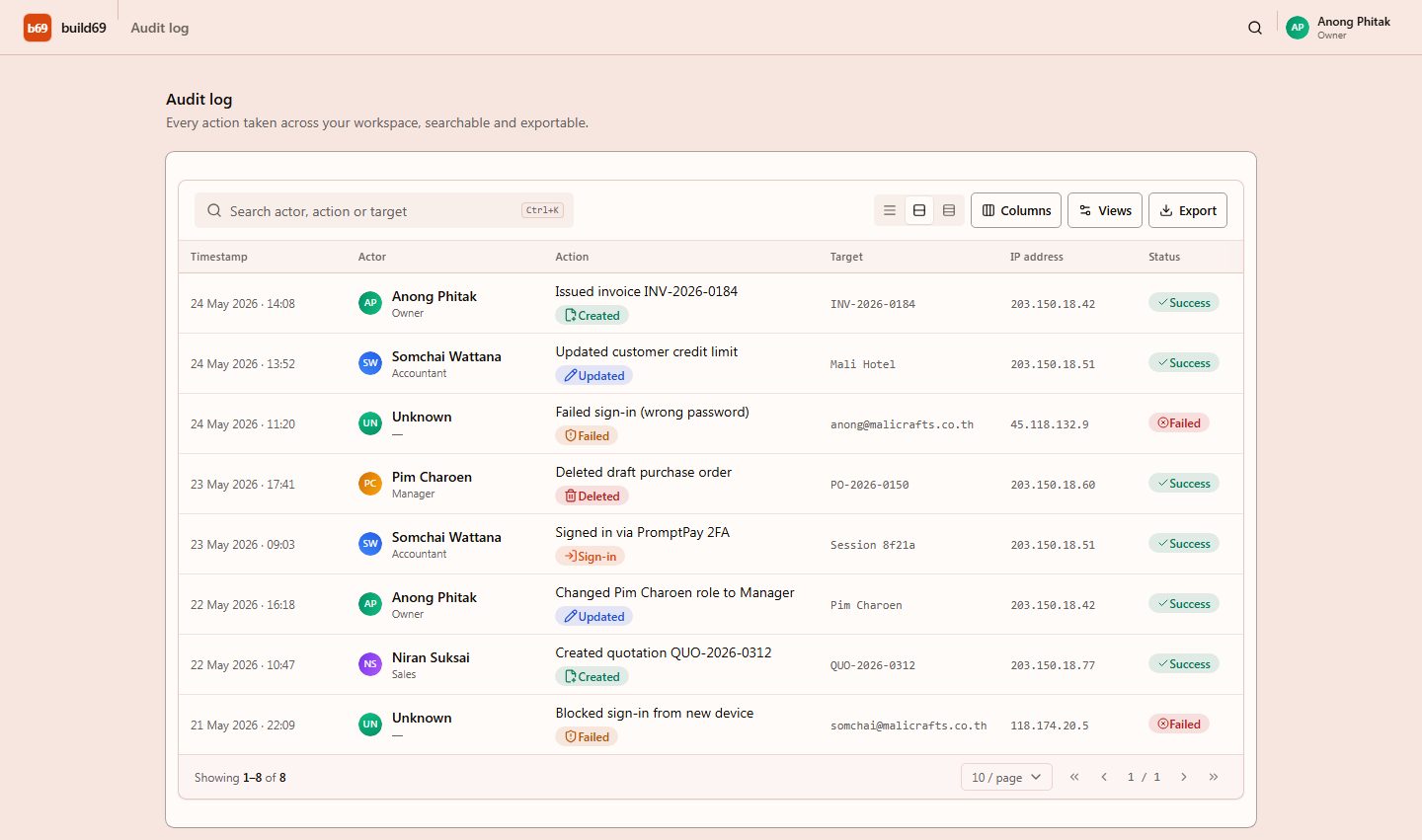
AuditLog
v1.0.35AppAudit log / activity page — table, timeline, with-filters, detail and security layouts. Full-page copy-paste template; baked-in demo content (edit the JSX to customise).
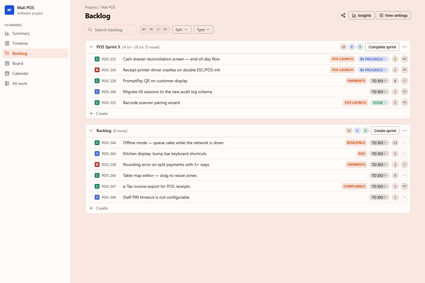
BacklogPage
v1.0.10AppJira-parity project page with the full Planning sidebar — Summary, Timeline, Backlog and Board views. Full-page copy-paste template; baked-in demo content (edit the JSX to customise).
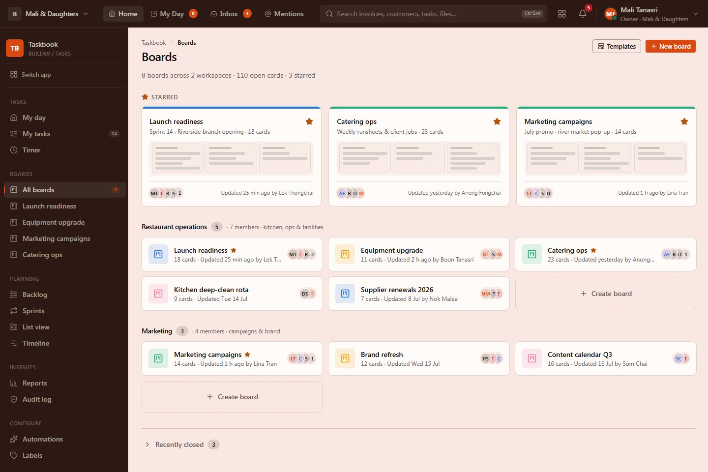
BoardsPage
v1.0.13AppComposed example workspace-home page: PageHead + starred board cards with mini column previews + workspace-grouped board grids + collapsed recently-closed rail. Reference for any boards/projects directory screen.
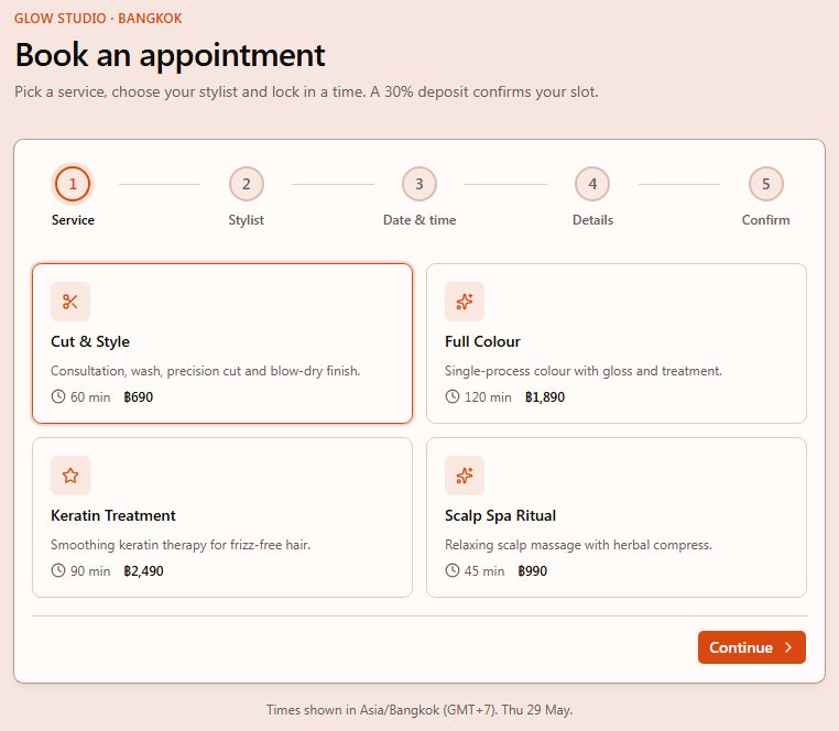
Booking
v1.0.15AppBooking / appointment page — multi-step, service picker, calendar slots, provider select and confirmation. Full-page copy-paste template; baked-in demo content (edit the JSX to customise).
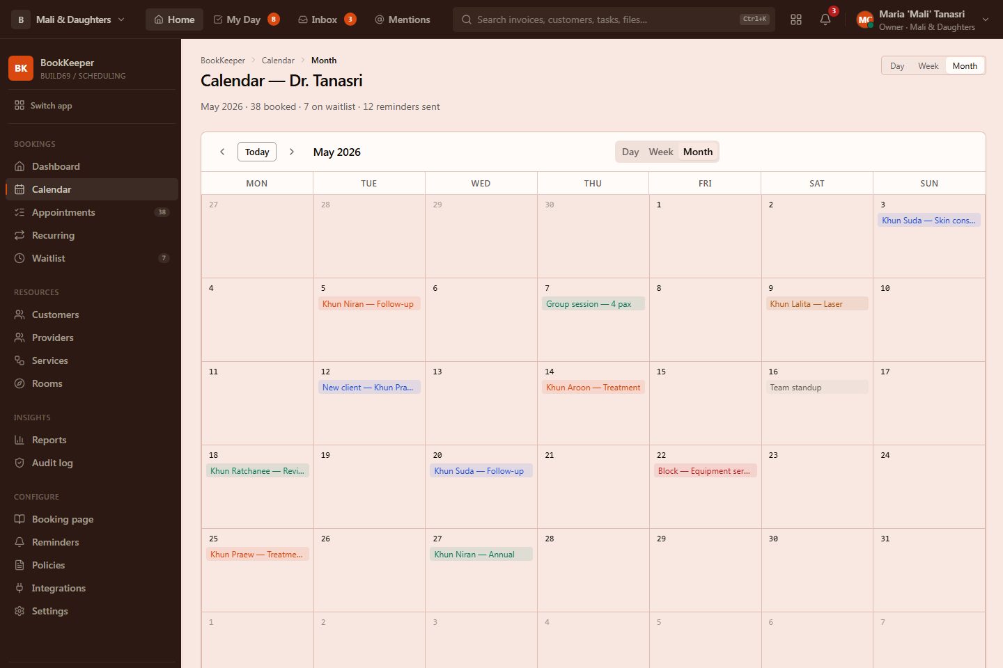
CalendarPage
v1.0.20AppComposed example calendar page using BuildCalendar at full height with a sidebar of calendars.
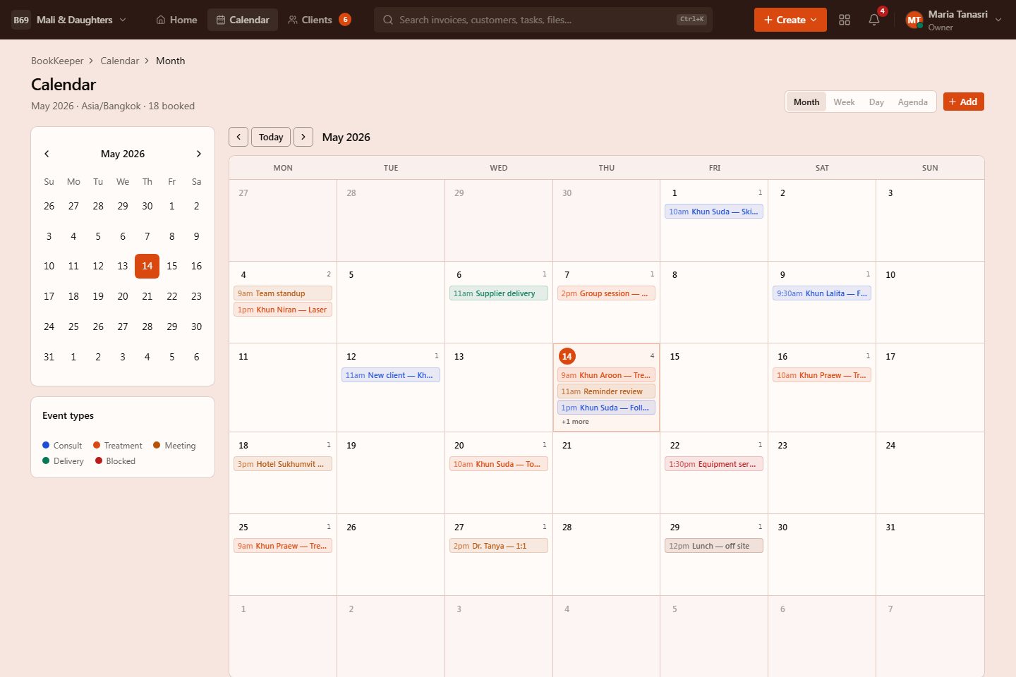
CalendarView
v1.0.13AppCalendar page — month, week, day-agenda, scheduler and team-availability layouts. Full-page copy-paste template; baked-in demo content (edit the JSX to customise).
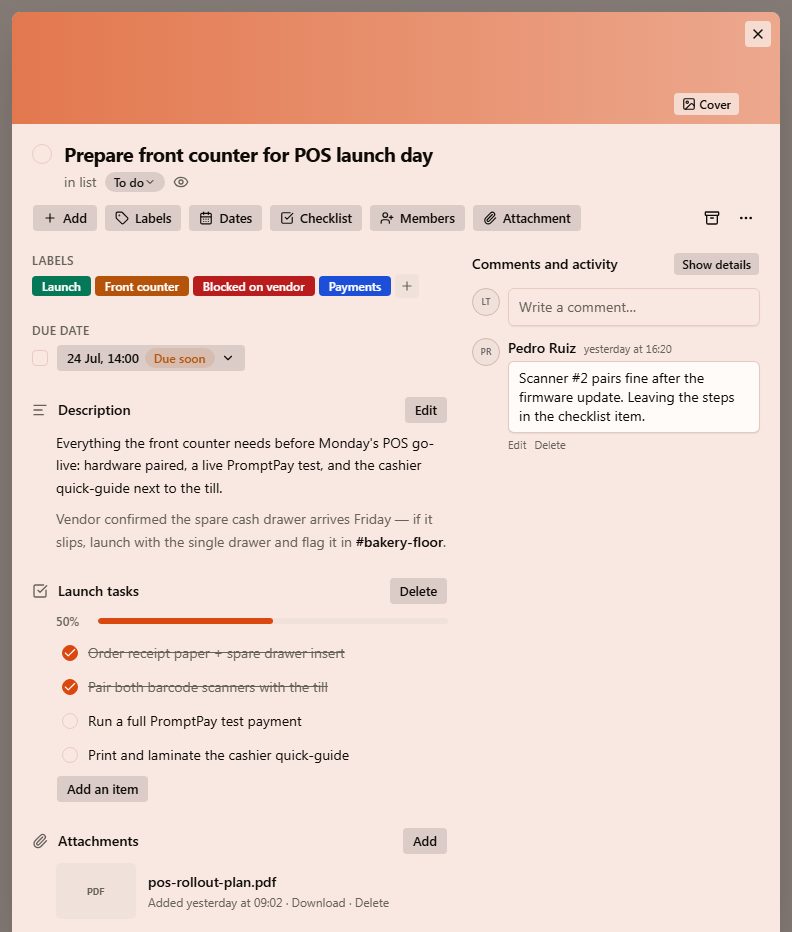
CardDetailPage
v1.0.11AppTrello-parity card back (the 2024+ two-column redesign) — cover, checklists, activity and sidebar actions over a dimmed board. Full-page copy-paste template; baked-in demo content (edit the JSX to customise).
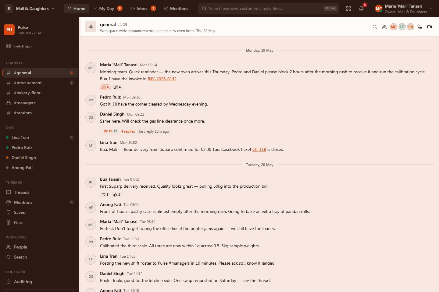
ChatPage
v1.0.17AppComposed example chat page: conversation list + Chat thread + agent suggestions side panel.
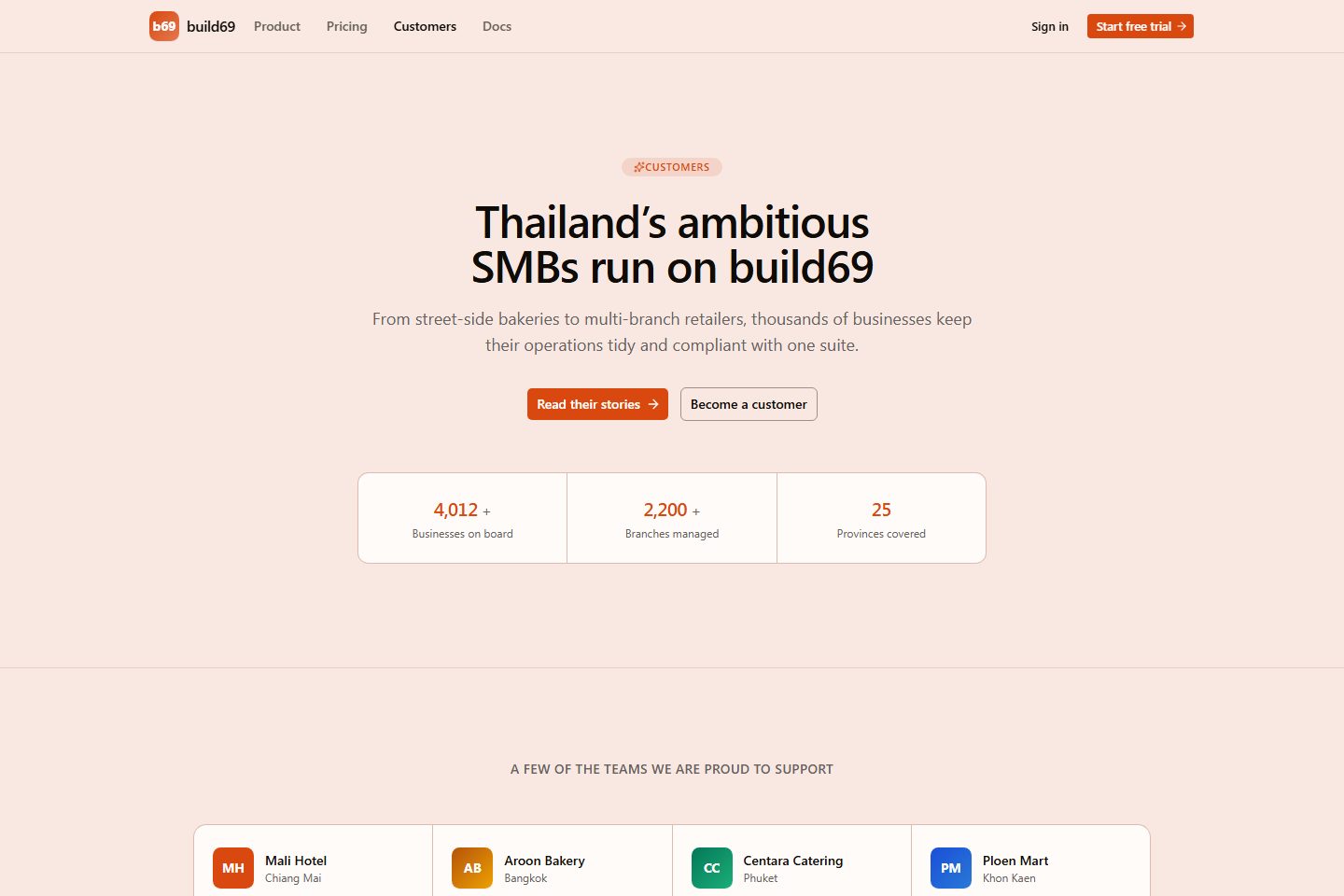
Customers
v1.0.14AppCustomers / case studies page — logo walls, case study grids, testimonials and stats heroes. Full-page copy-paste template; baked-in demo content (edit the JSX to customise).
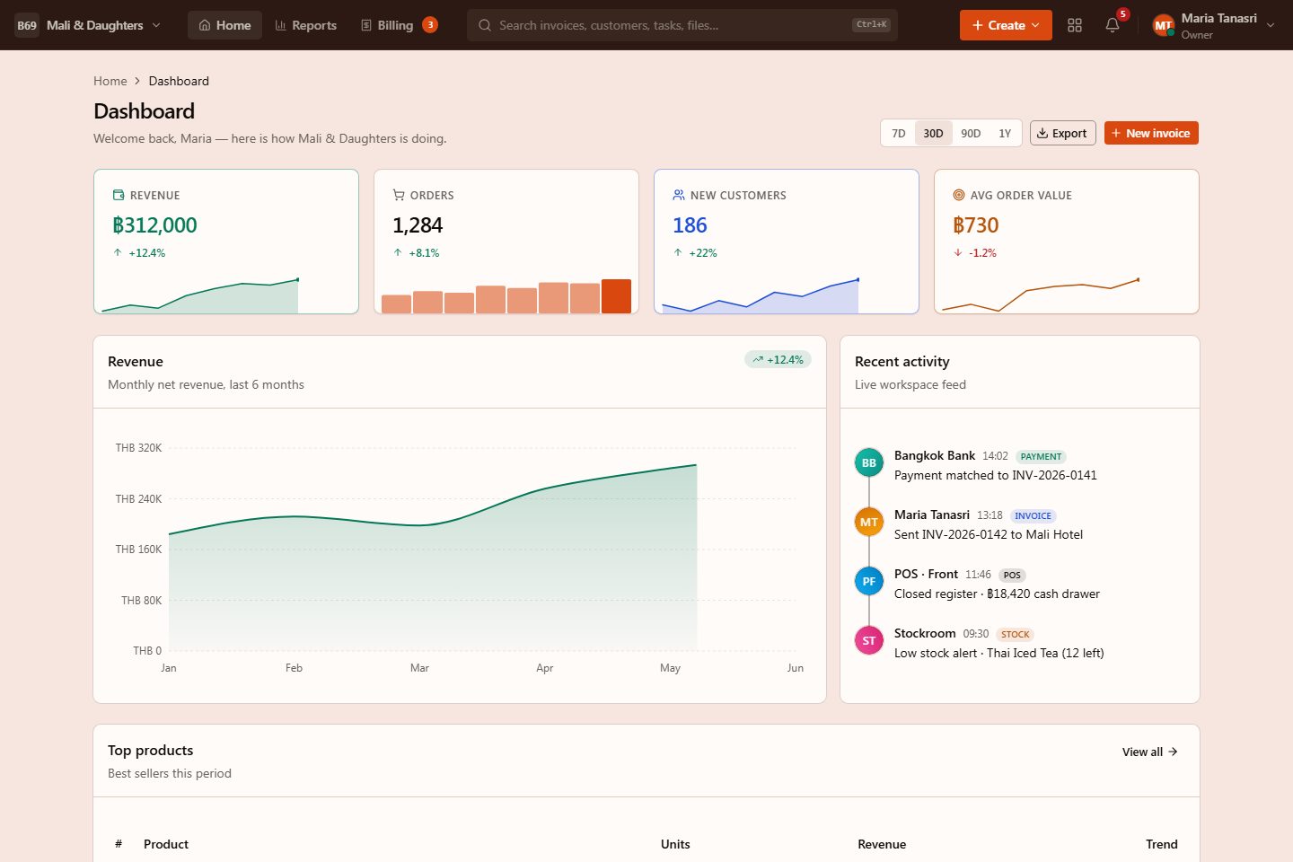
Dashboard
v1.0.20AppApplication dashboard page — overview, analytics, finance, sales and project-ops layouts. Full-page copy-paste template; baked-in demo content (edit the JSX to customise).
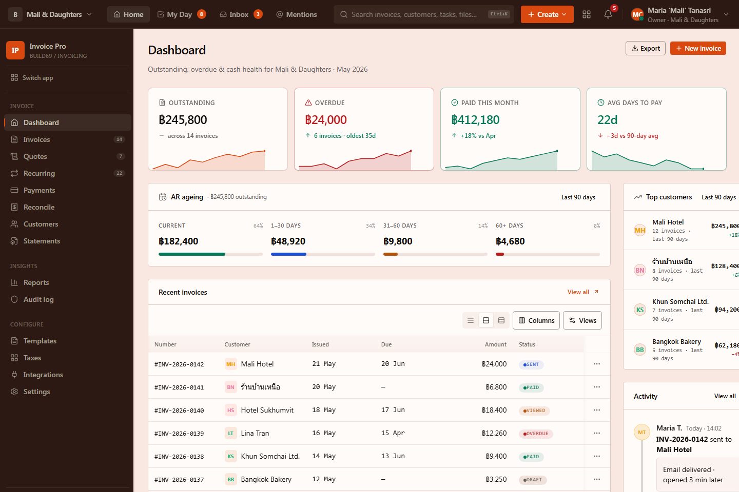
DashboardPage
v1.0.39AppComposed example dashboard: StatCard row, two-column charts + activity, recent records table. Reference for building your own dashboard.
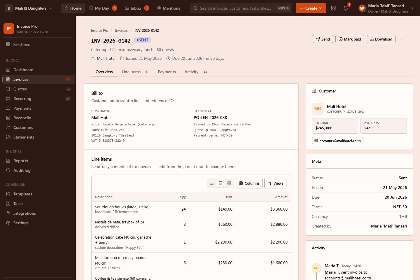
DetailPage
v1.0.40AppComposed example detail page: DetailHead + Tabs + KVList side panel + Timeline. Reference for any "view a record" page.
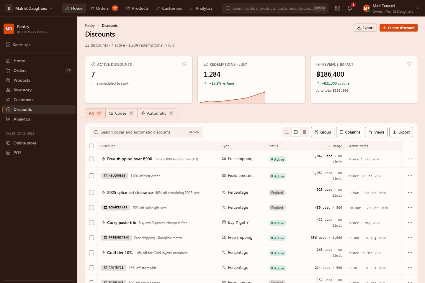
DiscountsPage
v1.0.30AppComposed example promotions-admin page: commerce back office with summary StatCards, All/Codes/Automatic tabs, a discounts DataTable, and a create-discount Sheet form.
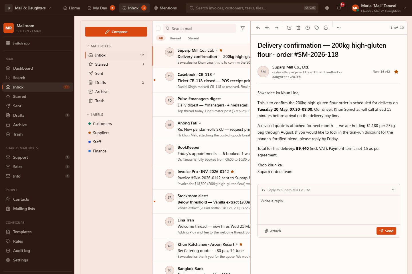
EmailPage
v1.0.17AppComposed example email client page using EmailThreeColumn at full height.
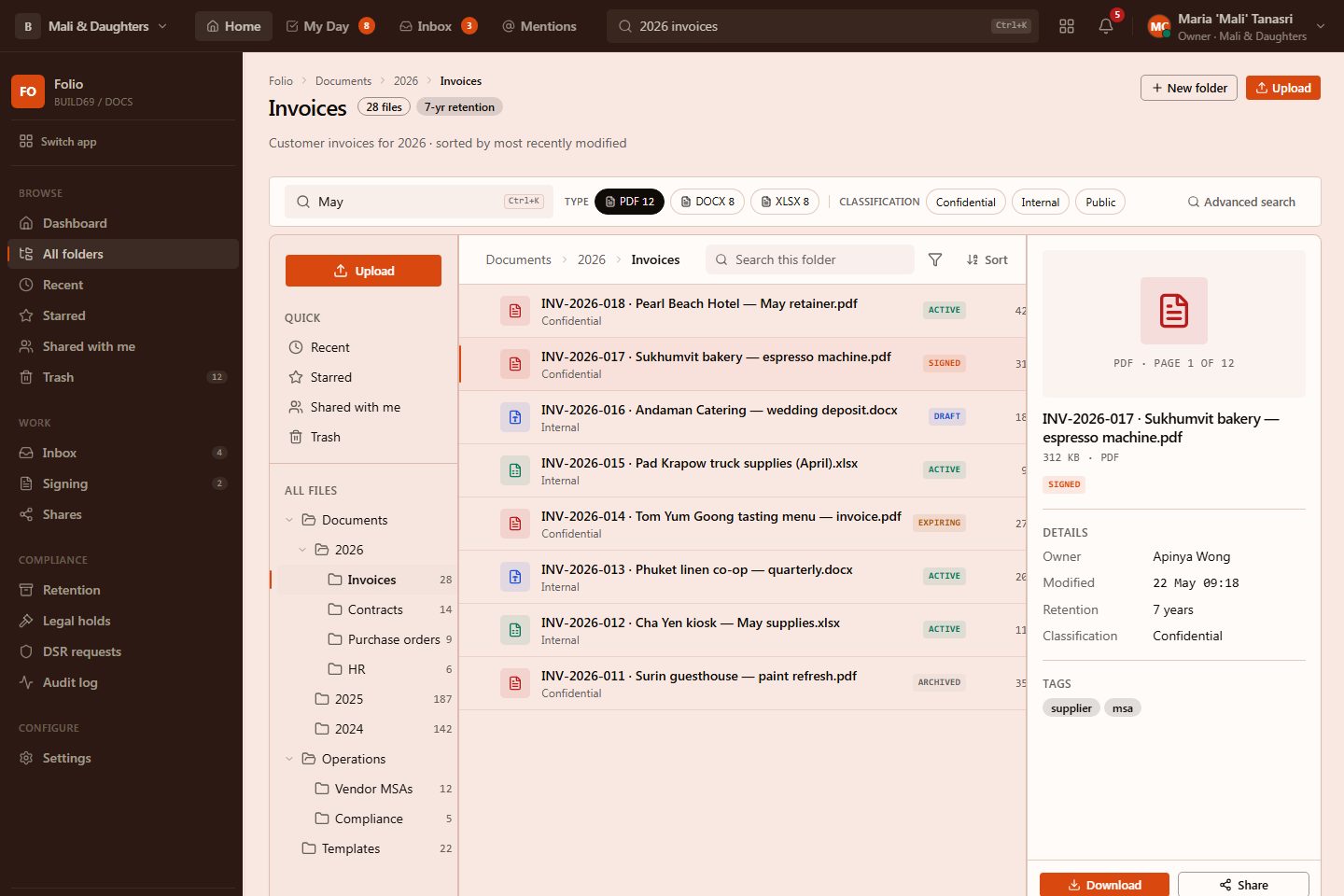
FileBrowserPage
v1.0.20AppComposed example file manager page using FileBrowser at full height.
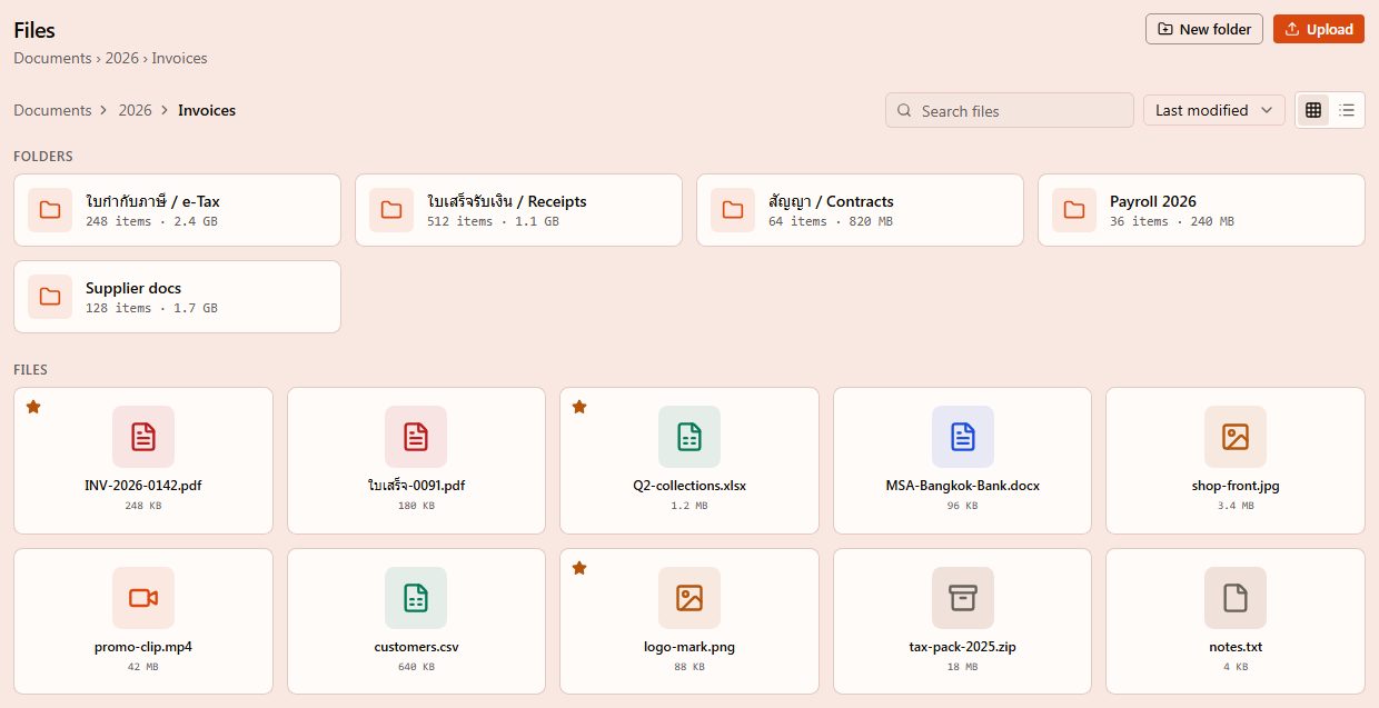
Files
v1.0.17AppFiles / document manager page — grid, list, tree, browser and upload layouts. Full-page copy-paste template; baked-in demo content (edit the JSX to customise).
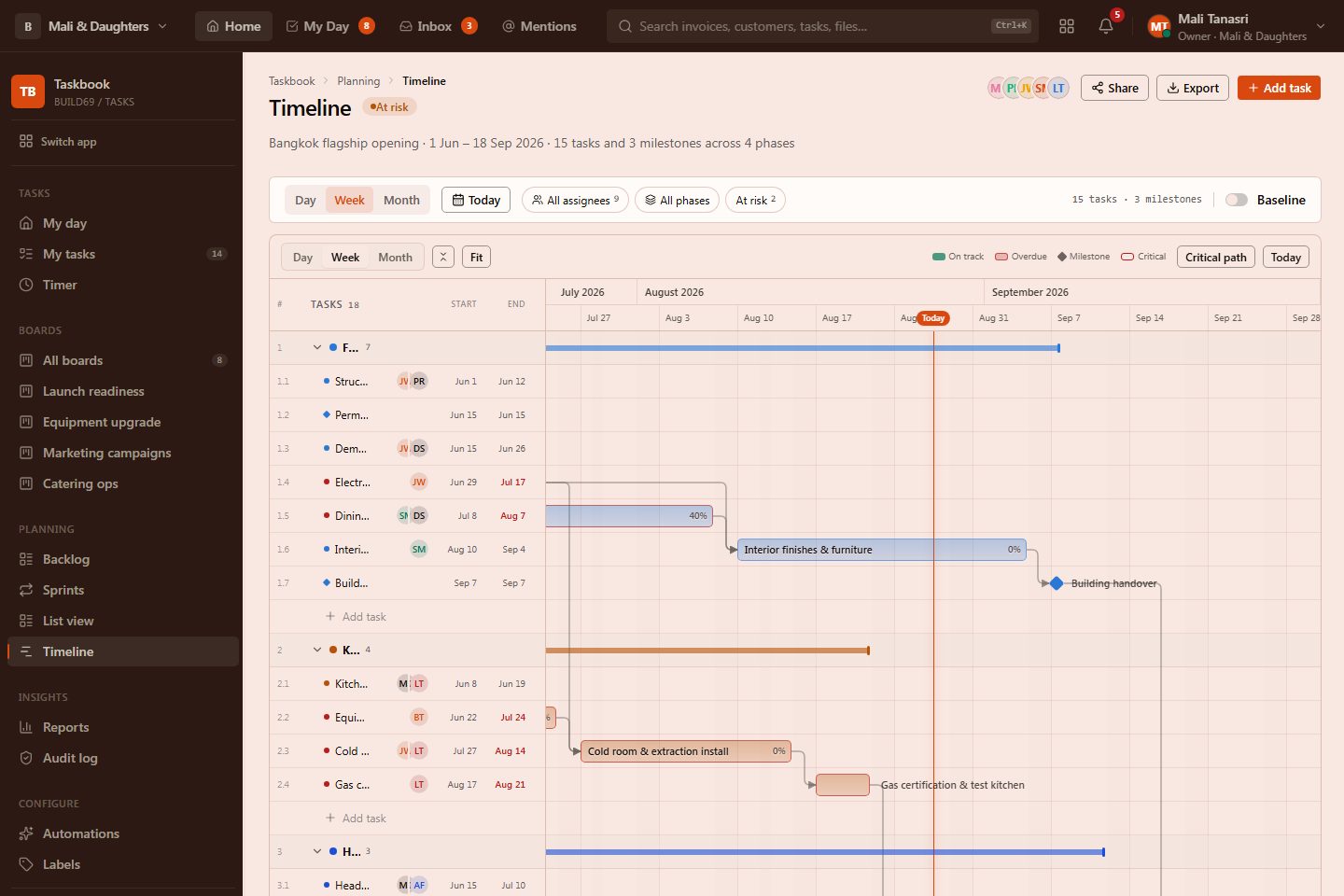
GanttPage
v1.0.18AppComposed example timeline page: PageHead + FilterBar toolbar (zoom, Today, Baseline switch) + grouped GanttChart with a task-detail side panel. Reference for any project-scheduling app.
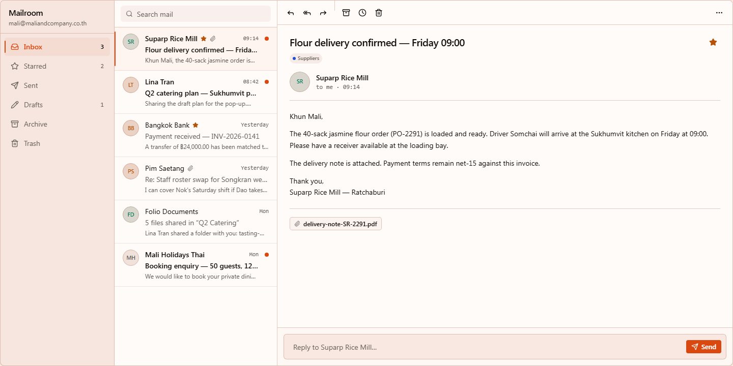
Inbox
v1.0.15AppInbox / messaging page — three-pane, email client, chat messenger, unified and support-ticket layouts. Full-page copy-paste template; baked-in demo content (edit the JSX to customise).
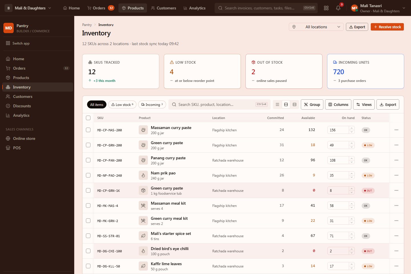
InventoryPage
v1.0.29AppComposed example inventory page: commerce back-office shell + stat strip + DataTable stock grid with inline on-hand adjusters and OK/Low/Out flags + incoming purchase orders. Reference for any stock-control screen.
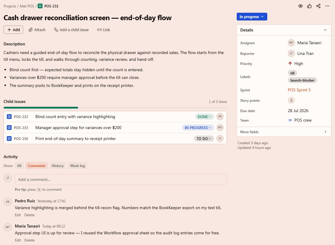
IssueDetailPage
v1.0.11AppJira-parity issue view — breadcrumb with the issue key, description, child issues with a progress bar and an Activity feed. Full-page copy-paste template; baked-in demo content (edit the JSX to customise).
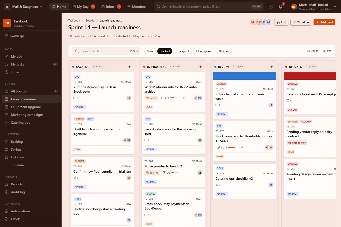
KanbanPage
v1.0.20AppComposed example board page: PageHead + FilterBar + Kanban. Reference for any pipeline board.
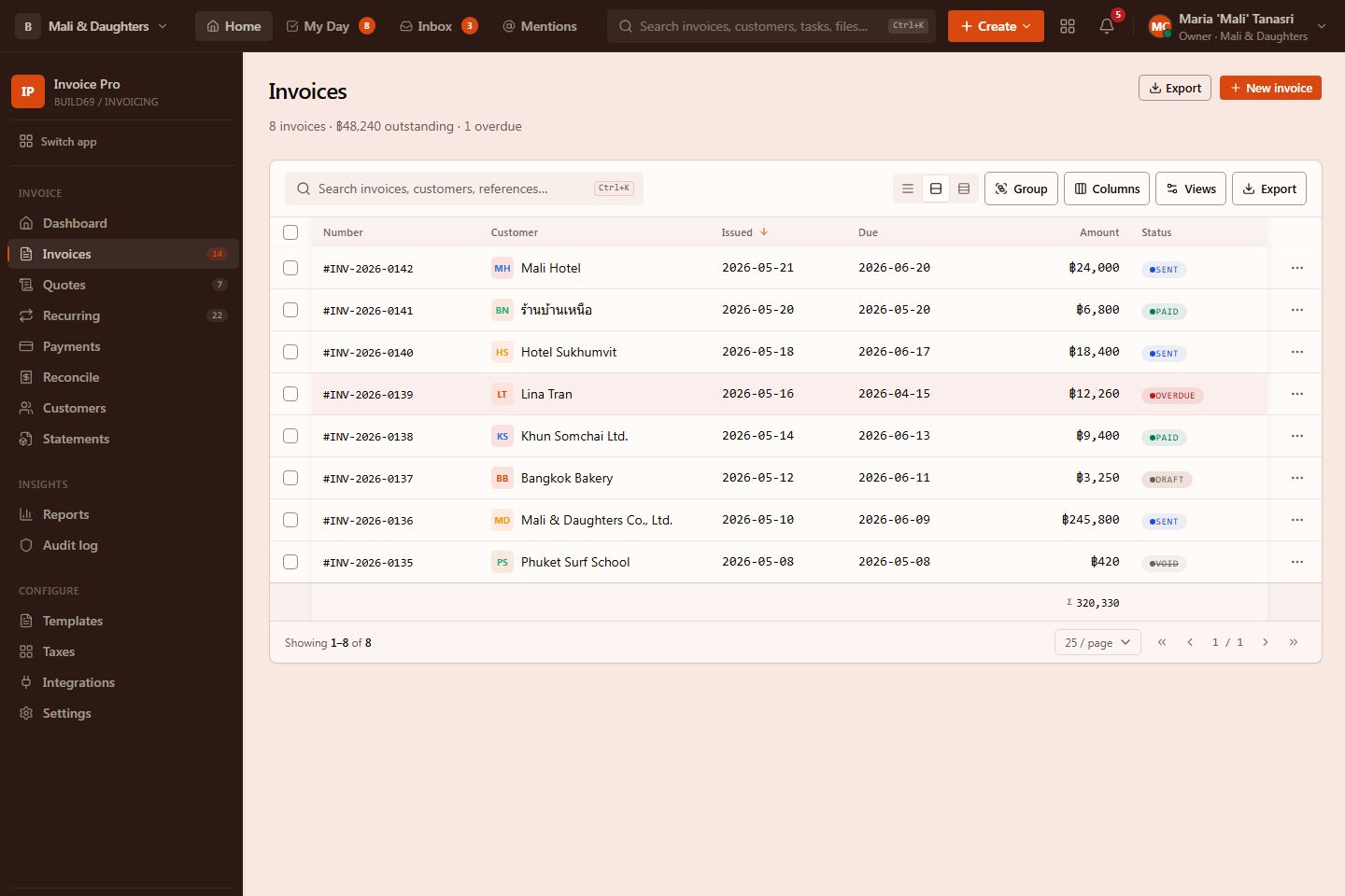
ListPage
v1.0.37AppComposed example list page: PageHead + FilterBar + DataTable + ListMeta. Reference for any "browse records" page.
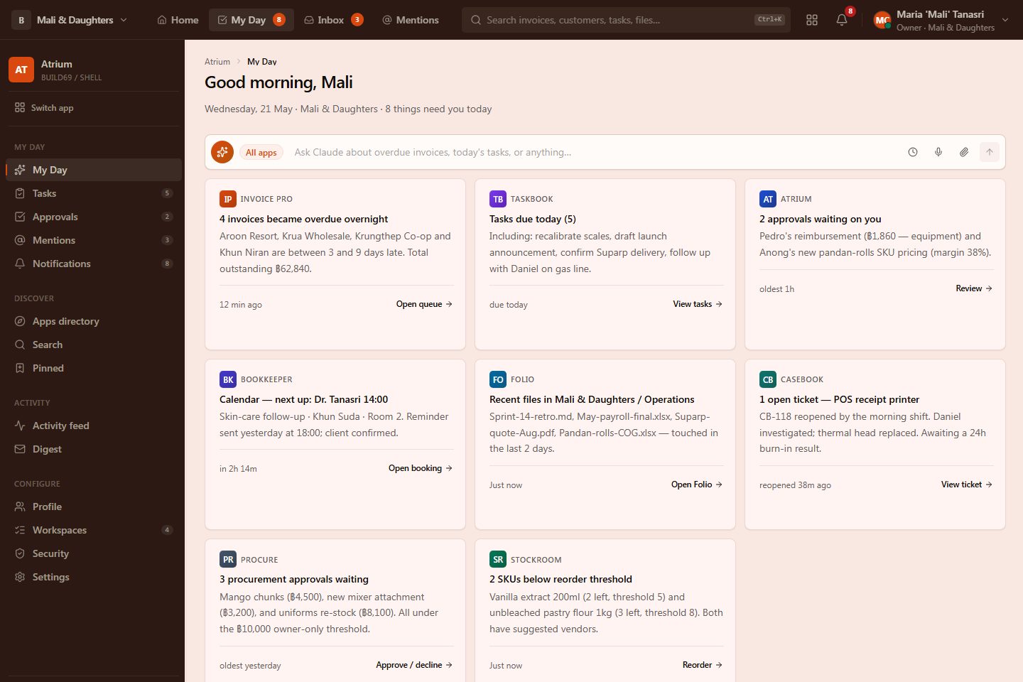
MyDayPage
v1.0.19AppComposed example "my day" page: pinned cards row + tasks + calendar slice + agent suggestions.
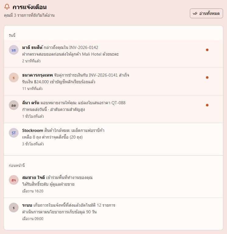
Notifications
v1.0.12AppNotifications page — feed, tabbed, panel, with-filters and grouped layouts. Full-page copy-paste template; baked-in demo content (edit the JSX to customise).
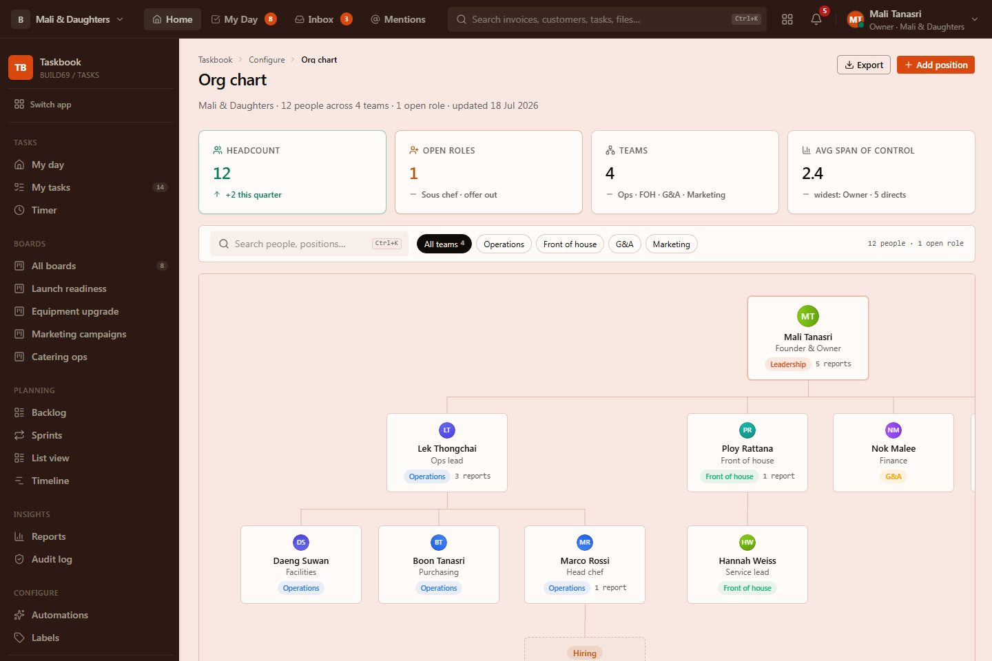
OrgChartPage
v1.0.14AppComposed example HR org-chart page: StatCard strip + FilterBar over a recursive position-hierarchy diagram with token-drawn connectors, team identity chips and a dashed hiring node. Reference for people/HR hierarchy screens.
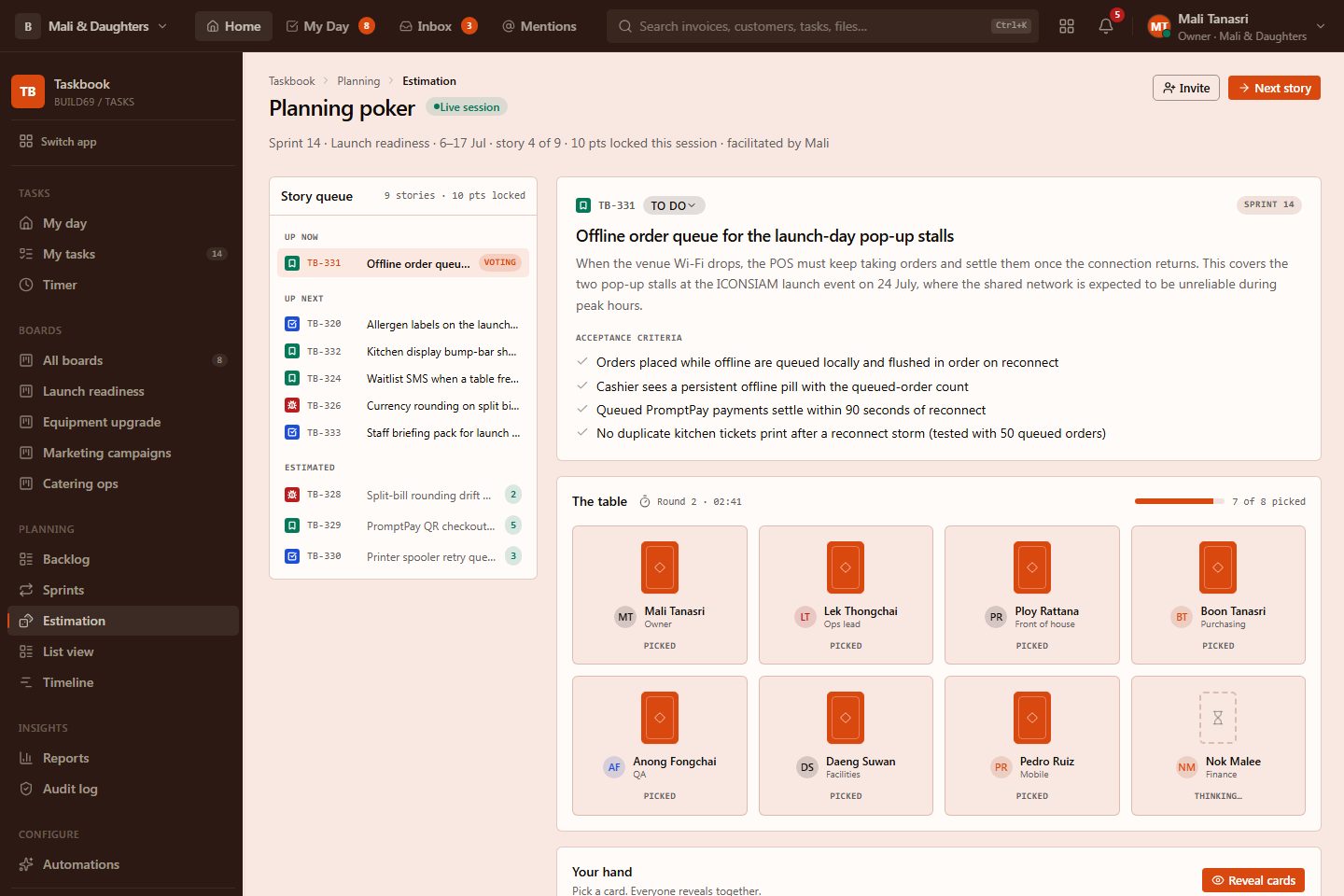
PlanningPokerPage
v1.0.13AppComposed example planning-poker estimation page: story-queue rail, current-story panel with acceptance criteria, a players table of hidden/empty/revealed vote cards, and a selectable estimate deck with computed consensus/spread reveal outcomes.
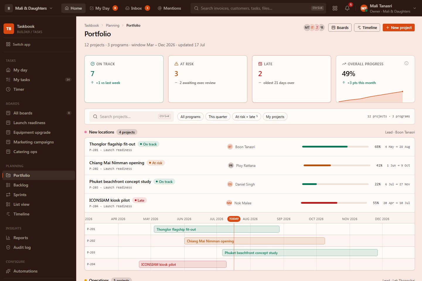
PortfolioPage
v1.0.15AppComposed example portfolio page: StatCard health summary + FilterBar + program-grouped project rows, each program fused with a shared-axis TimelineHorizontal mini-Gantt.
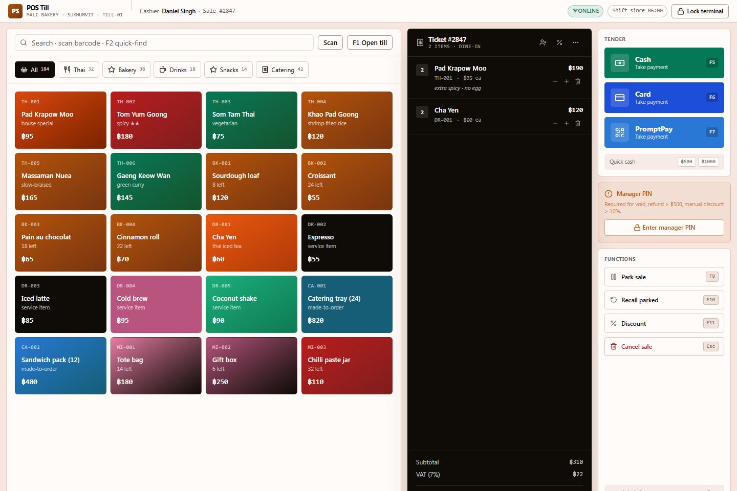
POSTillPage
v1.0.9AppComposed example point-of-sale till page: product grid + open cart + payment pad. Reference for retail POS surfaces.
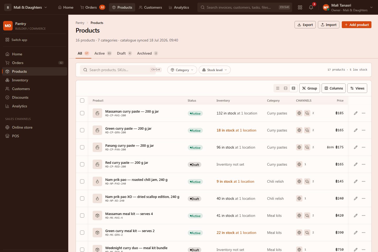
ProductManagerPage
v1.0.29AppComposed example products-admin page (Shopify parity) for a commerce back office: status tabs with counts, search + filter chips, and the pro DataTable with SKU tiles, status badges, low-stock warnings, bulk actions and a Sheet product editor.
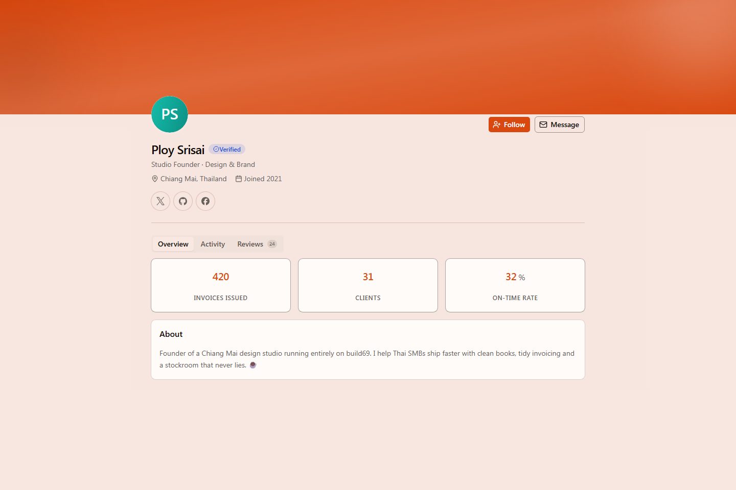
Profile
v1.0.17AppPublic / user profile page — classic, social, resume, team-member and freelancer layouts. Full-page copy-paste template; baked-in demo content (edit the JSX to customise).
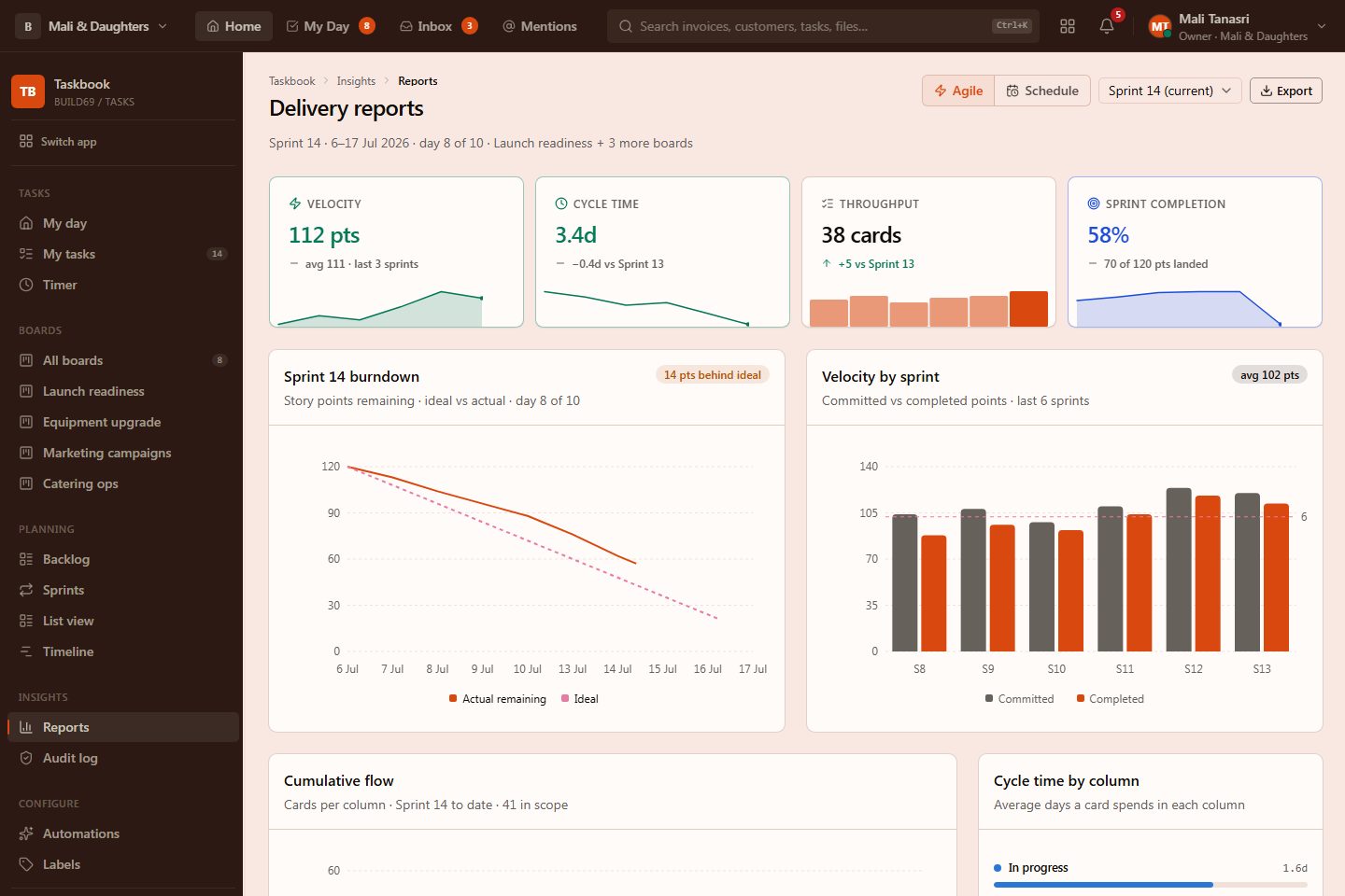
ProjectReportsPage
v1.0.33AppComposed example delivery-analytics reports page: KPI StatCards plus burndown / velocity / cumulative-flow charts (agile view) or a baseline-slippage DataTable with milestones (schedule view), switched by a view prop.
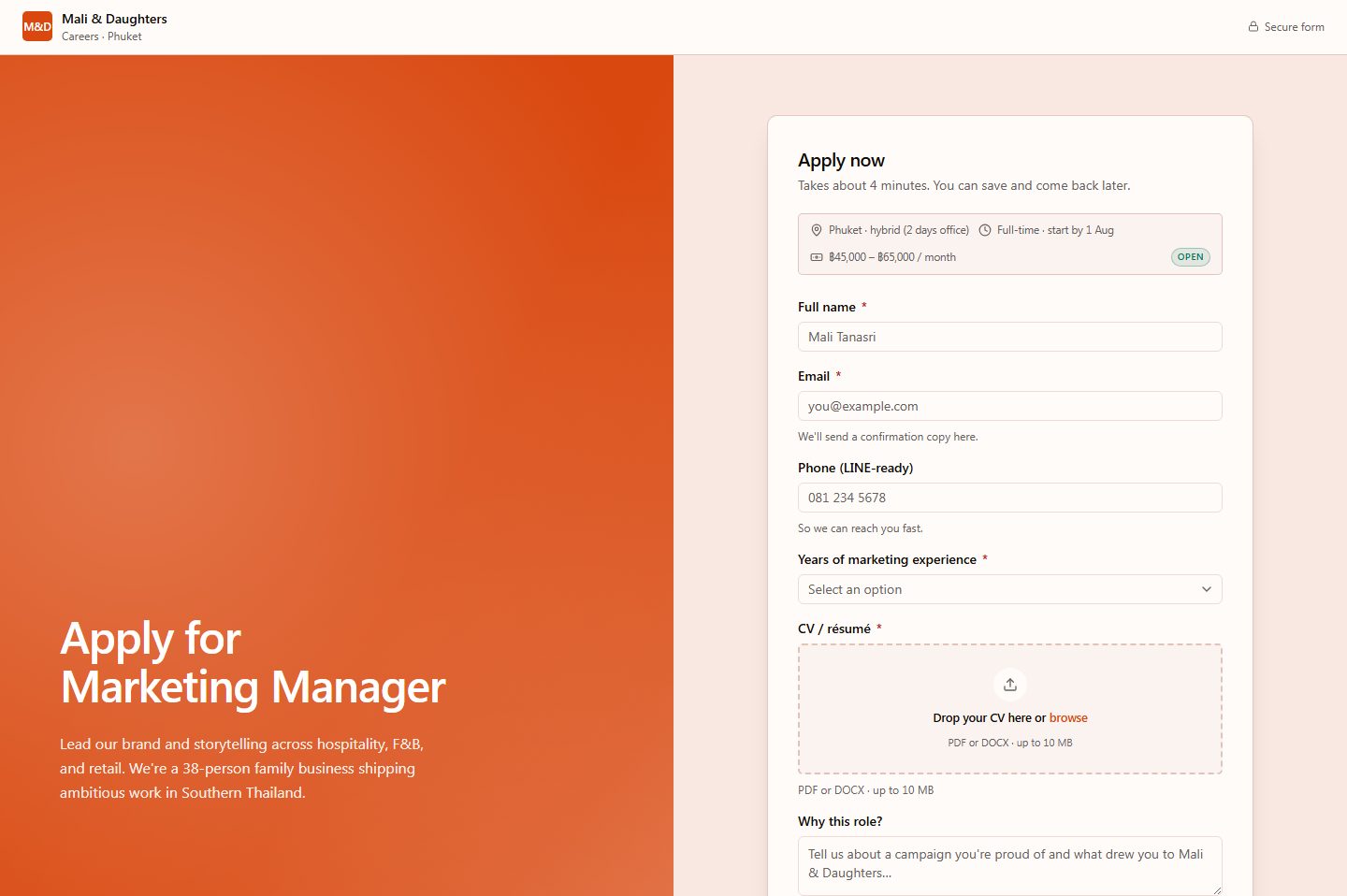
PublicFormPage
v1.0.10AppComposed example public-facing form page: PublicFormCover hero + FormSection body + thank-you state.
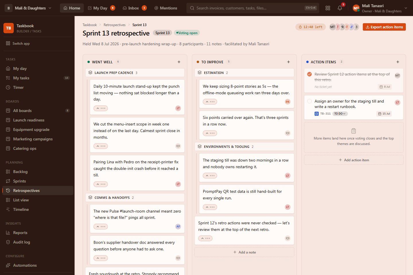
RetroPage
v1.0.15AppComposed example sprint-retrospective board: Went well / To improve / Action items columns with vote pills, anonymous notes, theme grouping and owner-assigned action items under a timer-chip PageHead.
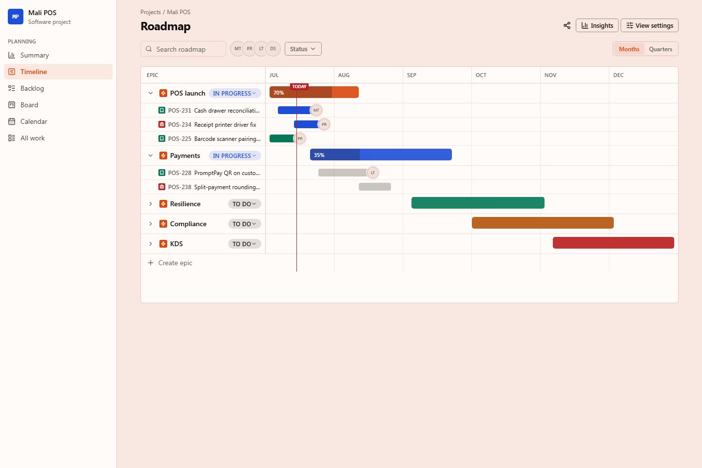
RoadmapPage
v1.0.10AppJira-parity roadmap — the Timeline view as a full page, with epics and progress-filled bars on a Months / Quarters time axis. Full-page copy-paste template; baked-in demo content (edit the JSX to customise).
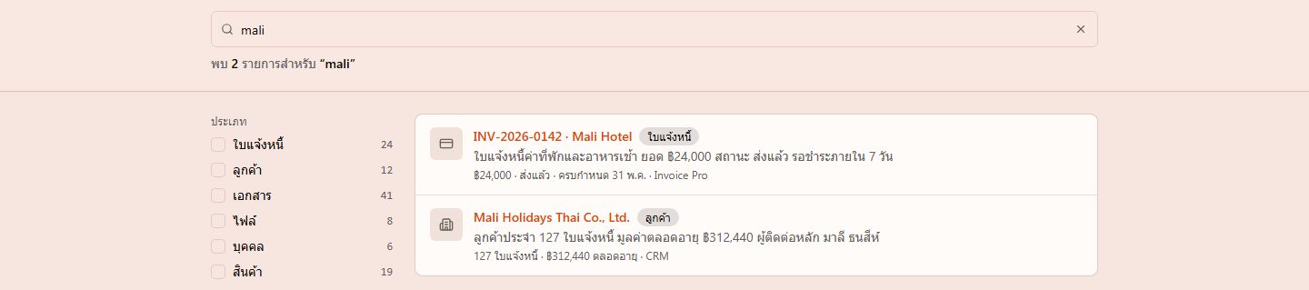
SearchResults
v1.0.12AppSearch results page — list, tabbed, grid, with-filters and global command layouts. Full-page copy-paste template; baked-in demo content (edit the JSX to customise).
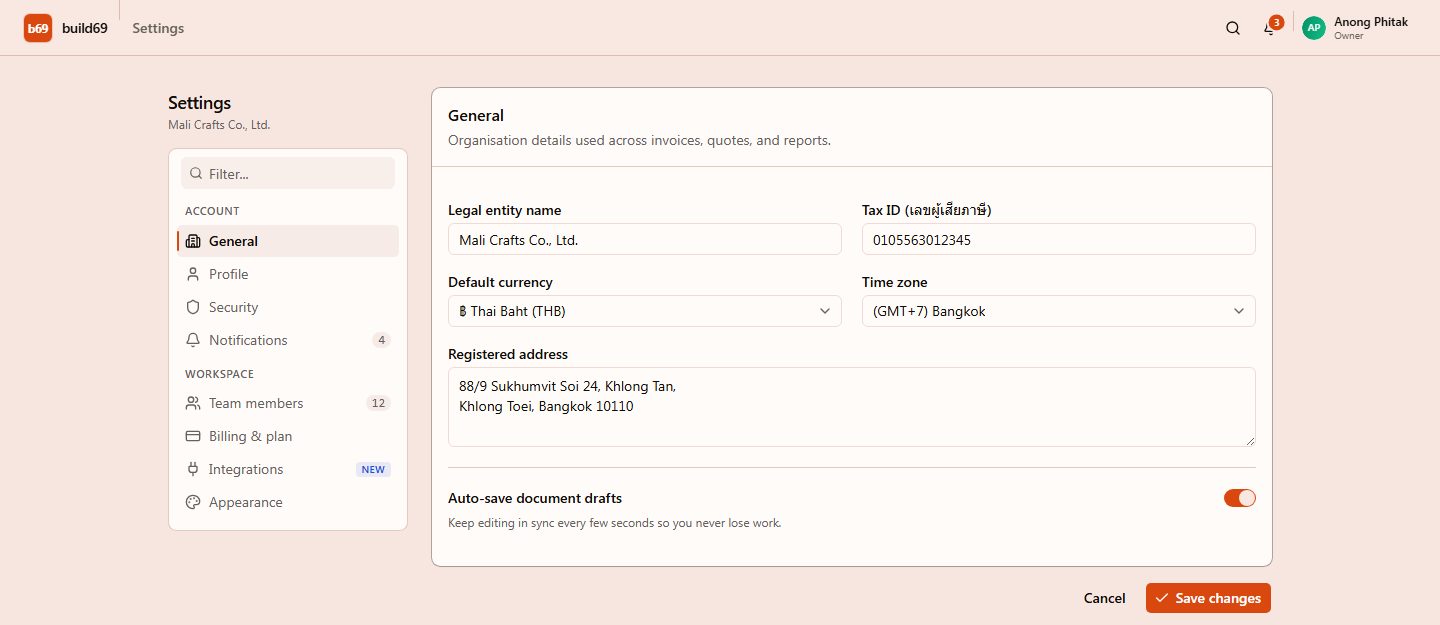
Settings
v1.0.13AppSettings page — sidebar layout, tabbed, profile form, account/security, notifications and integrations. Full-page copy-paste template; baked-in demo content (edit the JSX to customise).
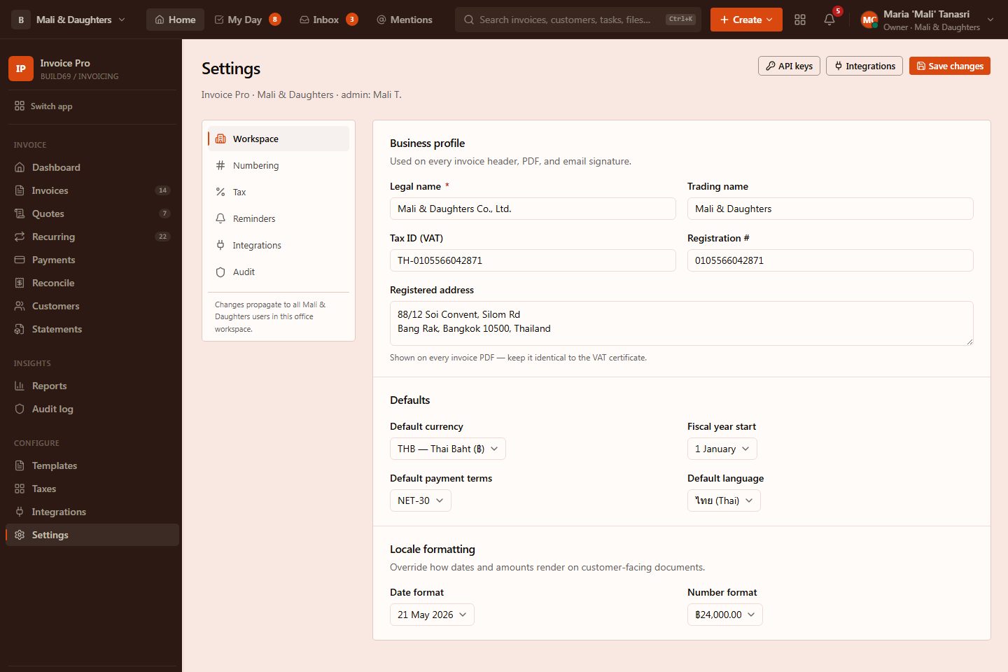
SettingsPage
v1.0.18AppComposed example settings page: sidebar of sections + scrolling FormSection blocks. Reference for any preferences page.
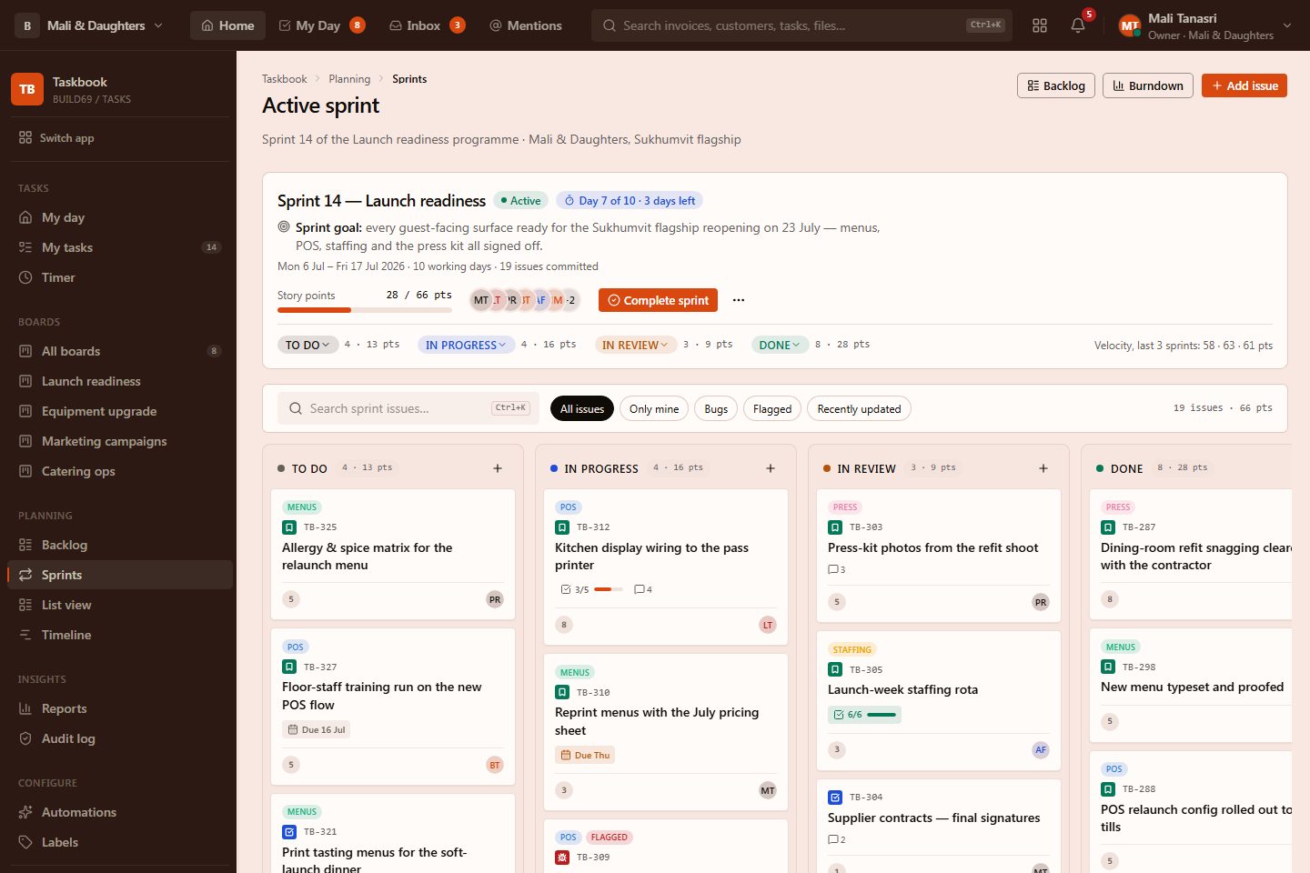
SprintBoardPage
v1.0.15AppComposed example active-sprint page (Jira Active-sprints parity): sprint header card with goal, day countdown, story-point Progress and participants above a four-column Kanban scoped to the sprint.
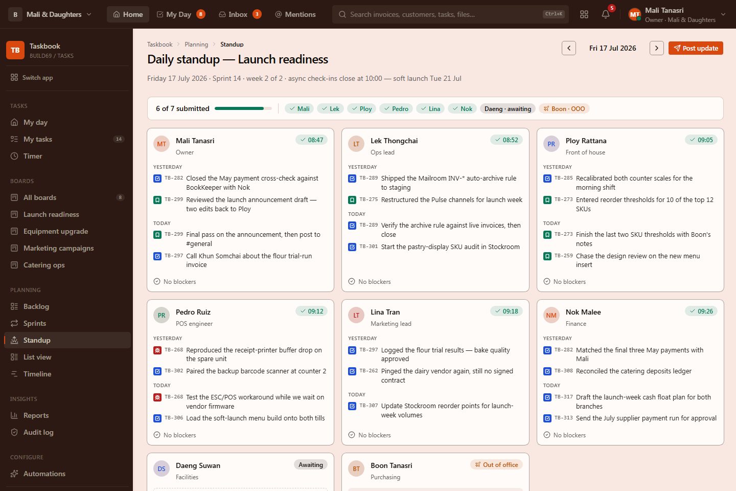
StandupPage
v1.0.13AppComposed example daily-standup page: PageHead day switcher, submitted/awaiting status strip, a grid of per-person check-in cards (Yesterday/Today issue bullets, destructive blocker callouts, out-of-office states) and a parking-lot topic list.
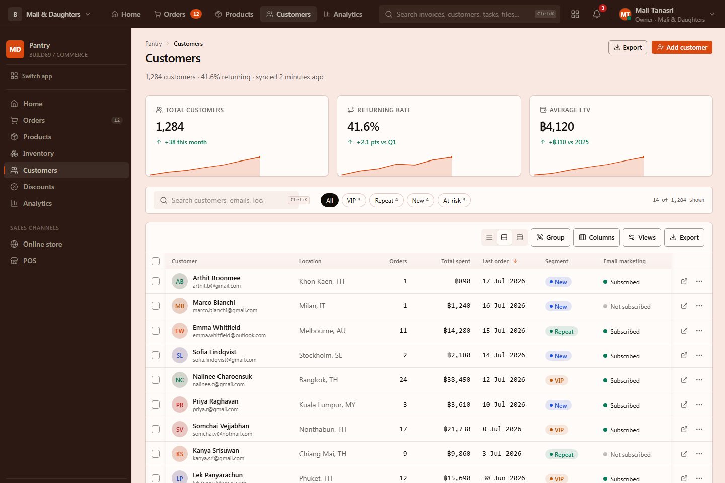
StoreCustomersPage
v1.0.30AppComposed example commerce CRM page: stat strip + segment FilterBar + customer DataTable with a slide-in customer profile Sheet. Reference for any merchant back-office customer list.
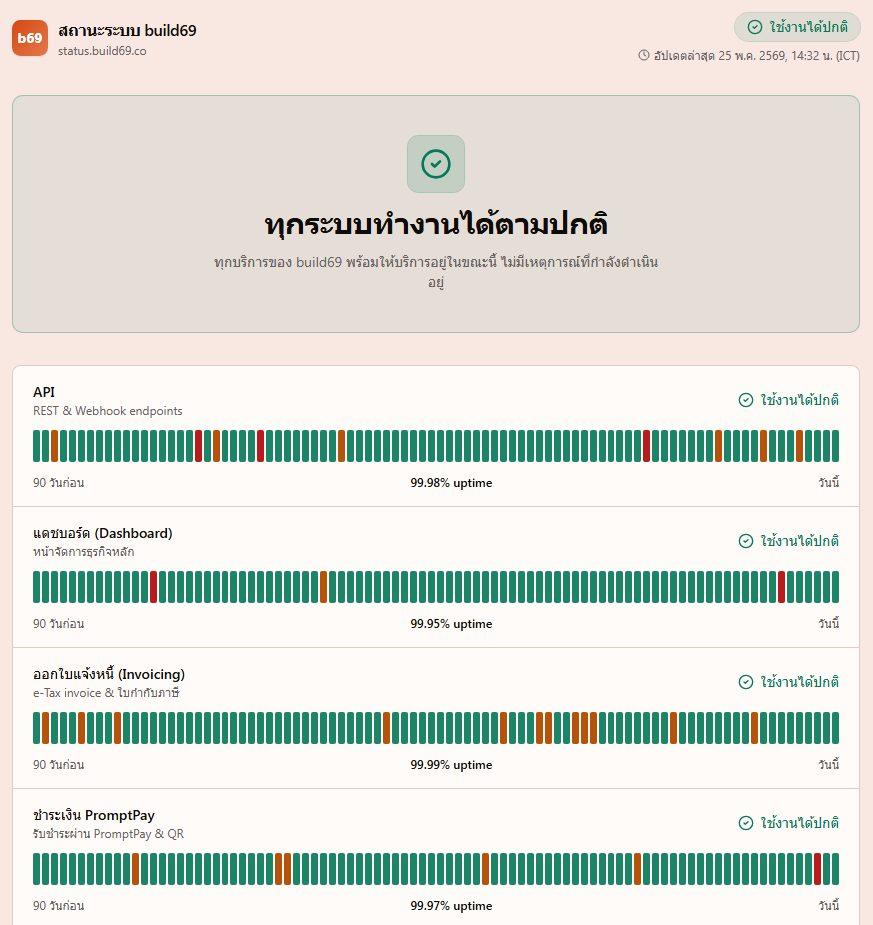
SystemStatus
v1.0.16AppSystem status / uptime page — all-operational, with-incident, component list, uptime history and incident history layouts. Full-page copy-paste template; baked-in demo content (edit the JSX to customise).
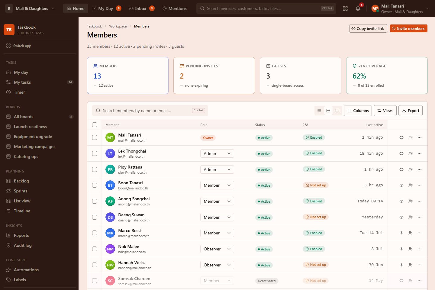
TeamPage
v1.0.29AppComposed example workspace-members admin page: PageHead + StatCard strip + members DataTable with inline role Selects and icon row actions + Pending invites / Guests sections. The admin counterpart of InviteAccept.
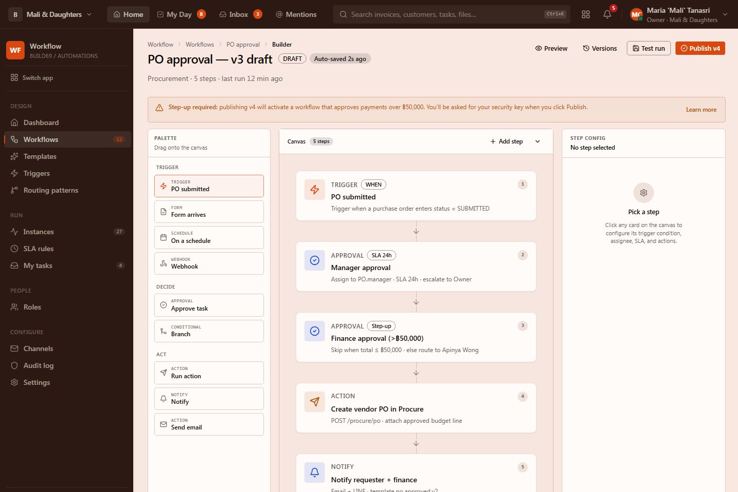
WorkflowDesignerPage
v1.0.20AppComposed example workflow / automation designer page: palette + RuleStep canvas + properties side panel.
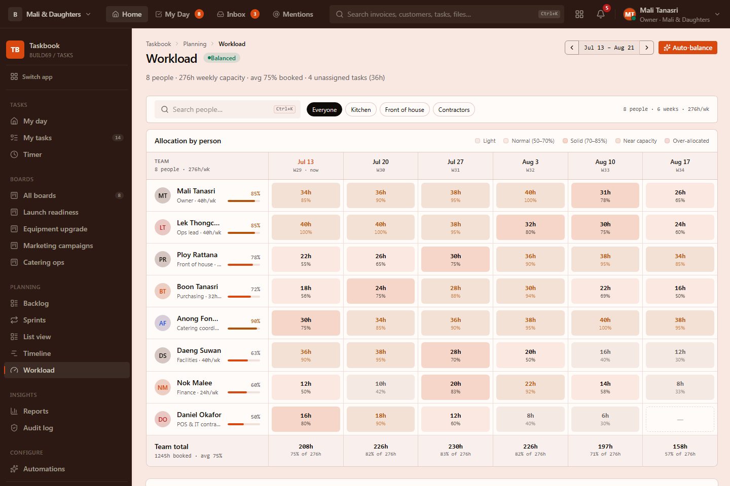
WorkloadPage
v1.0.13AppComposed example workload page: PageHead with week-range switcher + FilterBar + six-week person-by-week allocation grid with utilisation tints and over-allocation flags + unassigned pool with suggested assignees. Reference for any resource-allocation view.
Auth11
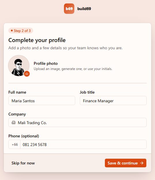
AccountSetup
v1.0.15AuthAccount / workspace setup page for profile and workspace configuration during onboarding. Full-page copy-paste template; baked-in demo content (edit the JSX to customise).
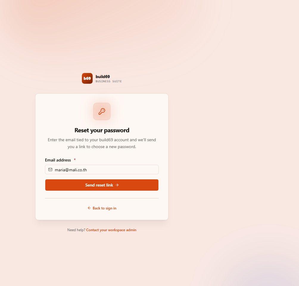
ForgotPassword
v1.0.12AuthPassword-reset request page that captures an email to send a reset link. Full-page copy-paste template; baked-in demo content (edit the JSX to customise).
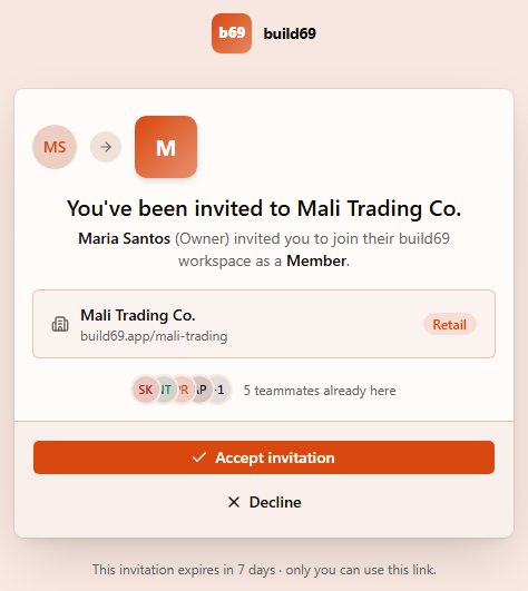
InviteAccept
v1.0.11AuthTeam-invite acceptance page where an invitee joins a workspace (optionally creating an account). Full-page copy-paste template; baked-in demo content (edit the JSX to customise).
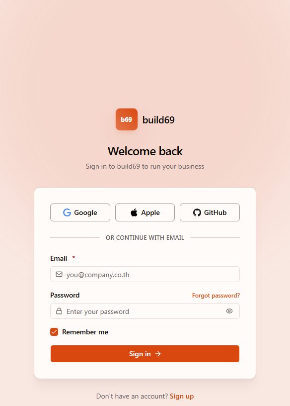
Login
v1.0.15AuthSign-in page with email/password, SSO buttons and "forgot password" link. Full-page copy-paste template; baked-in demo content (edit the JSX to customise).
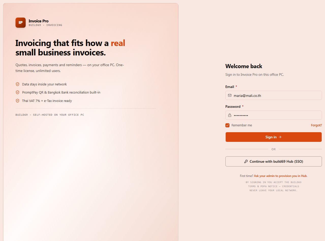
LoginPage
v1.0.9AuthComposed example of a build69 login screen (split layout with brand panel + form). This is a reference, not a reusable atom — copy it as the starting point for your own auth flow.
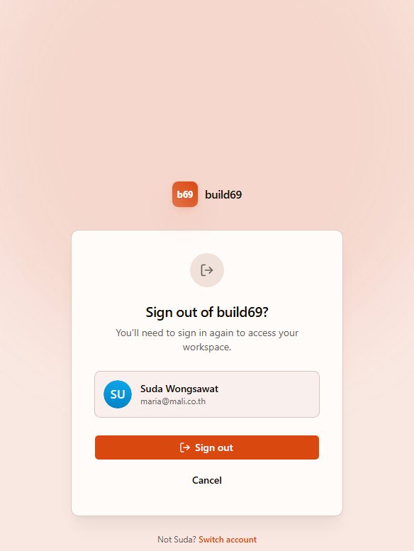
Logout
v1.0.11AuthSign-out page covering the confirm prompt and the post-logout state. Full-page copy-paste template; baked-in demo content (edit the JSX to customise).
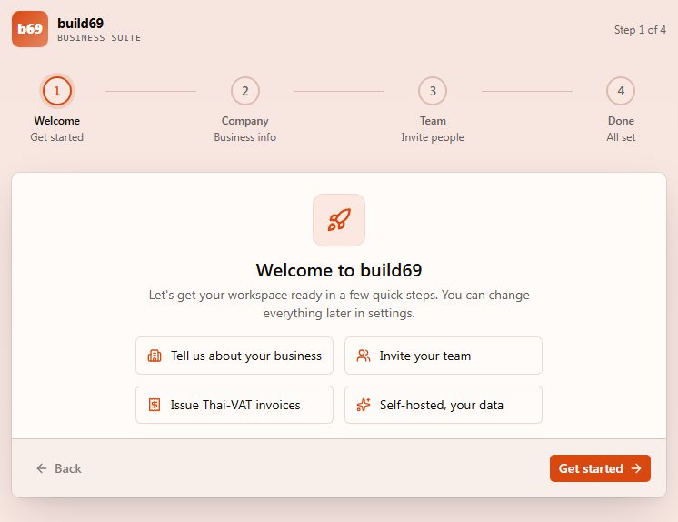
Onboarding
v1.0.13AuthFirst-run onboarding page — multi-step wizard, checklist and split-welcome flows. Full-page copy-paste template; baked-in demo content (edit the JSX to customise).
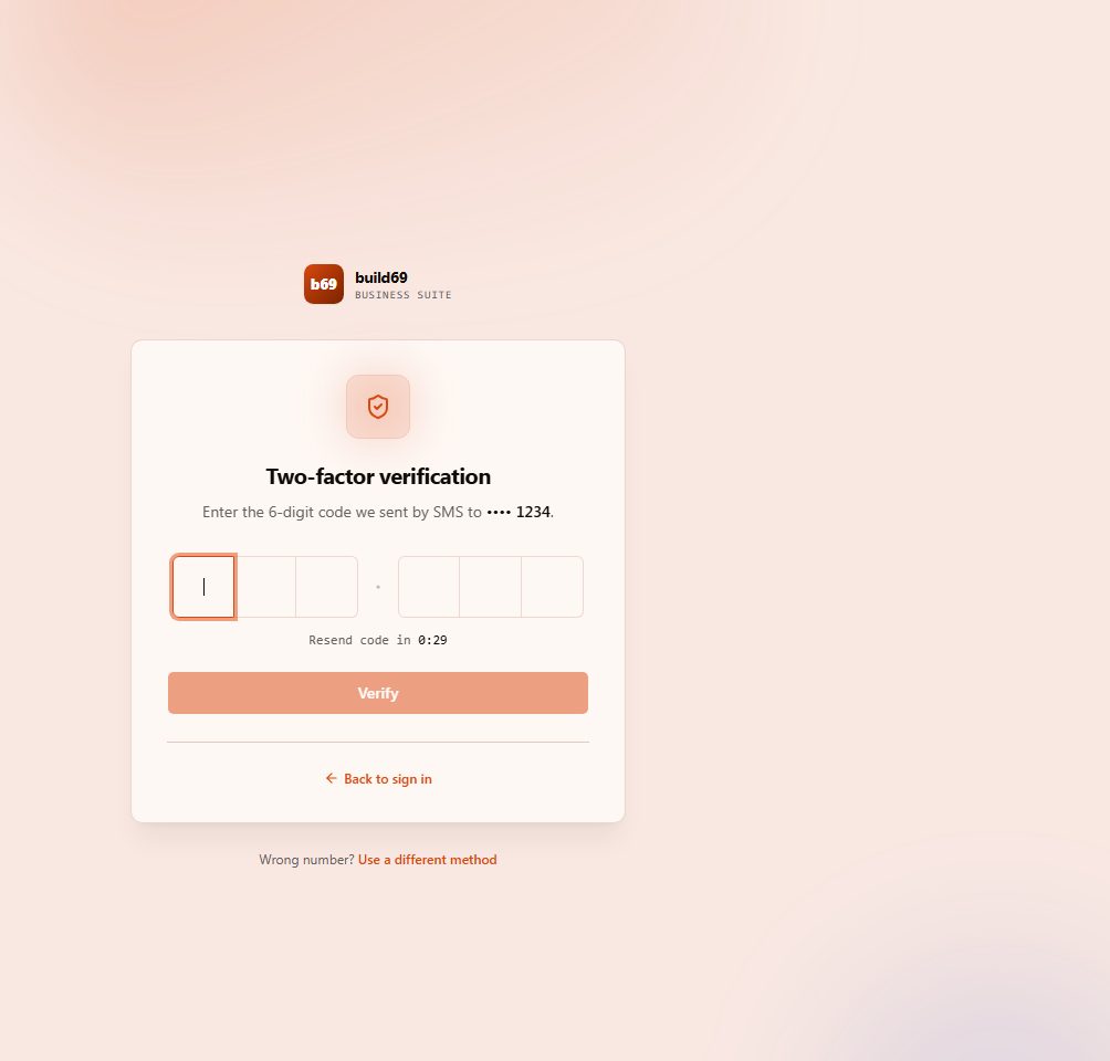
OtpVerify
v1.0.11AuthOne-time-code verification page for email / SMS / authenticator 2FA flows. Full-page copy-paste template; baked-in demo content (a few optional display props such as last4).
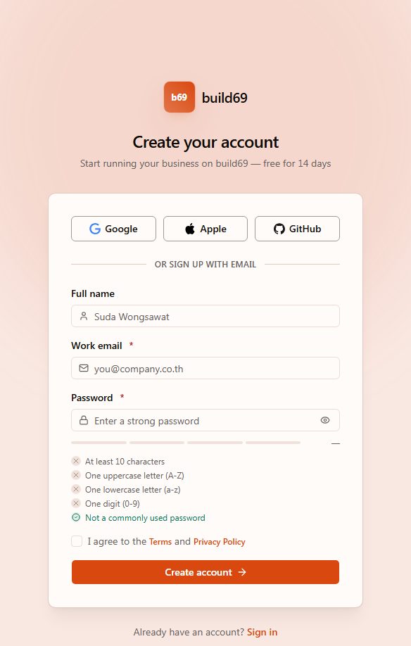
Register
v1.0.14AuthAccount sign-up page with form, benefits panel and multi-step variant. Full-page copy-paste template; baked-in demo content (edit the JSX to customise).
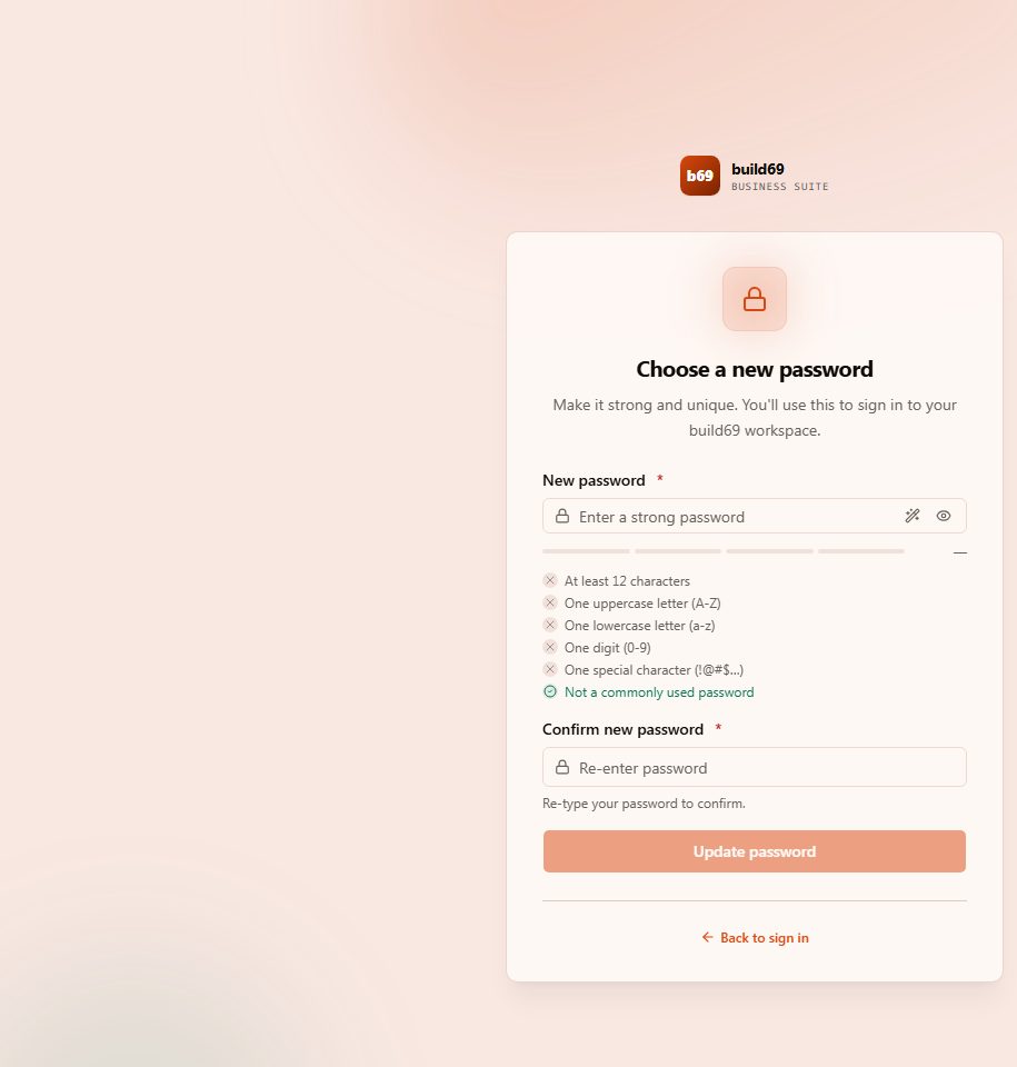
ResetPassword
v1.0.12AuthSet-new-password page reached from a reset link, including an expired-link state. Full-page copy-paste template; baked-in demo content (edit the JSX to customise).
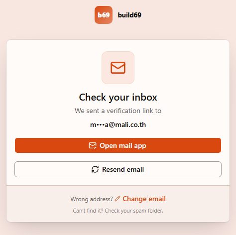
VerifyEmail
v1.0.10AuthEmail-verification page covering the link-sent, enter-code and verified states. Full-page copy-paste template; baked-in demo content (edit the JSX to customise).
Commerce11
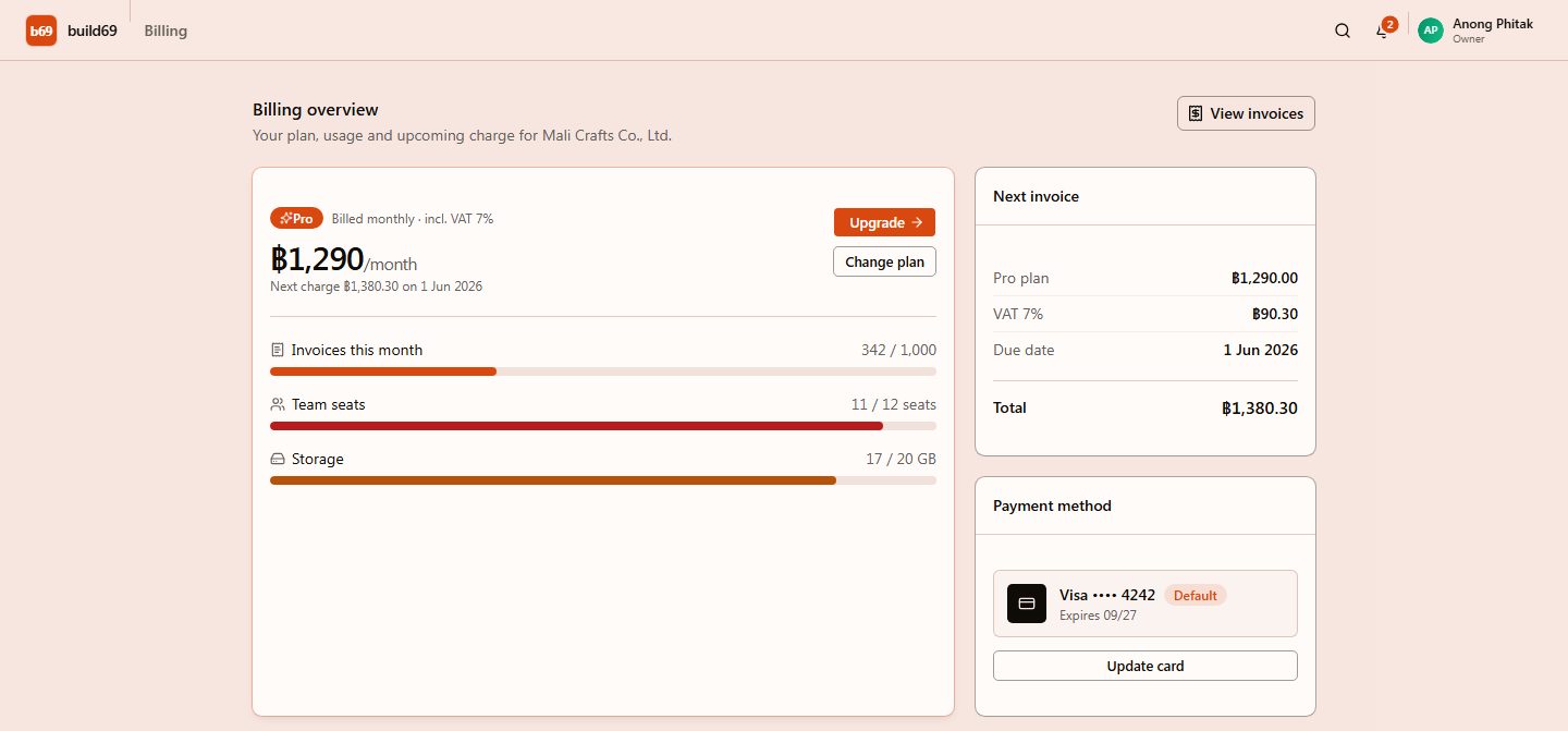
Billing
v1.0.15CommerceBilling page — overview, plan management, payment methods, invoice history and usage metering. Full-page copy-paste template; baked-in demo content (edit the JSX to customise).
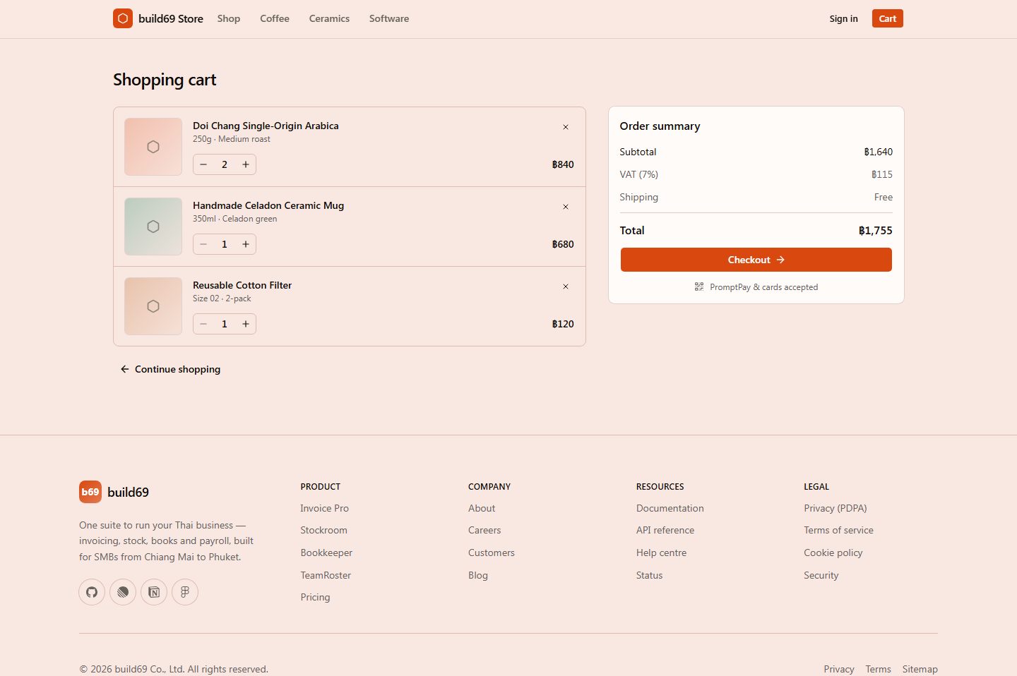
Cart
v1.0.11CommerceShopping cart page — classic, slide-over, with-suggestions, empty and with-coupon layouts. Full-page copy-paste template; baked-in demo content (edit the JSX to customise).
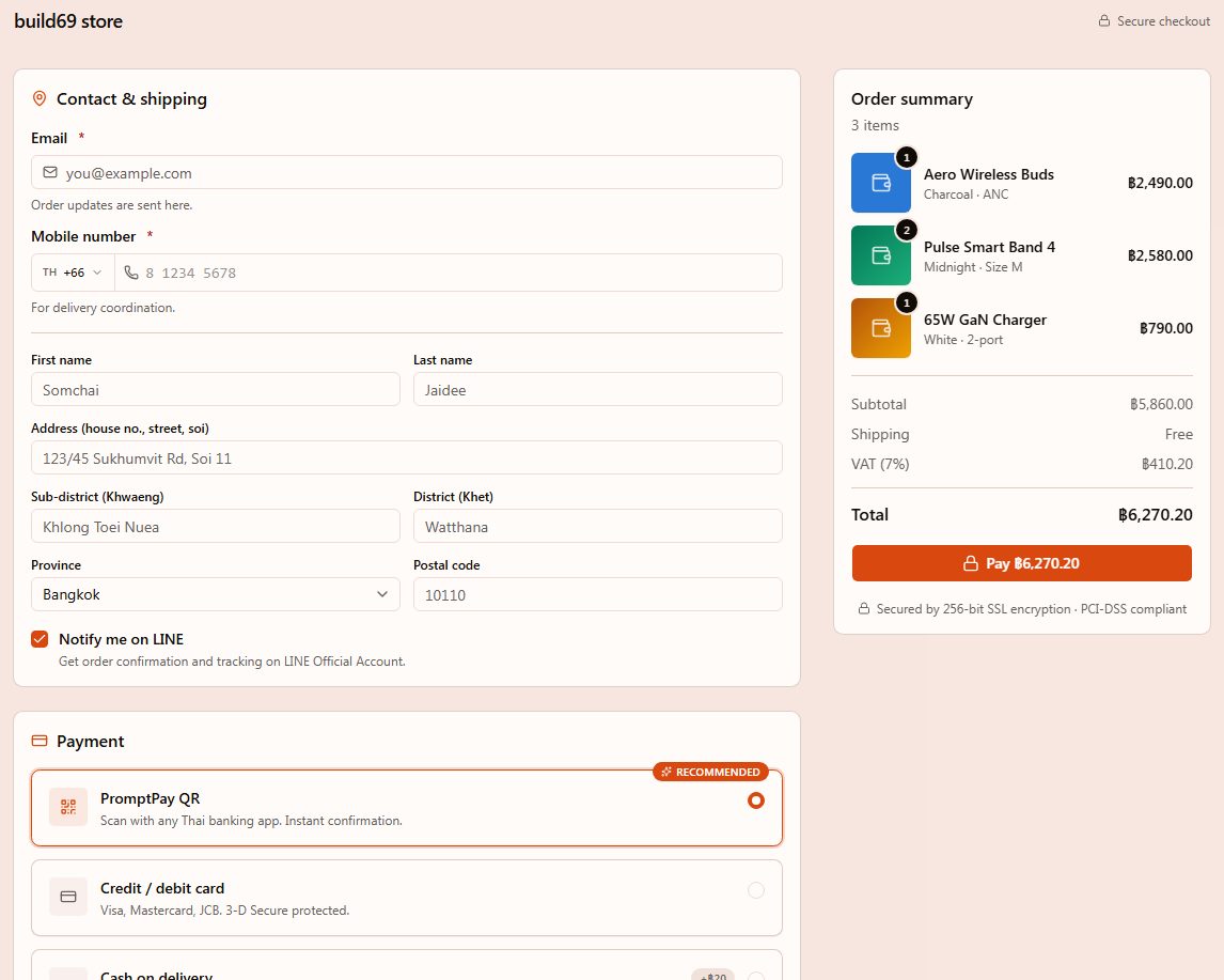
Checkout
v1.0.14CommerceCheckout page — two-column, multi-step, one-page, guest and express layouts. Full-page copy-paste template; baked-in demo content (edit the JSX to customise).
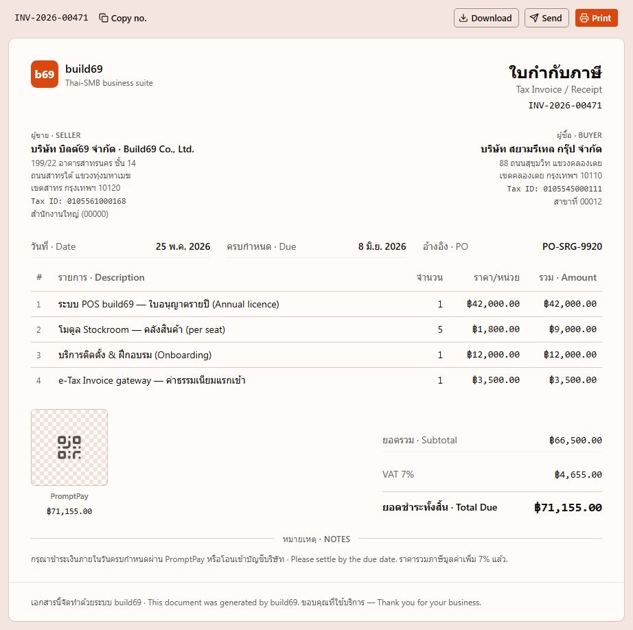
InvoiceView
v1.0.11CommerceInvoice / document view page — standard, minimal and detailed invoices plus quotation, receipt, credit note and PO documents. Full-page copy-paste template; baked-in demo content (edit the JSX to customise).
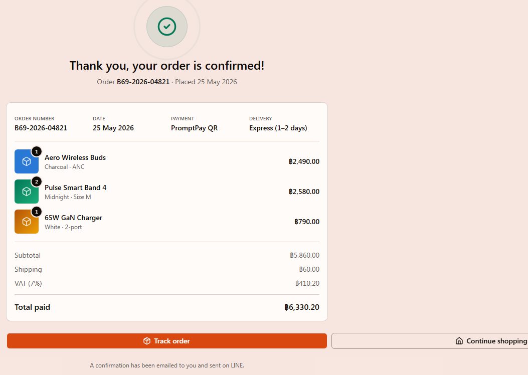
OrderConfirmation
v1.0.14CommerceOrder confirmation / thank-you page — classic, with-tracking, receipt and thank-you layouts. Full-page copy-paste template; baked-in demo content (edit the JSX to customise).
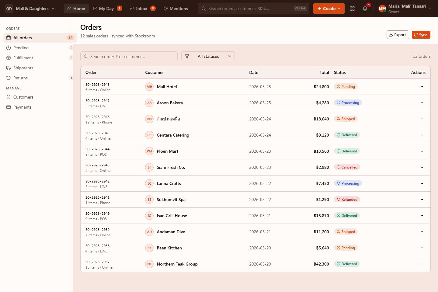
Orders
v1.0.19CommerceOrders management page — table, filters, order detail, card grid and status tabs. Full-page copy-paste template; baked-in demo content (edit the JSX to customise).
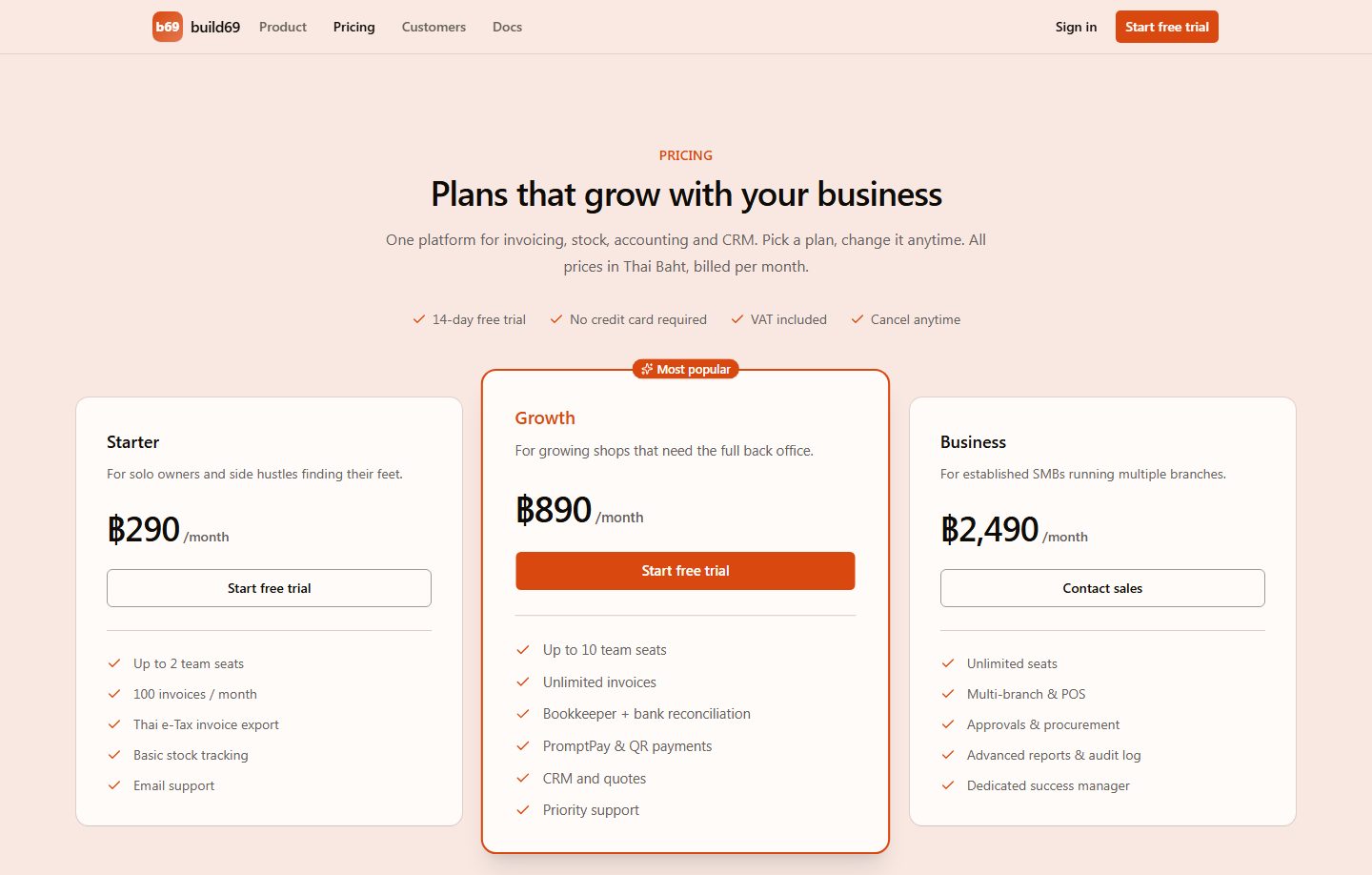
PricingPage
v1.0.16CommerceFull pricing page — tier grids, annual toggles, comparison tables, calculators and FAQ. Full-page copy-paste template; baked-in demo content (edit the JSX to customise).
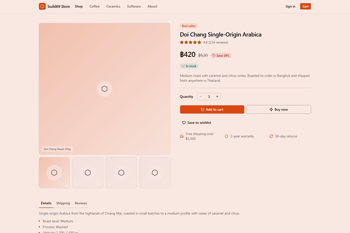
ProductDetail
v1.0.12CommerceProduct detail page — classic, gallery, with-variants, with-reviews and bundle layouts. Full-page copy-paste template; baked-in demo content (edit the JSX to customise).
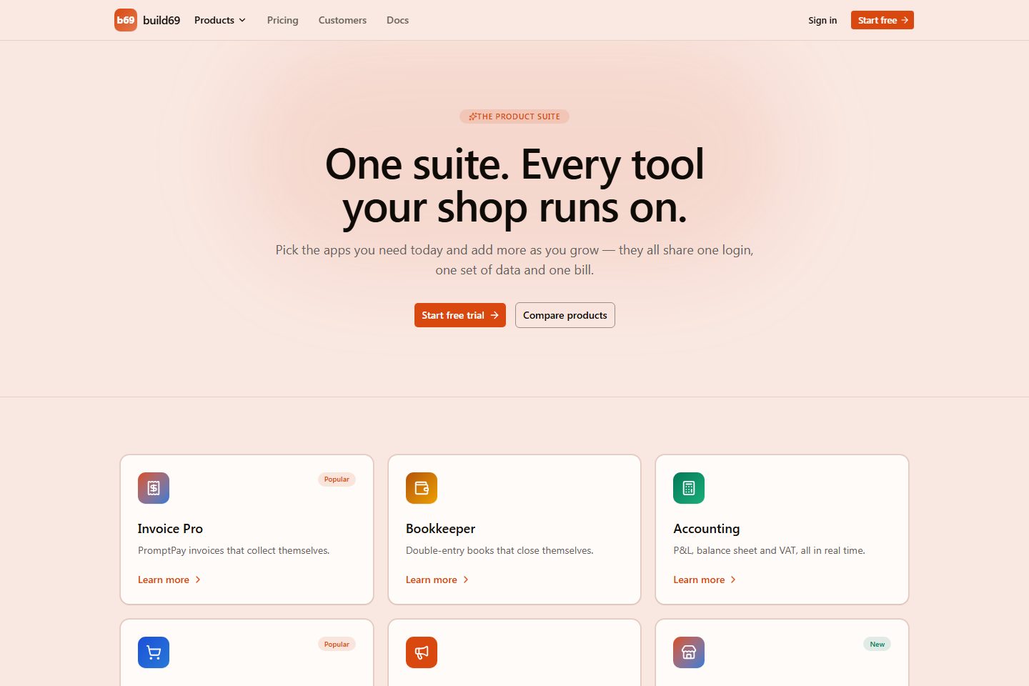
Products
v1.0.14CommerceProducts / catalog page — grids, category browsing, bundles, comparison and ecommerce layouts. Full-page copy-paste template; baked-in demo content (edit the JSX to customise).
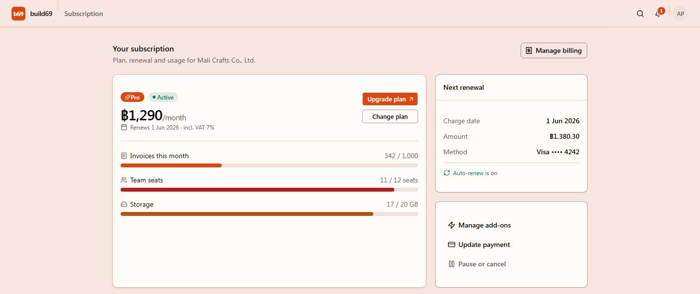
Subscription
v1.0.11CommerceSubscription management page — overview, change plan, usage, payment method and invoices. Full-page copy-paste template; baked-in demo content (edit the JSX to customise).
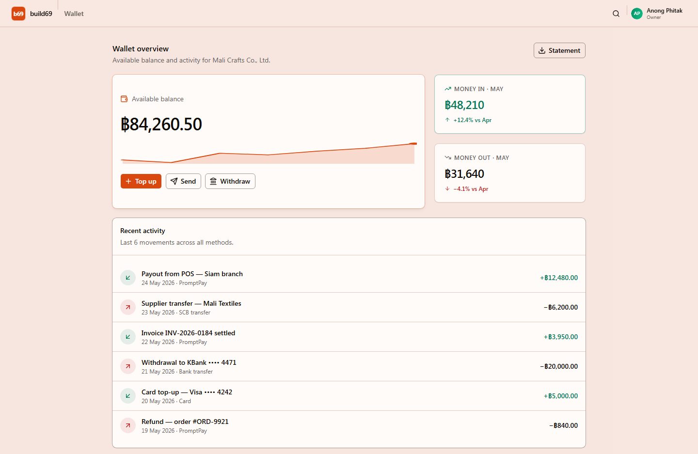
Wallet
v1.0.18CommerceWallet / balance page — overview, transactions, top-up, withdraw, cards and transfers. Full-page copy-paste template; baked-in demo content (edit the JSX to customise).
Site35
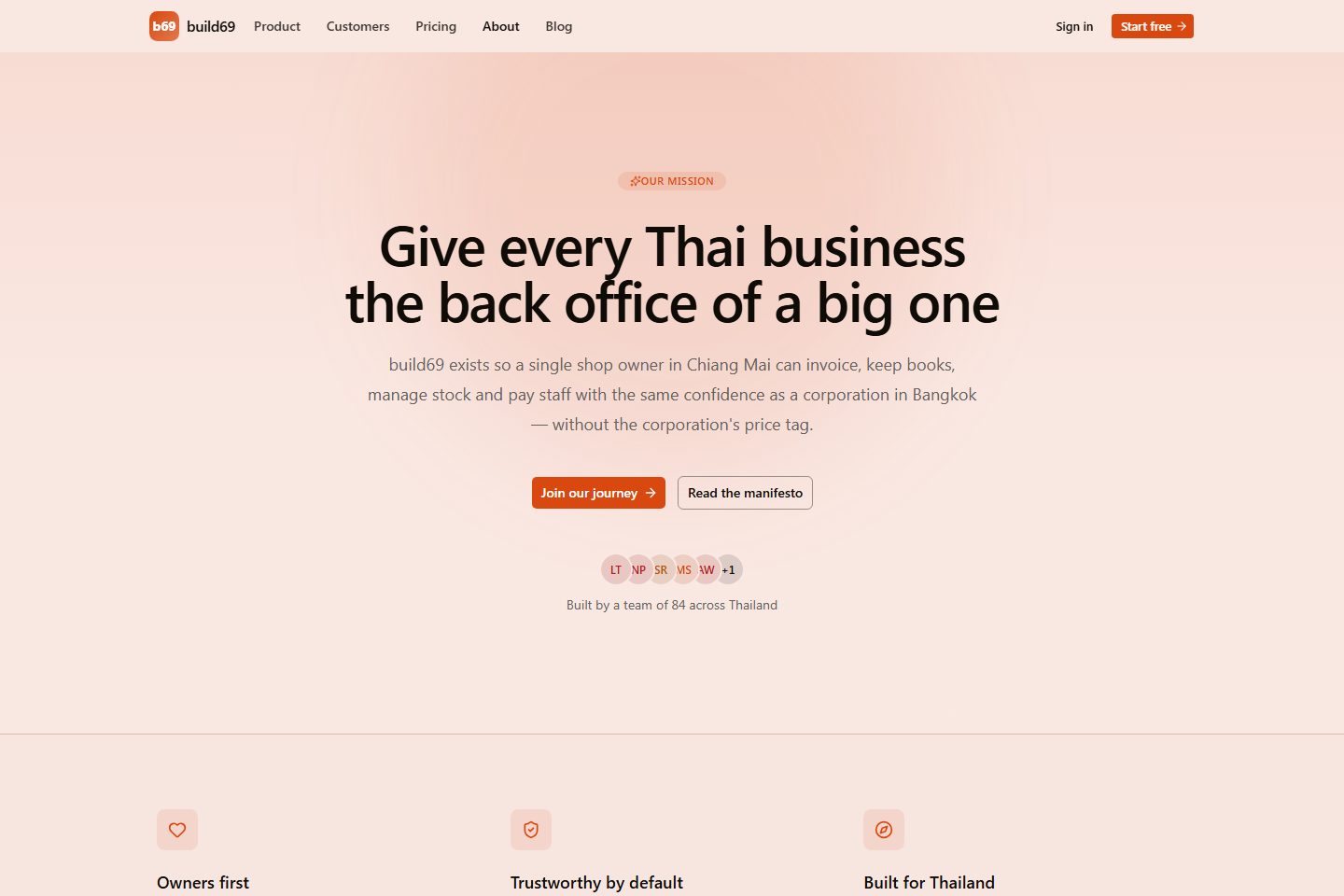
About
v1.0.14SiteAbout / company page — mission, story timeline, values, team and stats. Full-page copy-paste template; baked-in demo content (edit the JSX to customise).
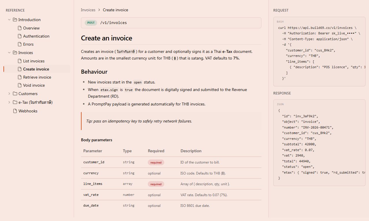
ApiReference
v1.0.21SiteAPI reference / developer docs page — three-column docs, endpoint reference, auth, webhooks and SDK layouts. Full-page copy-paste template; baked-in demo content (edit the JSX to customise).
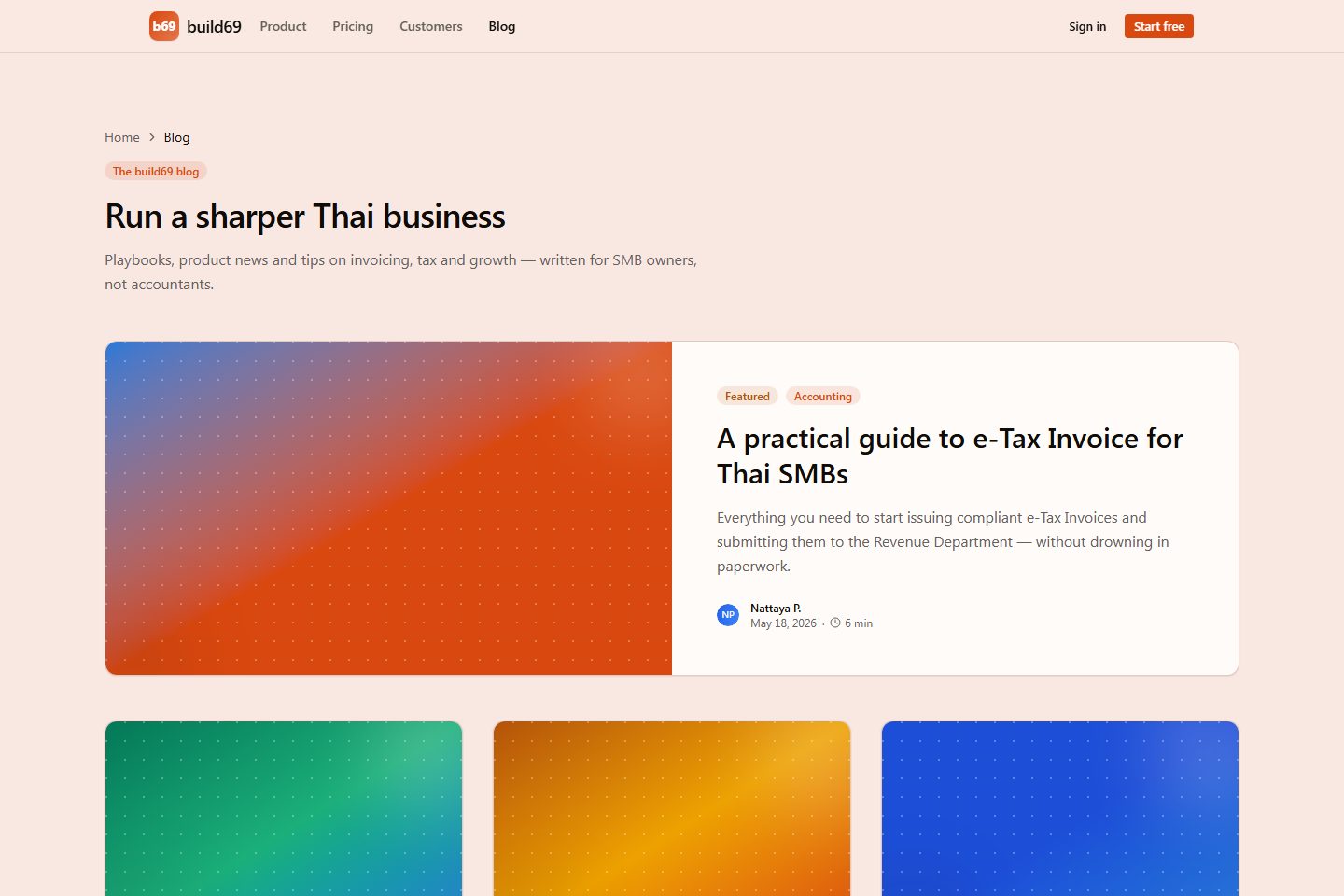
BlogIndex
v1.0.12SiteBlog index / article listing page — three-column grid, magazine, list rows and sidebar layouts. Full-page copy-paste template; baked-in demo content (edit the JSX to customise).
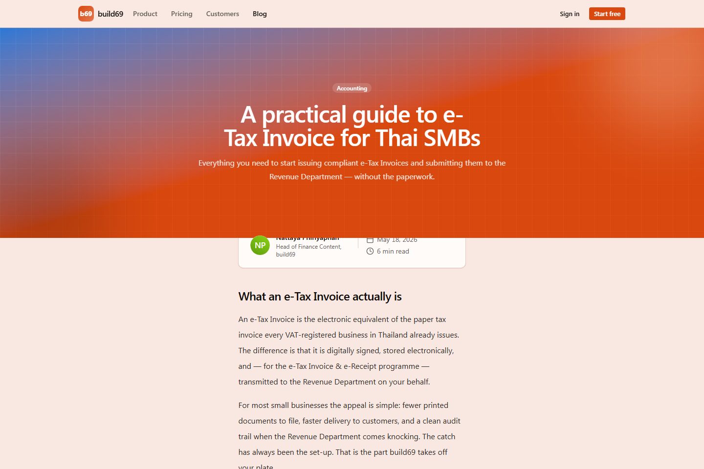
BlogPost
v1.0.18SiteBlog post / article page — classic, with-TOC, minimal, wide-hero and with-sidebar layouts. Full-page copy-paste template; baked-in demo content (edit the JSX to customise).
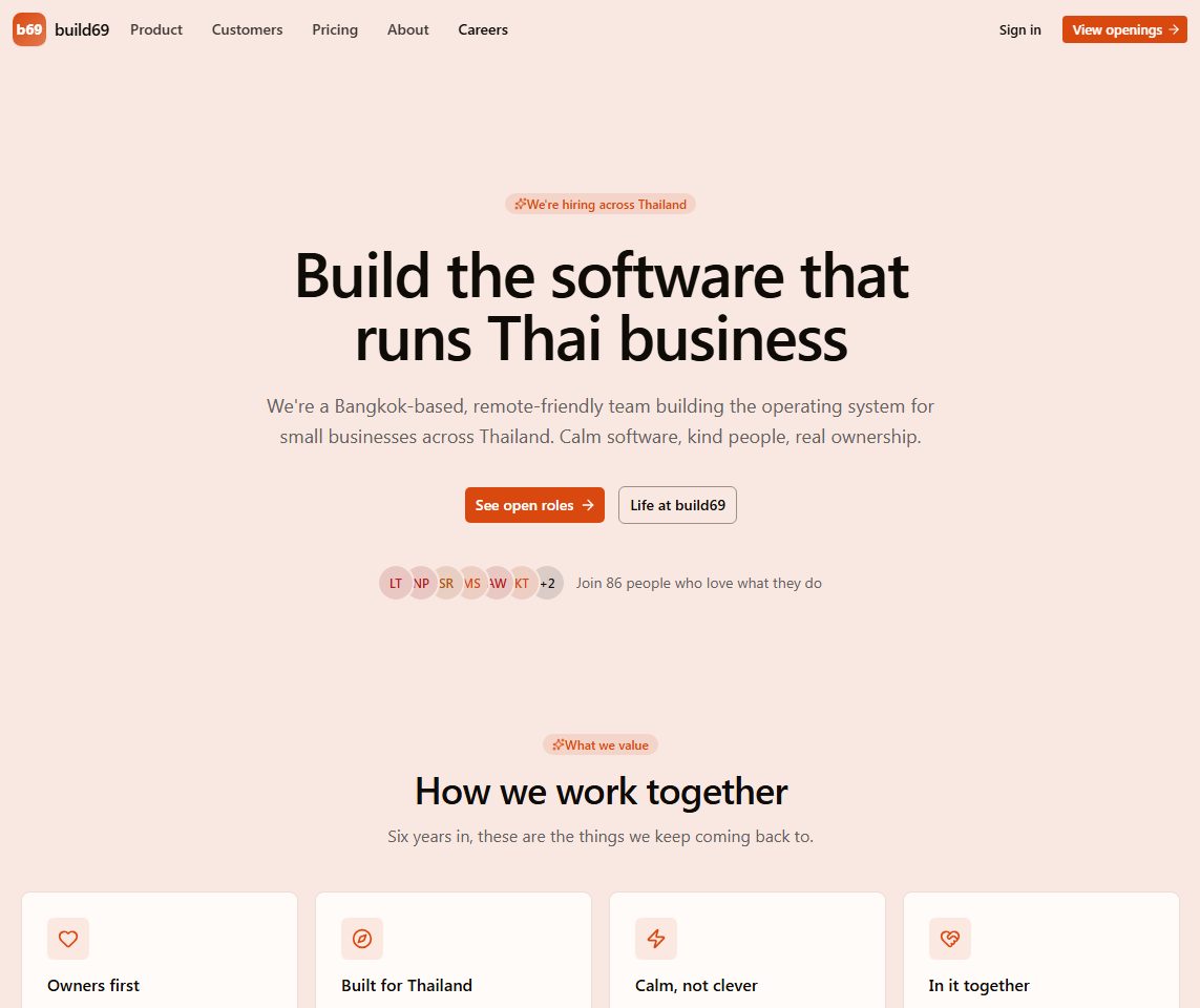
Careers
v1.0.16SiteCareers / jobs page — hero, perks, open roles, departments, culture and job detail layouts. Full-page copy-paste template; baked-in demo content (edit the JSX to customise).
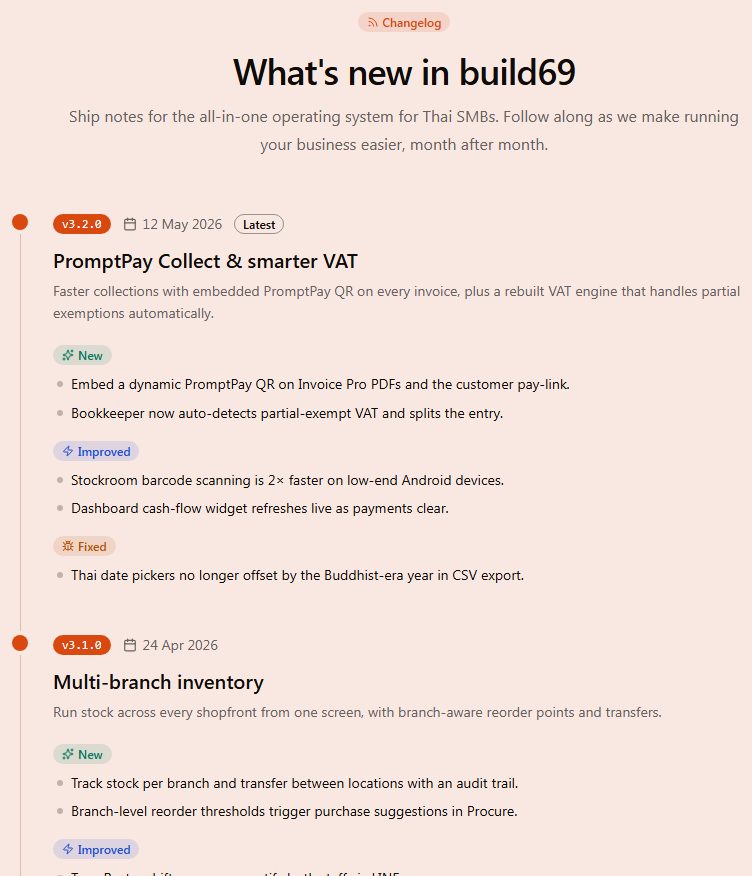
Changelog
v1.0.18SiteChangelog / release notes page — timelines, cards, markdown and subscribe layouts (plus roadmap variants). Full-page copy-paste template; baked-in demo content (edit the JSX to customise).
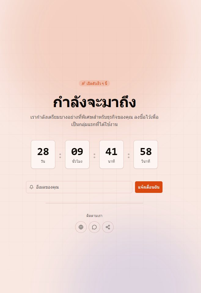
ComingSoon
v1.0.11SiteComing-soon / pre-launch page with countdown and email capture. Full-page copy-paste template; baked-in demo content (edit the JSX to customise).
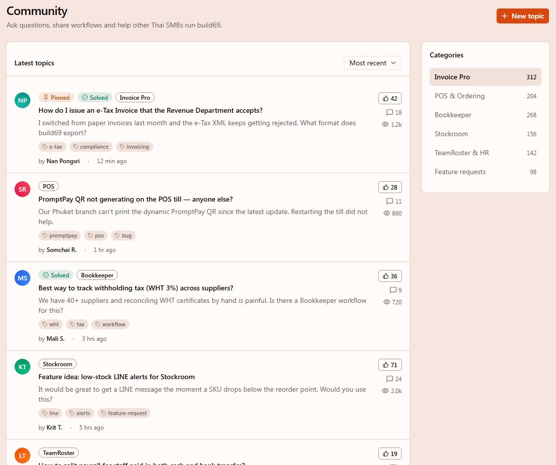
Community
v1.0.15SiteCommunity / forum page — feed, categories, thread detail, questions and leaderboard layouts. Full-page copy-paste template; baked-in demo content (edit the JSX to customise).
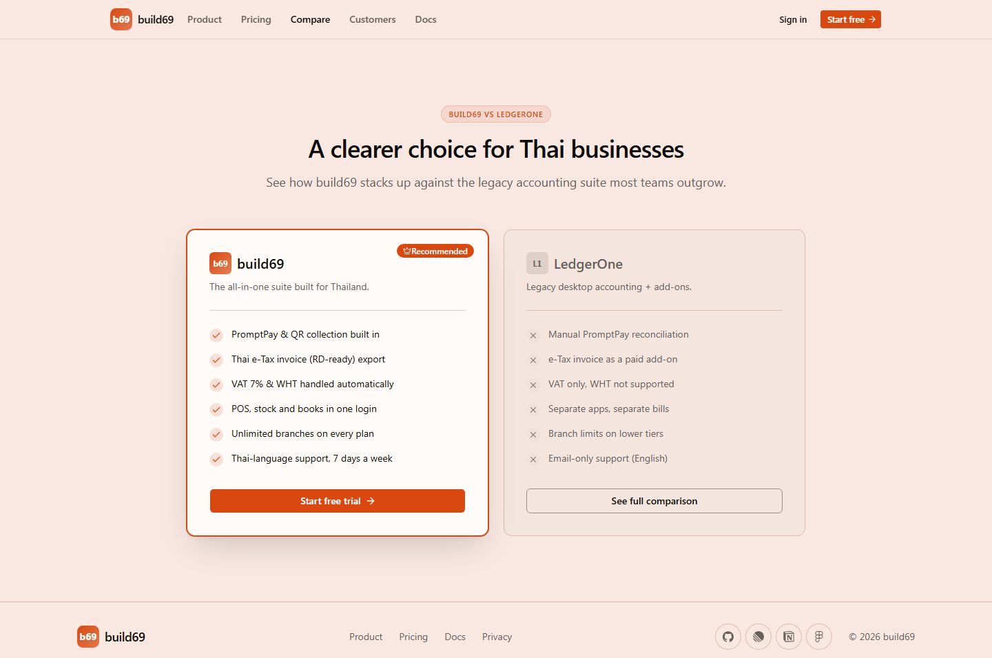
Compare
v1.0.16SiteComparison / vs page — two-column, full feature tables, migration and scorecard layouts. Full-page copy-paste template; baked-in demo content (edit the JSX to customise).
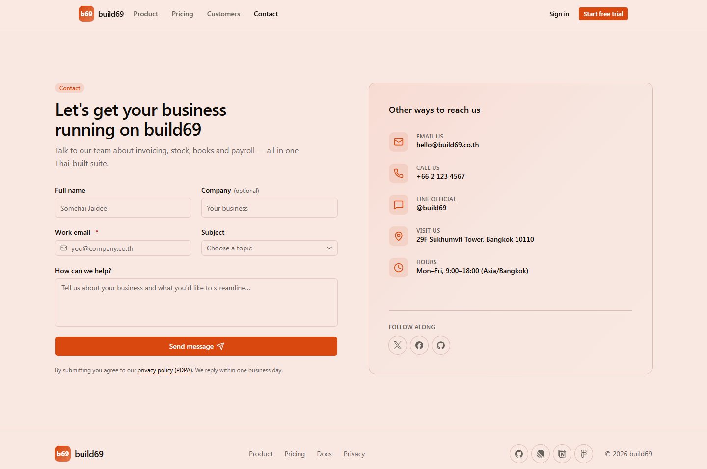
ContactPage
v1.0.14SiteFull contact page — split info, map, departments, office locations and sales enquiry forms. Full-page copy-paste template; baked-in demo content (edit the JSX to customise).
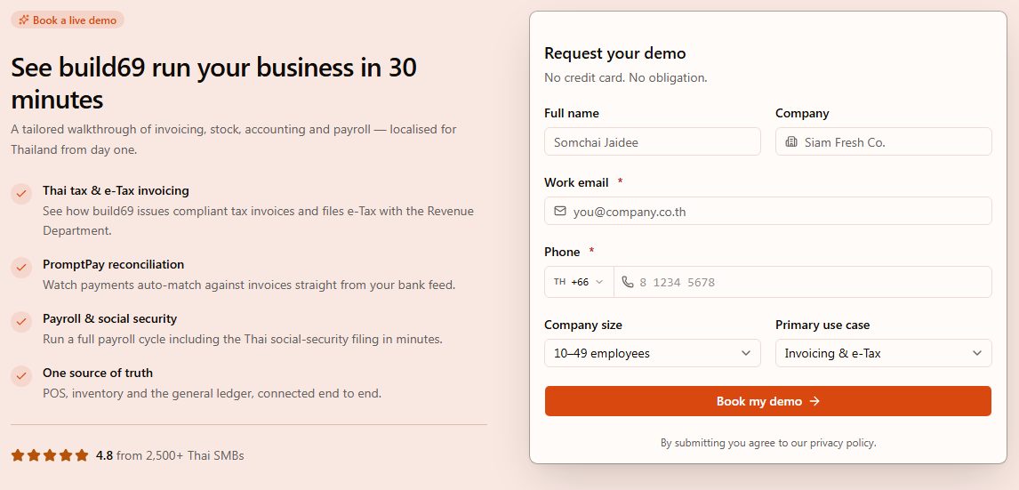
Demo
v1.0.17SiteRequest-a-demo page — booking forms, calendar slots, with-video, multi-step and enterprise layouts. Full-page copy-paste template; baked-in demo content (edit the JSX to customise).
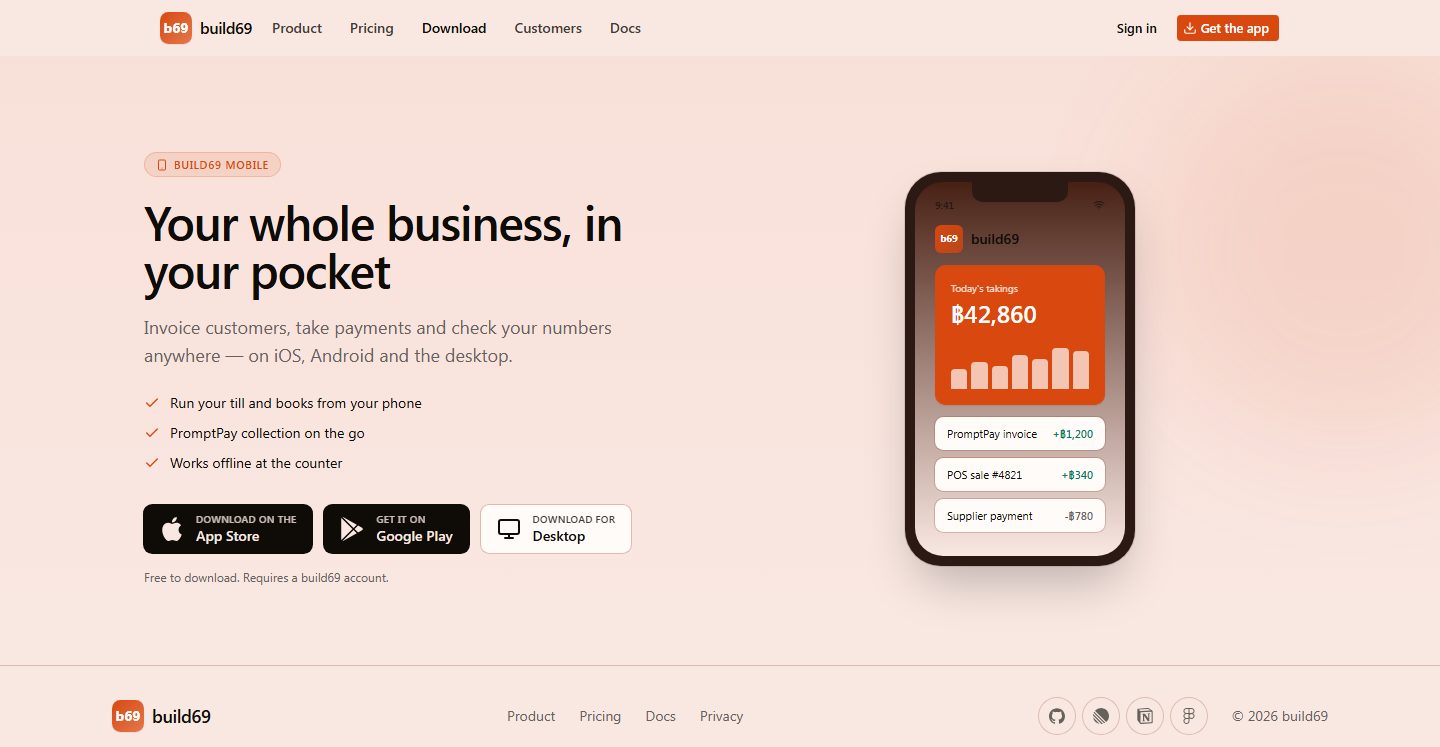
Download
v1.0.13SiteDownload / get-the-app page — hero, app-store badges, platform grids, QR codes and release notes. Full-page copy-paste template; baked-in demo content (edit the JSX to customise).
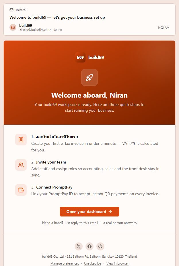
EmailTemplates
v1.0.13SiteTransactional / marketing email templates — welcome, verify, receipt, invoice, newsletter and notification layouts. Copy-paste blocks; baked-in demo content (edit the JSX to customise).

EmptyStates
v1.0.10SiteEmpty-state page templates — empty inbox, no results, no data, error, no access and empty cart. Full-page copy-paste template; baked-in demo content (edit the JSX to customise).
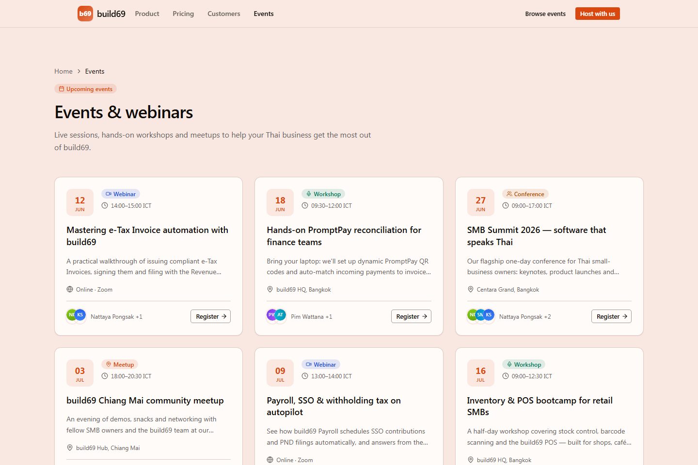
Events
v1.0.17SiteEvents / webinars page — grids, lists, calendar views, speakers and webinar registration. Full-page copy-paste template; baked-in demo content (edit the JSX to customise).
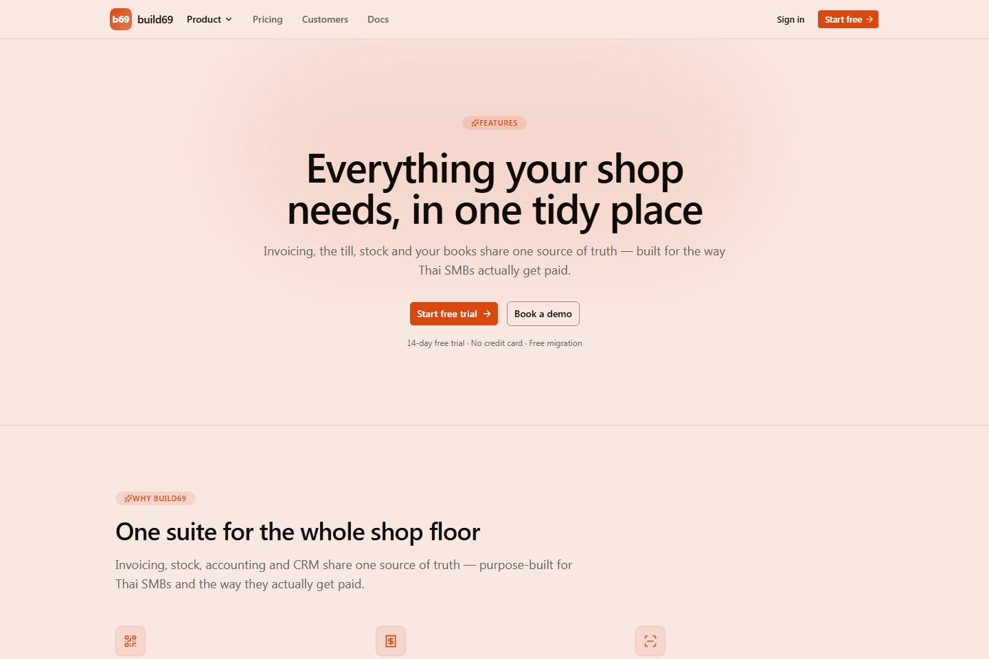
FeaturesPage
v1.0.15SiteFull features page — hero grids, alternating stories, tabbed product tours, bento showcases and comparisons. Full-page copy-paste template; baked-in demo content (edit the JSX to customise).

Forbidden403
v1.0.10Site403 forbidden / access-denied page for unauthorised requests. Full-page copy-paste template; baked-in demo content (edit the JSX to customise).
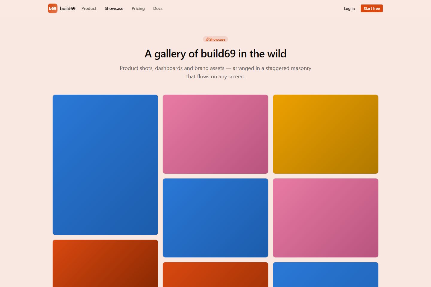
Gallery
v1.0.16SiteGallery / portfolio page — masonry, grids, filtered, quilted and lightbox layouts. Full-page copy-paste template; baked-in demo content (edit the JSX to customise).
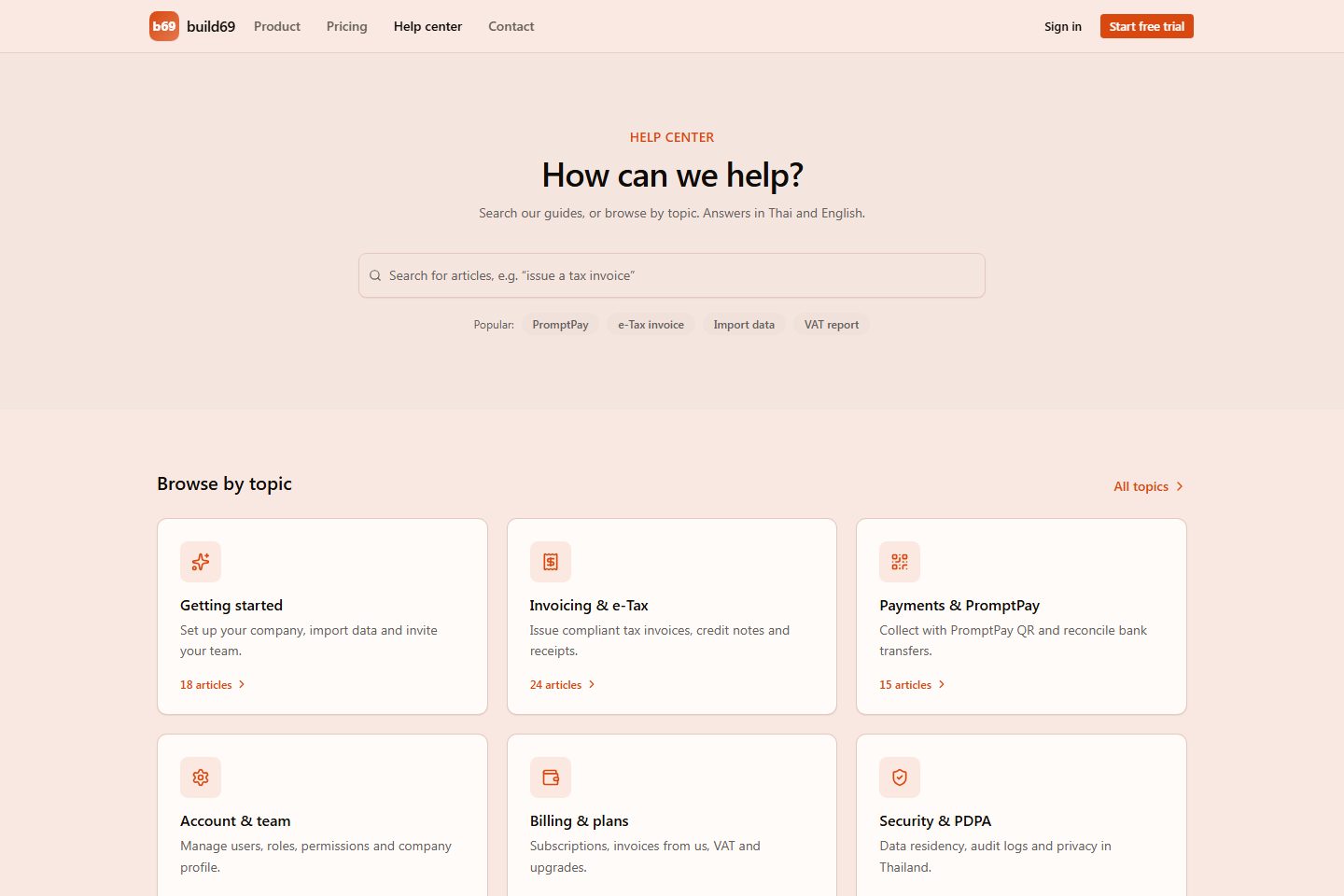
HelpCenter
v1.0.21SiteHelp center / docs page — home, category grids, article docs, knowledge base and search. Full-page copy-paste template; baked-in demo content (edit the JSX to customise).
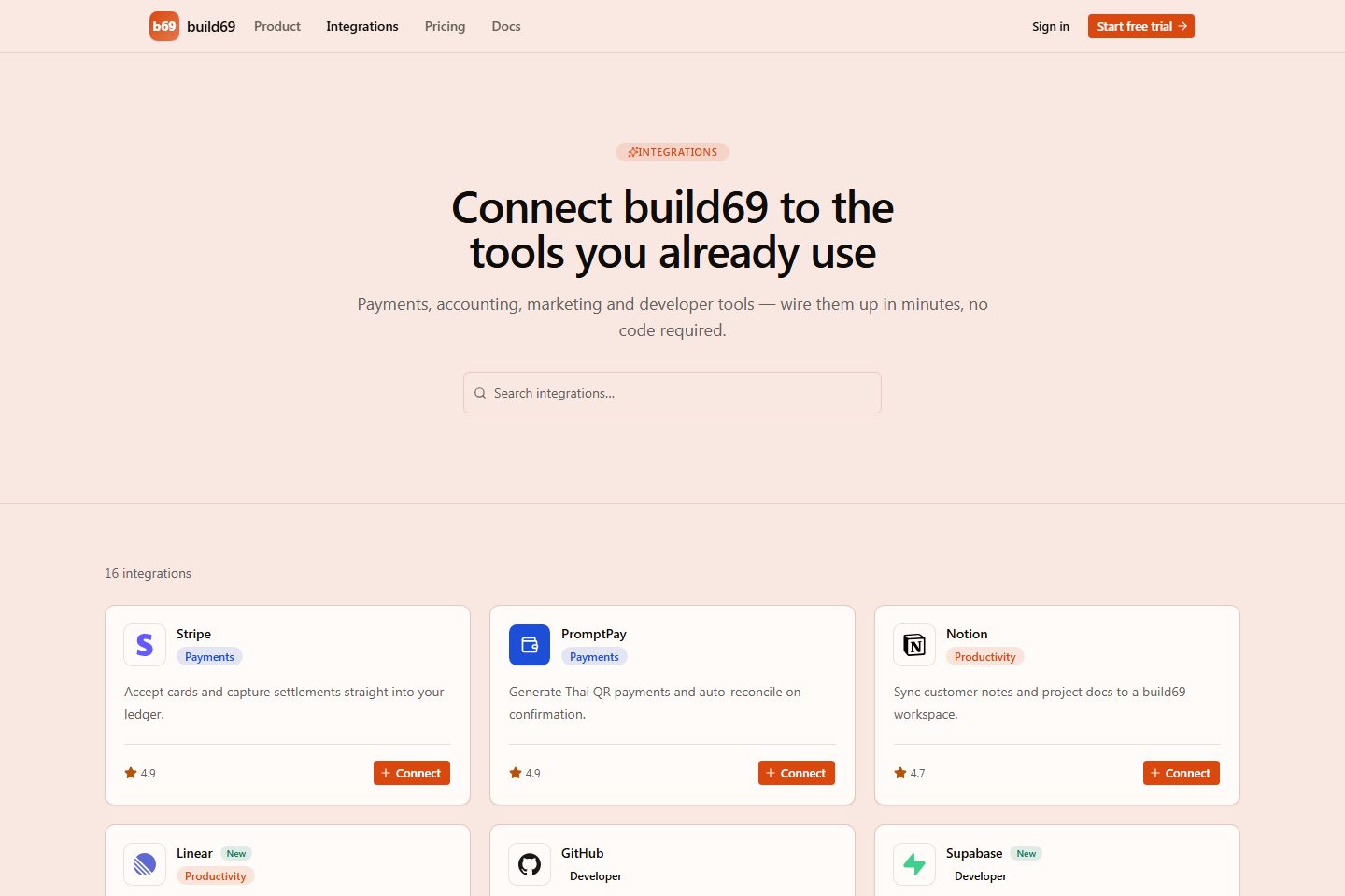
Integrations
v1.0.14SiteIntegrations / marketplace page — grids, by-category, search, marketplace and connected layouts. Full-page copy-paste template; baked-in demo content (edit the JSX to customise).
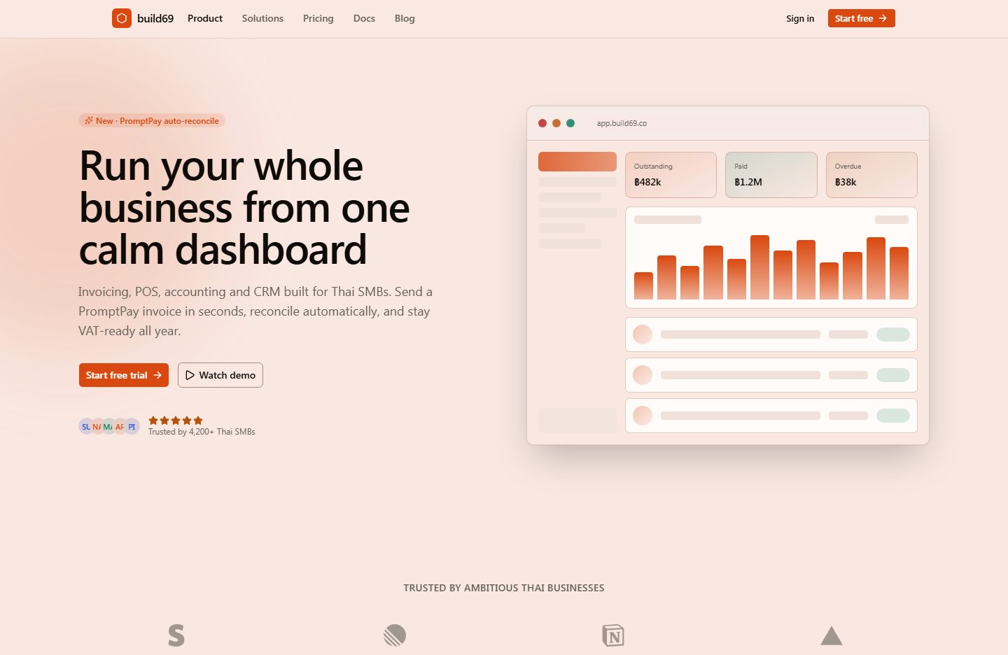
Landing
v1.0.17SiteFull landing pages composed from sections — SaaS classic, product launch, startup, conversion-focused and enterprise layouts. Full-page copy-paste template; baked-in demo content (edit the JSX to customise).
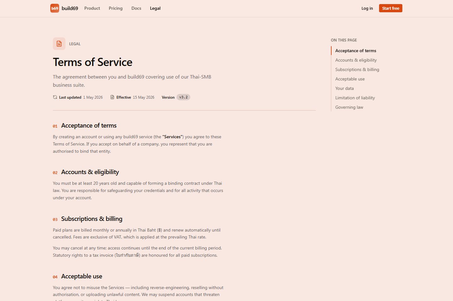
Legal
v1.0.15SiteLegal document pages — terms of service, privacy policy, cookie policy, refund policy and acceptable-use. Full-page copy-paste template; baked-in demo content (edit the JSX to customise).

Maintenance
v1.0.10SiteScheduled-maintenance / downtime page with optional progress indicator. Full-page copy-paste template; baked-in demo content (edit the JSX to customise).
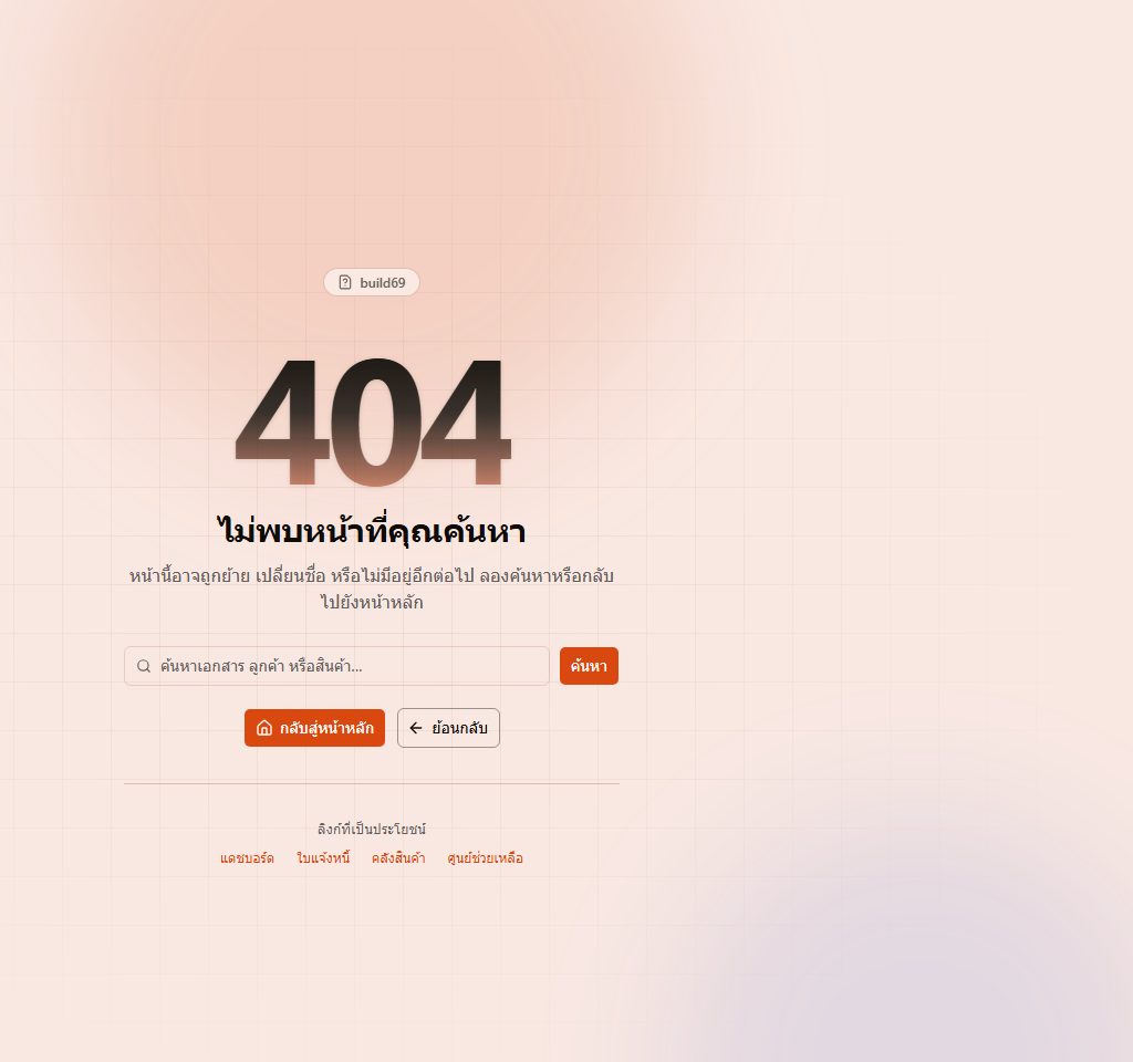
NotFound404
v1.0.10Site404 not-found error page with helpful navigation back to safety. Full-page copy-paste template; baked-in demo content (edit the JSX to customise).
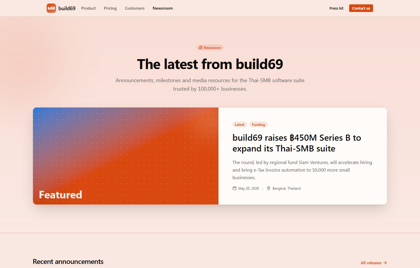
Press
v1.0.13SitePress / newsroom page — hero, release lists, coverage grids, media kits and awards. Full-page copy-paste template; baked-in demo content (edit the JSX to customise).

Referral
v1.0.13SiteReferral / invite-a-friend page — hero, dashboard, how-it-works, share cards and rewards. Full-page copy-paste template; baked-in demo content (edit the JSX to customise).
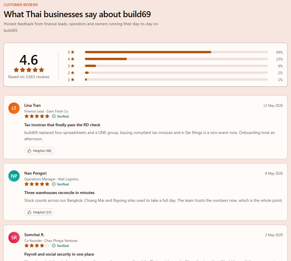
Reviews
v1.0.14SiteReviews / ratings page — overview, grids, summaries, G2-style and write-review layouts. Full-page copy-paste template; baked-in demo content (edit the JSX to customise).
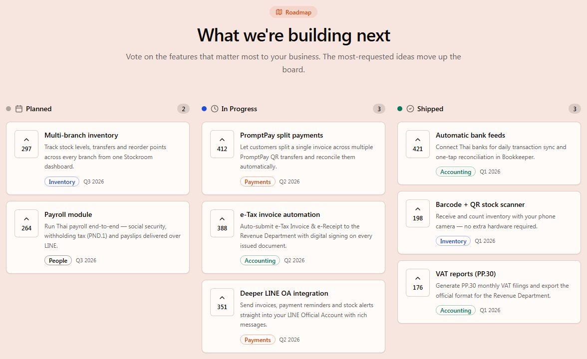
Roadmap
v1.0.15SiteProduct roadmap page — kanban columns, quarter timelines, voting boards and now/next/later layouts. Full-page copy-paste template; baked-in demo content (edit the JSX to customise).

ServerError500
v1.0.11Site500 internal-server-error page for unexpected failures. Full-page copy-paste template; baked-in demo content (edit the JSX to customise).

Services
v1.0.17SiteServices page — service grids, process steps, tiers, consulting and booking CTAs. Full-page copy-paste template; baked-in demo content (edit the JSX to customise).
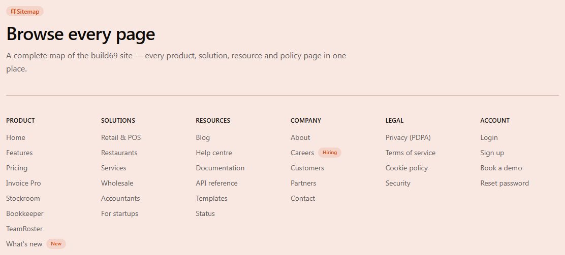
Sitemap
v1.0.12SiteHTML sitemap page — column lists, cards, visual trees, by-category and search layouts. Full-page copy-paste template; baked-in demo content (edit the JSX to customise).
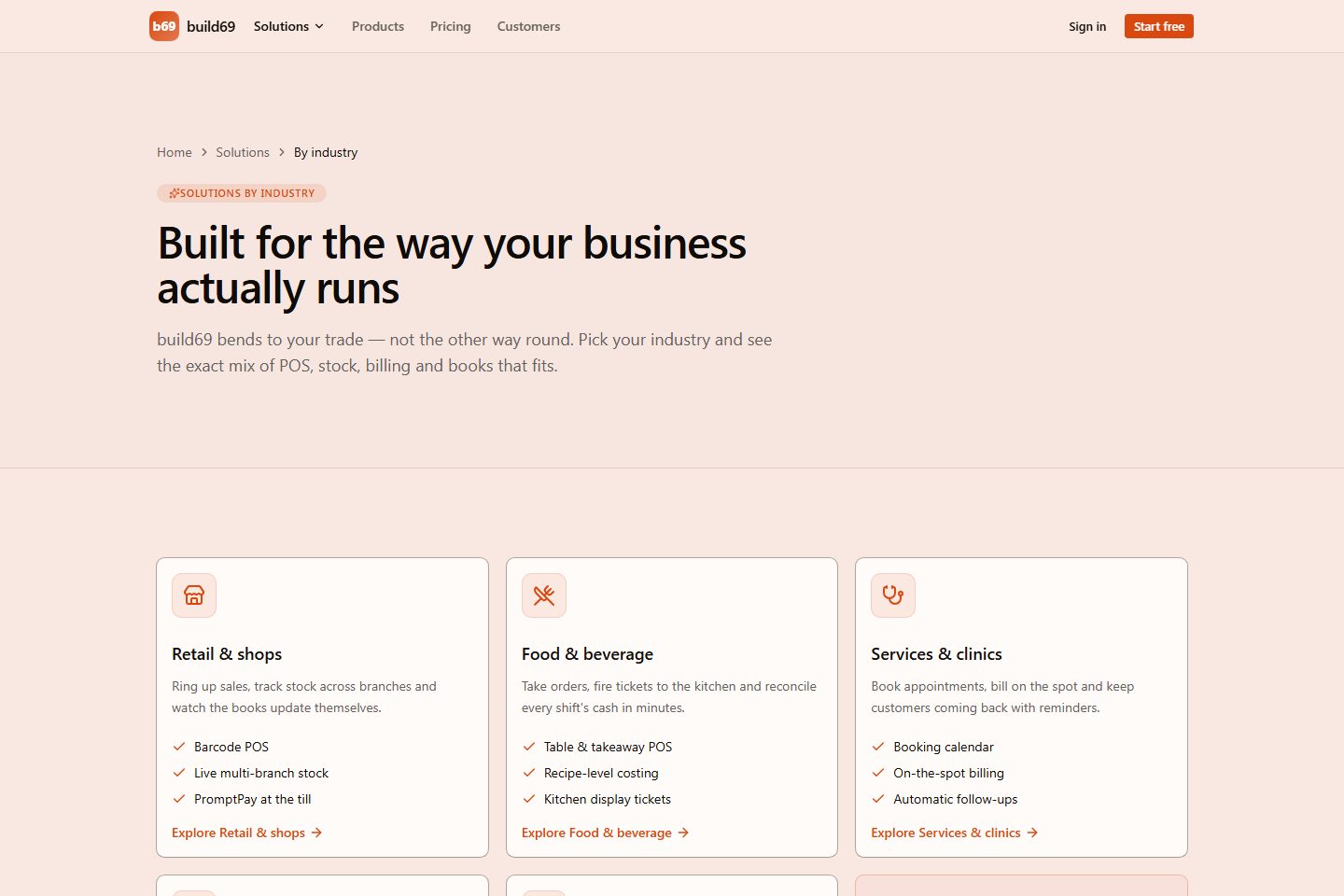
Solutions
v1.0.16SiteSolutions page — by-industry, by-role, by-size, use-case grids and solution detail layouts. Full-page copy-paste template; baked-in demo content (edit the JSX to customise).

Success
v1.0.12SiteSuccess / confirmation page for completed actions (order, verification, payment). Full-page copy-paste template; baked-in demo content (edit the JSX to customise).
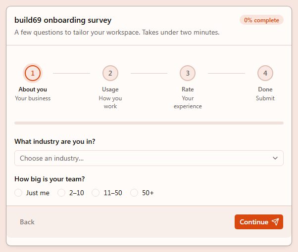
Survey
v1.0.14SiteSurvey / feedback page — multi-step, single question, NPS, CSAT and feedback-form layouts. Full-page copy-paste template; baked-in demo content (edit the JSX to customise).

Waitlist
v1.0.15SiteWaitlist / early-access page — hero, gradient, referral, split and countdown layouts. Full-page copy-paste template; baked-in demo content (edit the JSX to customise).
Fetch any of these with one prompt.
Connect the MCP URL and your agent pulls a self-contained bundle — source, sub-components, and deps resolved.